This ultra—low cost two family house on a highly visible lot adjacent to I—95 in Providence, Rhode Island, was designed in close collaboration with a local developer—builder with a strong interest in contemporary design. The massing is a variation on the standard triple—decker housing that populates nearby streets. It creates a loose symmetry between the two mirrored units, which are arranged front to back on the site and share a common roof terrace between the double—height living rooms on the top floor. The result is a subtle icon for the city, visible from vantage points across downtown.
The tight budget forced a unique resourcefulness in the design, with the goal of providing the highest quality of space and light. As a result, many of the materials employed in the project were sourced as remainders from other local construction projects, allowing a higher quality of finish across the project while eliminating the materials from the construction waste stream.
The facade is clad in corrugated metal with inline frosted acrylic windows that selectively peel away layers of the exterior wall to reveal wall studs, and fiberglass insulation, as well as allow light into the interior. The large translucent light monitors are site built, with high R—value multiwall polycarbonate serving as the control layer behind the acrylic cladding. These monitors allow a large amount of light into the double—height living space and provide a high level of thermal performance while costing a fraction of a similar construction in glass.
Project team: Edgar Rodriguez, Eamon Wagner
Structural engineer: Boulay Consulting
Associate architect: Assembly Archive


How generous can a kiosk be? Rather than build a boutique ornament, we need to think bigger. Instead of providing a luxury for the few, the Chicago Horizon maximizes its reach. It emphasizes a proliferation of space over form or detail. In lieu of flash, it provides relief for the city. The design for the kiosk became a quest to create the largest wood roof possible—to demarcate a zone of the city for all to enjoy.
Inspired by two Chicago prototypes—Mies van der Rohe’s experiments in flatness and the Eames’ explorations of scale in Powers of Ten—we designed a 56’ square open roof with the largest clear spans possible.
Radical simplicity underlies a subtle and varied experience. The lateral reach of the roof recalibrates the experience of two extremes of the Chicago landscape: at ground level, the Lake Michigan horizon dominates, forming a line of symmetry between ground and canopy. From the viewing platform, the roof becomes a new artificial horizon, shutting out the foreground and emphasizing the vertical skyline above an abstract floating plane.
The materials used in the pavilion are inexpensive: just some structural grade wood and chain—link fencing. Minimizing the cost of materials maximizes space for the public, and provides the Biennial with a dedicated event space in Millennium Park. The roof is made from Cross—Laminated Timber, a new structural wood material that sequesters carbon in its fibers. The roof alone more than offsets the emissions generated by all the other materials used in the project combined.
Two programmatic volumes—a viewing platform and a vending kiosk—hang between the roof and the ground. Enclosed in chain link fencing used in tension, the volumes provide a subtle hierarchy within the otherwise open plan. Fin columns are distributed in a finely tuned radial pattern to respond to lateral loads and uplift; their orientation creates at once an intense focus on the space and activities central to the pavilion, as well as outwards towards the horizon.
At night, the chain link enclosures double as a lighting installation, attracting visitors to their mysterious glow. Each is outfitted with a plane of programmable LED lighting and glowing with a different color temperature: one warm (moonlight), one cool (daylight). The two pulsate in dialogue with each other throughout the night, alternating between the two poles of experience that the kiosk creates: floor and ceiling; day and night.
Project team: Yasmin Vobis, Aaron Forrest, Will Gant, Hua Gao, Ronak Hingarh, Tida Osotsapa, Emily Yen
Design Engineer: Brett Schneider, Guy Nordenson and Associates
Engineer of Record: Thornton Tomasetti
Architect of Record: Animate Architecture
Photographs by Naho Kubota
Chicago Horizon was the winner of the BP Prize in the Chicago Lakefront Kiosk Competition for the inaugural Chicago Architecture Biennial. Generous additional support for both design and construction were provided by Nordic Structures, reThink Wood, and the Rhode Island School of Design.
Chicago Architecture Biennial BP Prize, 2015
WoodWorks Award, Best Government Building, 2015
Architect R+D Awards, Citation, 2016
AIA Rhode Island Honor Award, 2017
SEAoNY Excellence in Structural Engineering Award, 2017


Much urban architecture is framed in terms of solid and void: how to maintain the semblance of a historic city in the face of the automobile, regardless of shifting patterns of growth and inhabitation. This project for a new public garden and performance venue sees the voids opened up in the city by the planning decisions of the 1960s as an opportunity both for public space and for a new form of East—coast urbanism: the urbanism of the extended boundary.
A new public space is conceived as a green band cutting through the vast asphalt parking lot behind an existing cultural center, which as part of recent zoning changes has sharply reduced parking requirements. The strip serves as a soft boundary between the parking lot, the surrounding city, and the existing cultural center, reconnecting adjacent streets and marking the lot as an integral piece of the public realm. The large lawn serves as a generous gathering space bookended by native perennials at either end.
The centerpiece of the green band is a three—season performance venue that expands the capacity of local performance groups. Built from a modified catalog greenhouse, the performance space serves as an intensification of the landscape and the programming activities of the cultural center. The monumental doors attached at every column form a new order that, when open, extend the pavilion from discrete, minimal object out into the city. Simultaneously, timed lighting elements integrated into pavilion, fence, and landscape, allow the project to serve as a beacon within the neighborhood as it transitions from day into night.
Design—build collaboration with RISD Architecture students and the Southside Cultural Center of Rhode Island
Design Leads: Aaron Forrest, Yasmin Vobis, Elettra Bordonaro (Light Follows Behaviour), Katy Foley PLA (RISD Landscape Architecture)
Design—Build Lead: Sina Almassi
Administrative Leads: Laura Briggs, Jonathan Knowles, Scheri Fultineer, Sara Sullivan, Sara Willett
Architect of Record: James Barnes
Structural Engineer: Wilbur Yoder
Photographs by Naho Kubota
2016 AIAri Merit Award, Educational/Institutional Category
2016 AIAri People's Choice Award
2017 dbXchange Awards, Honorable Mention
2018 ACSA Collaborative Practice Award


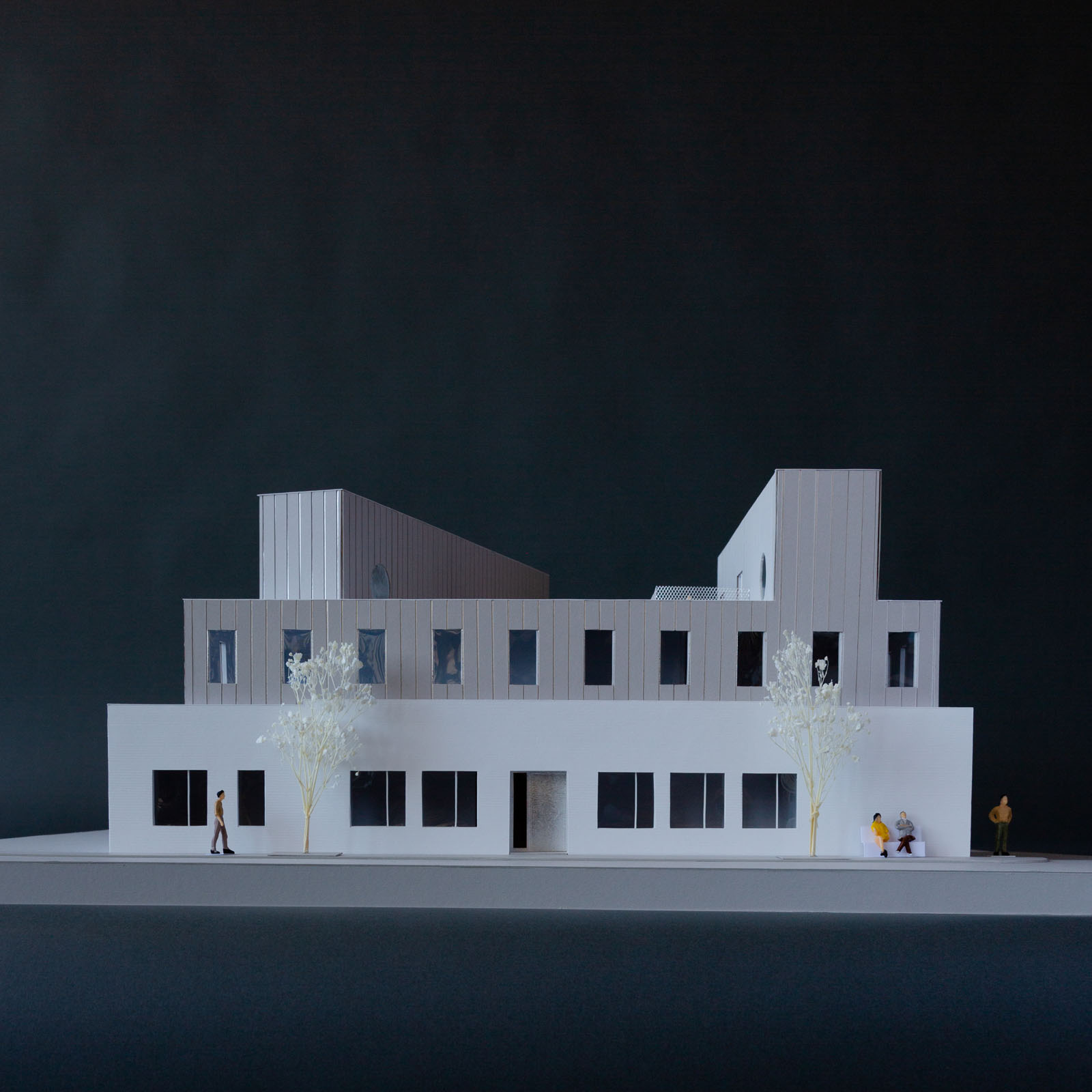
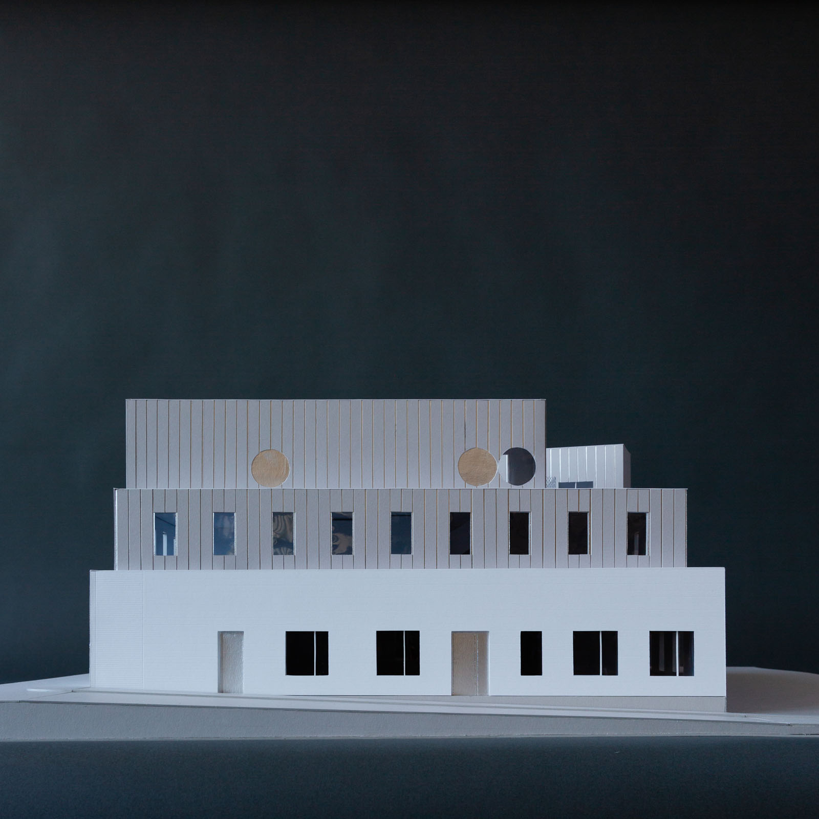
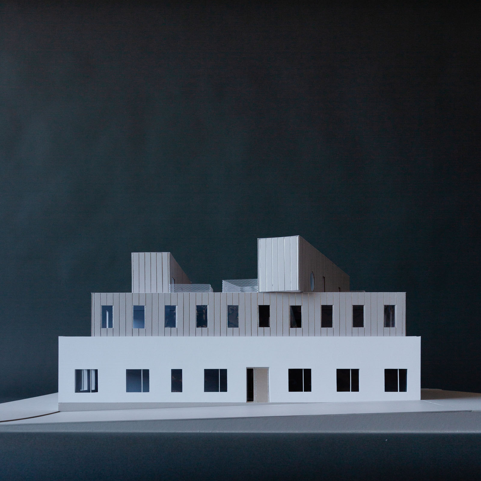
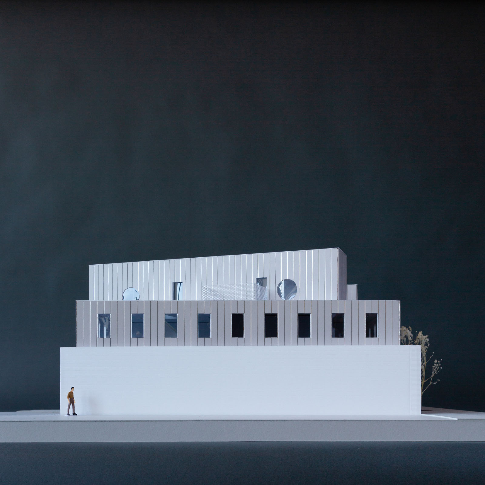
This adaptive reuse project converts an existing one—story warehouse in Providence to a mixed—income, multifamily building with outdoor amenities unique to the area. The design takes advantage of an oversized base building to create an open—air courtyard at its center as a common amenity for the building residents that doubles as a light and air shaft for the deep ground floor units. At the same time, rooftop bulkheads allow each of the second floor units access to individual private roof terraces.
A few simple design moves take advantage of design constraints imposed by the existing building to create a clear design statement without undue cost. The second floor addition steps in from the ground floor perimeter wall to avoid adding load to the existing masonry walls, while the bulkheads are positioned with a playful yet precise geometry that give the building a confident visual identity and a scale that matches surrounding developments. The strategic building configuration allows the use of a single stair, maximizing the number of units while creating a humane and attractive range of apartment types.
Construction 2024.
Project Team: Kei Takanami, Ariana Wu, Pericles Bien

The art museum is nothing if not inward—looking. Fortressed by solid walls from the messiness of the city, its insular world holds everyday life at bay in the service of constructing the canon.
Philadelphia Contemporary is different. It looks to the city with a radical openness. It denies the sanctuarization of art by releasing it into the streets. It recognizes the potential of the city and its diverse realities to incite and charge culture, yielding experiences that are far more provocative and unexpected.
We have proposed a museum that invites the city in, constructing a dialogue between the work on display and the diverse audiences that the museum hopes to engage. The project sees the museum as a piece of infrastructure: an abstract framework for art, performance, and community. Like all good infrastructure, it is designed to tolerate both good behavior and bad. It encourages its inhabitants to make use of it — to hang things on it, to act out, and to invent new art forms, new audiences, new positions, and new ways to construct the city.
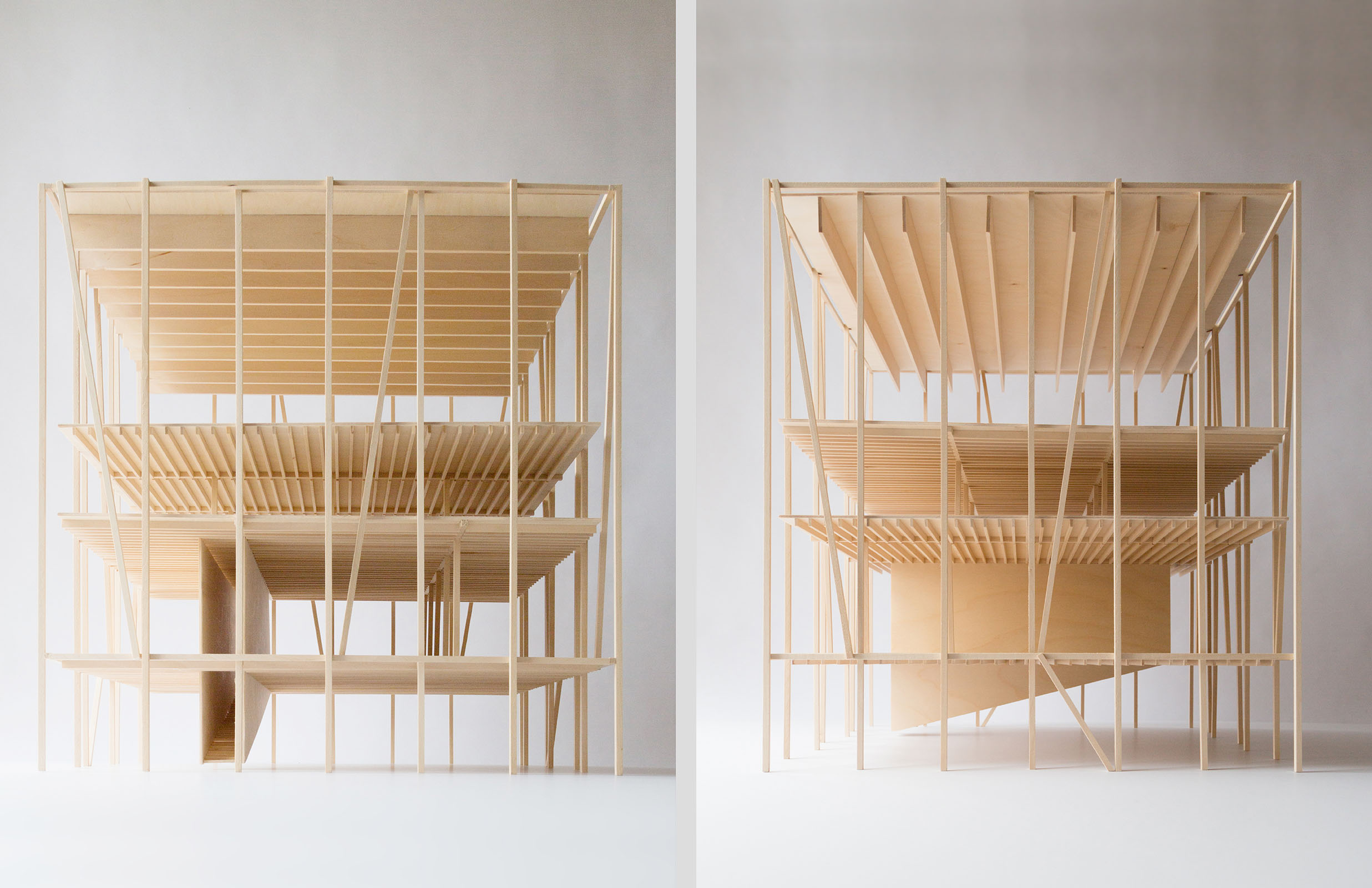
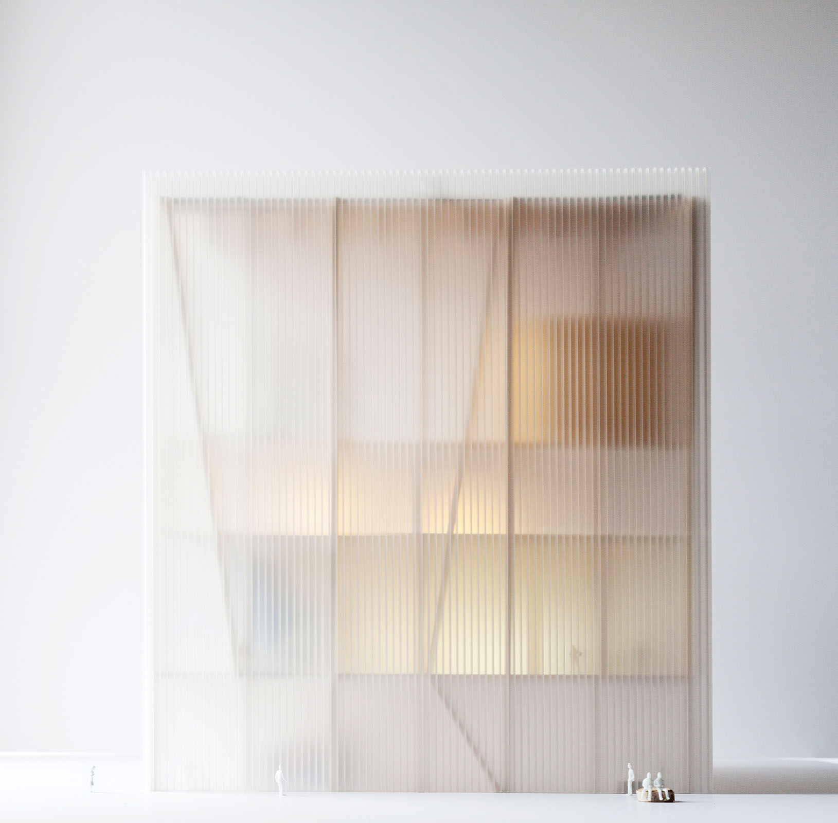
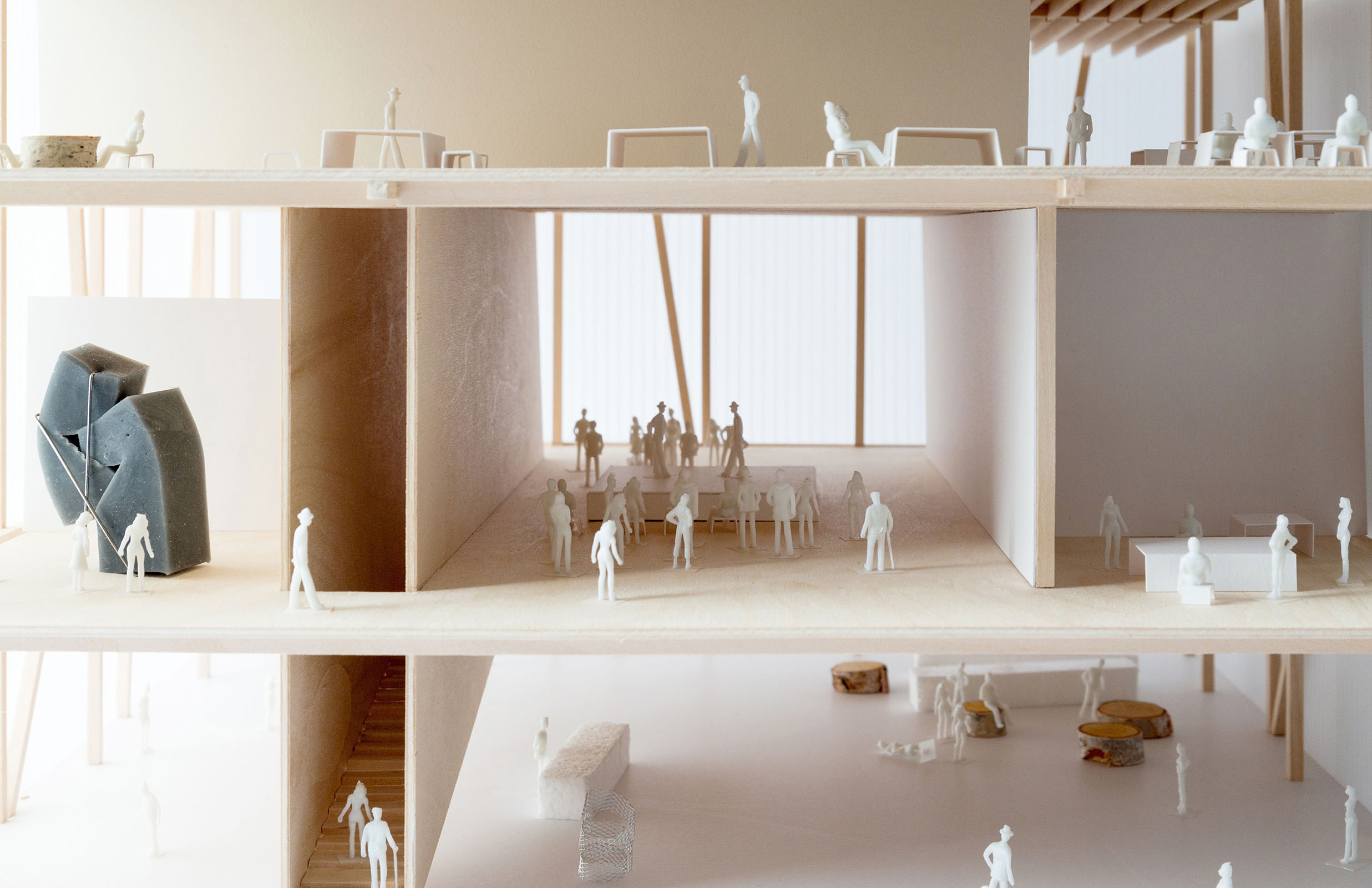
The proposed design maximizes the space of the city by stepping back from the street, to punctuate the narrow street with a new civic space. This move pushes the museum program into a vertical stack with building services pushed outward into two support volumes that anchor the building to the site. The stack itself is a clear, open framework that allow these programs to unfold against each other without extraneous impediments; a series of suspended, open floors, which would allow the institution to radically rewrite the way we communicate culture, creating simultaneity and strategic overlaps between exhibition, education, and events.
The ground floor is a large, column—free open space continuous with the plaza outside. The efficiency of the stack allows an extra program: an open, flexible lobby that invites the everyday activity of the city to come inside while creating informal opportunities for exhibition and performance. The floor of the space continues the slope and material of the plaza and can be opened to the exterior along two sides.
Smaller galleries are located on the second floor alongside the education spaces. All museum operations, from administration to exhibition prep, take place on the third floor and can be viewed by visitors as they move up to the 8,000 square foot kunsthal on the fourth floor. A public roof garden tops the museum and acts as an extension of the public plaza below. A giant fabric room at its center creates a veil of shelter for recreation and performance, while acting as a giant three—dimensional flag signaling to the street below that the museum is open, active, and welcoming.
The museum is proposed as a mass timber structure, the first of its type in North America. The structural frame is left exposed on the interior in conjunction with ample natural light through clerestory windows, creating a counterpoint to the typical white—box museum aesthetic. Two staircases connect all of the public spaces of the building, interleaving movement with programs and views of the city and the spaces of the museum. The multiple circulation routes through the building allow for both direct shortcuts and long, meandering trajectories that pull visitors through other activities along the way, exposing them to unexpected experiences.
Invited Design Competition. Finalist.
Design Architect: Ultramoderne
Team: Aaron Forrest, Yasmin Vobis, Robert Mohr, Lauren Bordes, Charlie Cotton, Sage Dumont, Nicola Ho, Tiantian Lou, Giacomo Sartorelli, Gabriel Schmid, Daniel Stone, Yinong Tao
Landscape: Hood Design Studio
Structural Engineer: Guy Nordenson and Associates
Lighting: Light Follows Behaviour






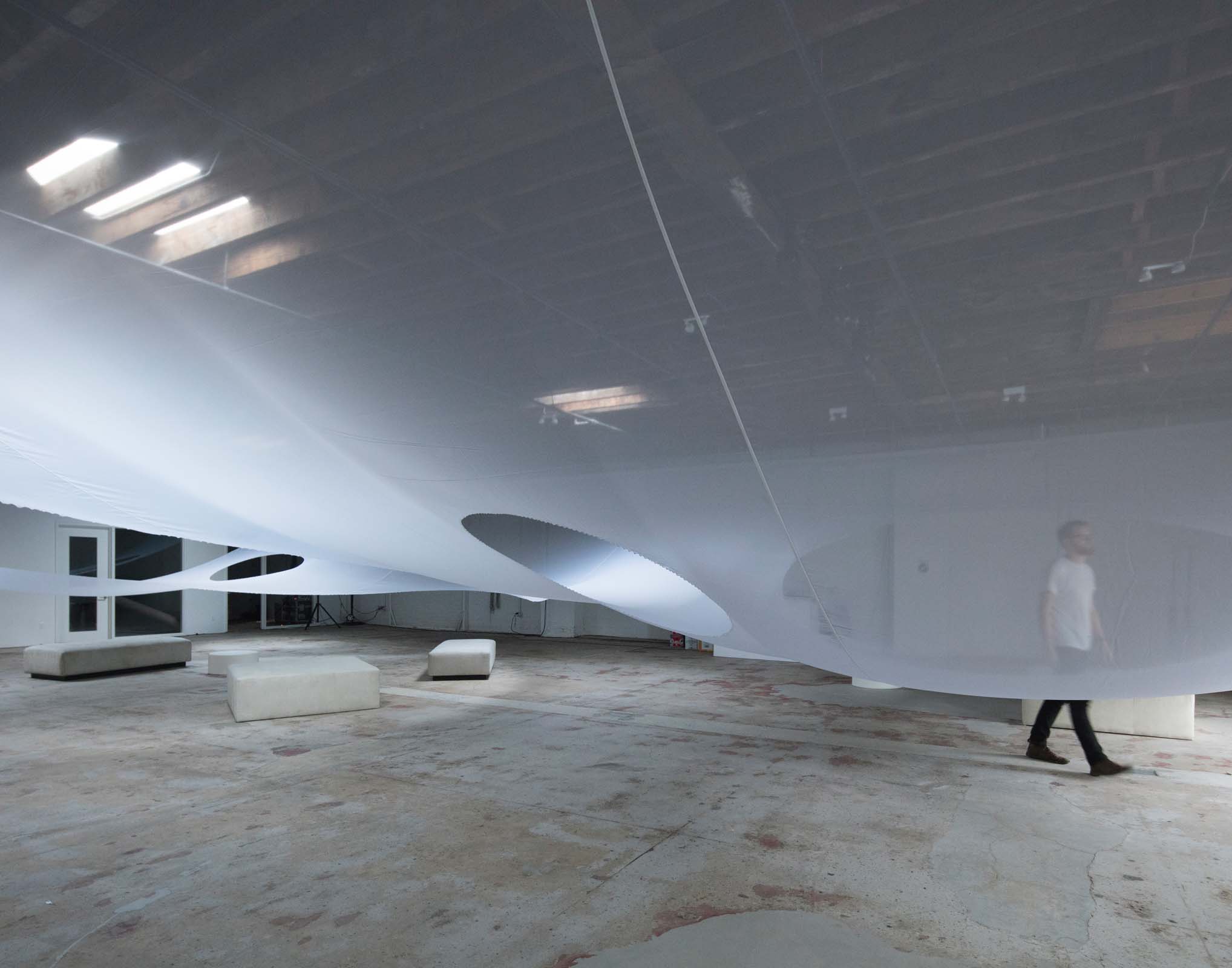
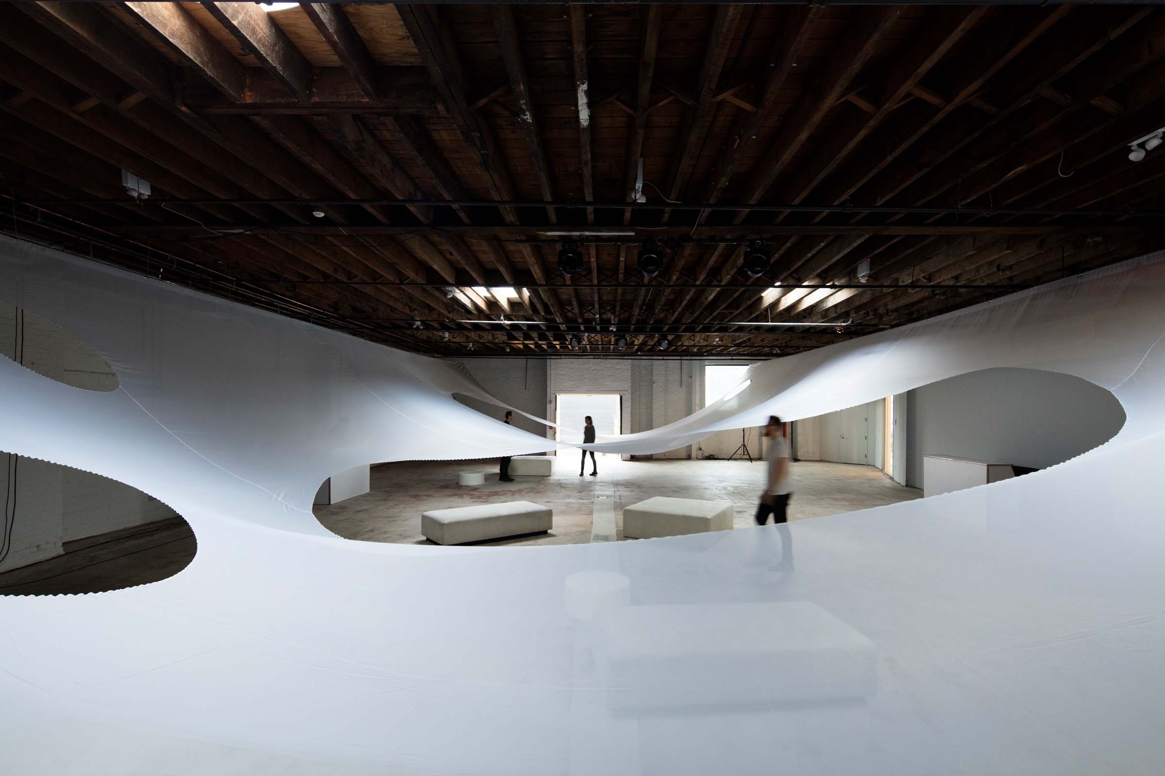
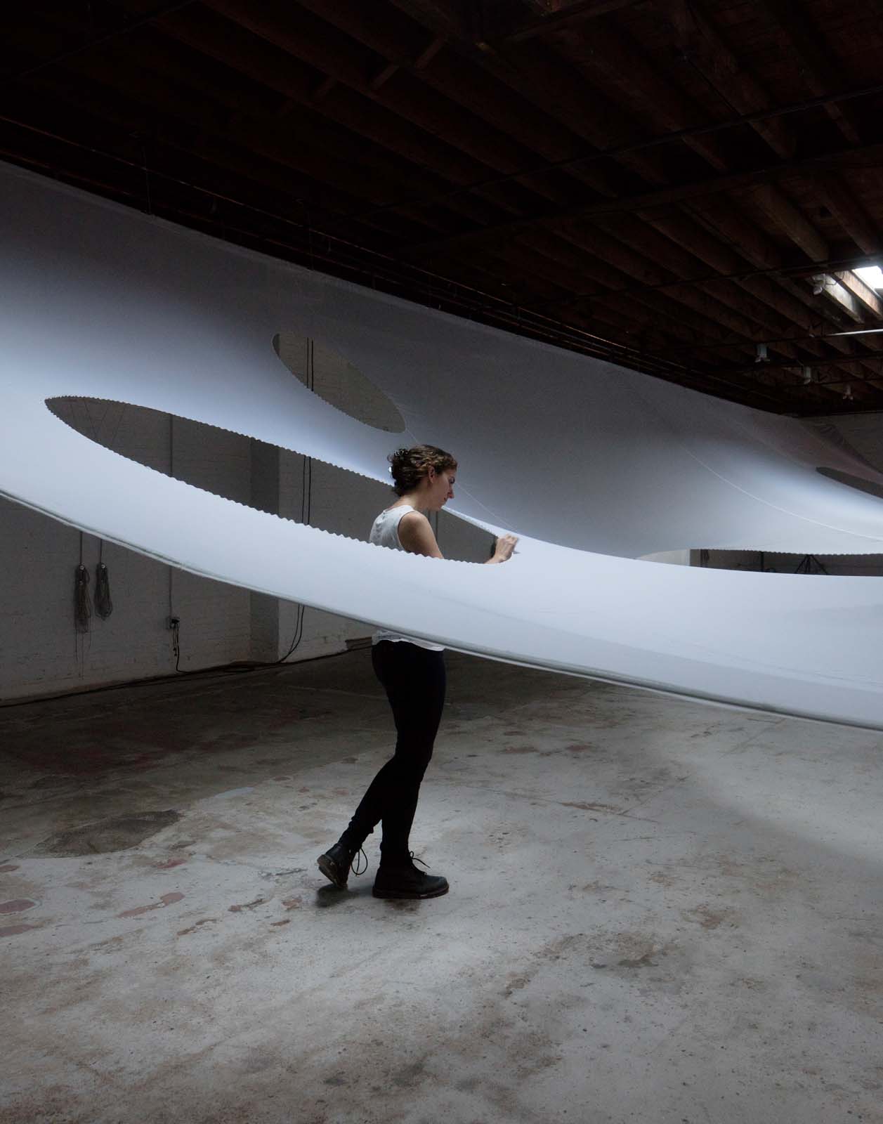
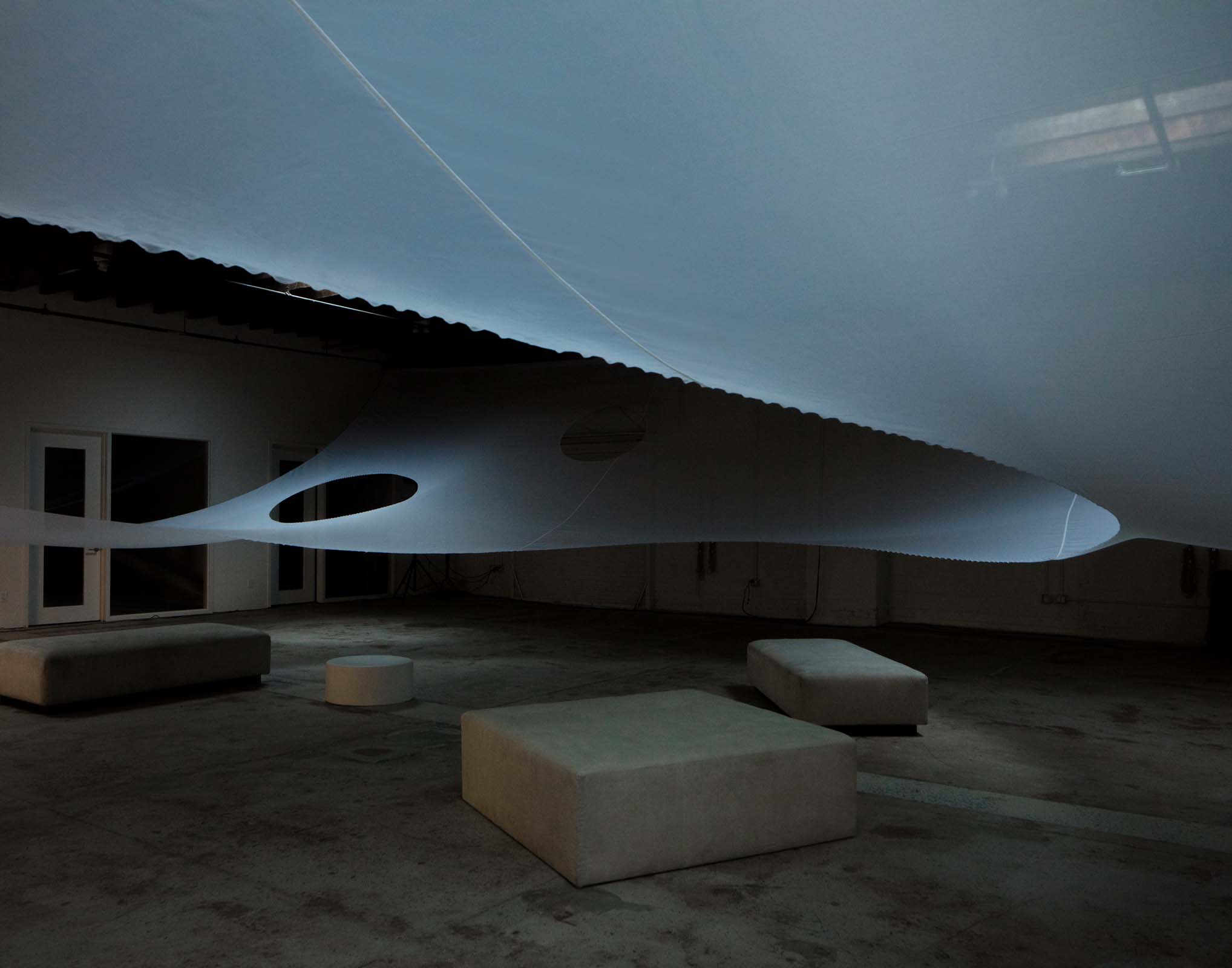
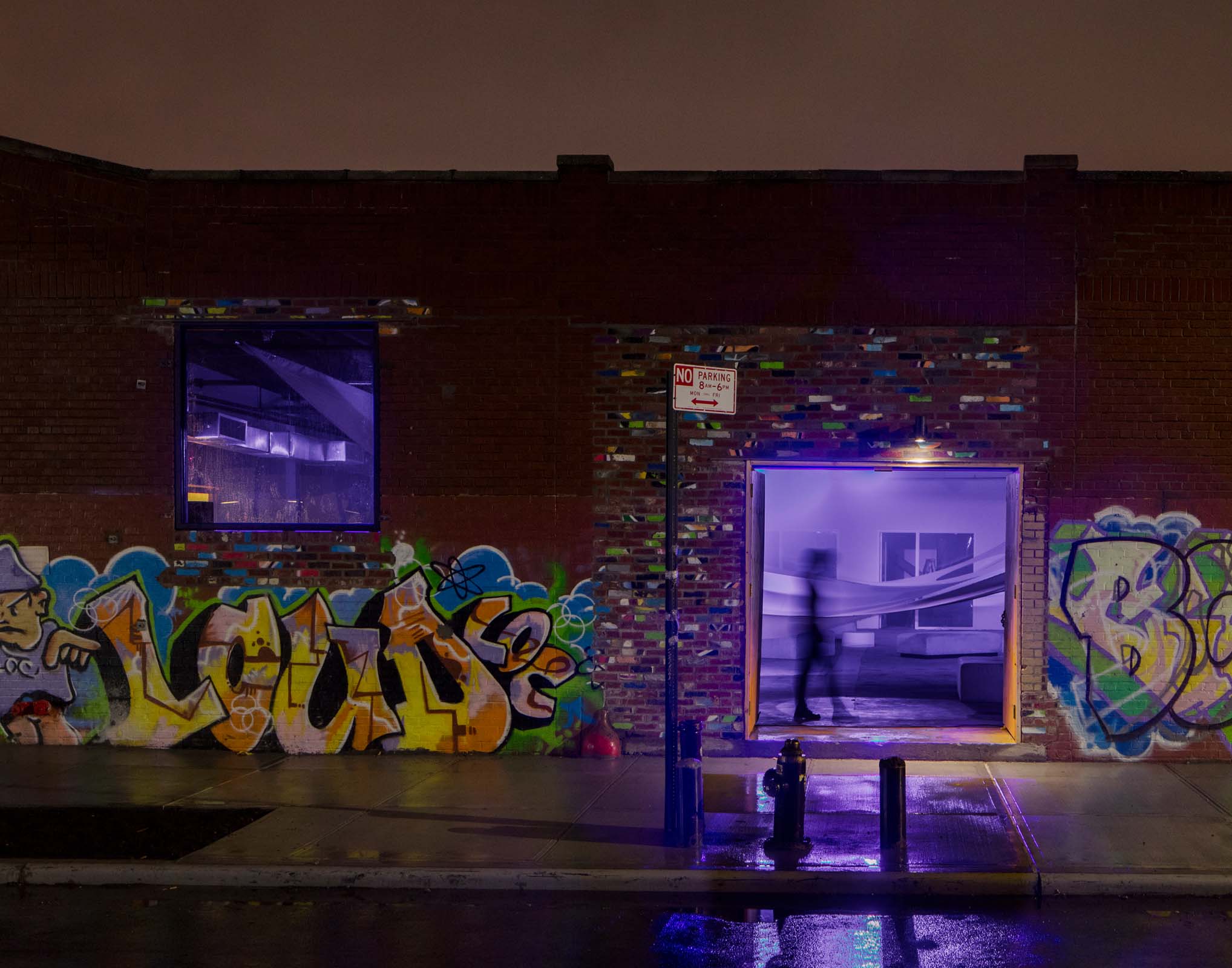
An oversize textile hangs within the industrial warehouse: a floating tabula rasa. The lightweight fabric hangs in a subtle catenary shape, creating new spaces and environments without the construction of a single wall. Monumental voids cut into the fabric lightly define rooms within the larger space, while a careful choreography allows the textile to animate between states twice during the night: from a low—lying plane that clears the space to floating overhead canopy—and back again.
Table's Clear was an installation for the Architectural League of New York's Beaux Arts Ball 2016.
Project team: Yasmin Vobis, Aaron Forrest, Chris Beck
Engineering: Brett Schneider
Fabrication: Gerriets International
Lighting: Wild Dogs International
Installation team: Pamela Funes—Montaldo, Daejeong Kim, Trevor Knebel, Michael Perles, Noah Klersfeld, Brandon Wang
Photographs by Naho Kubota





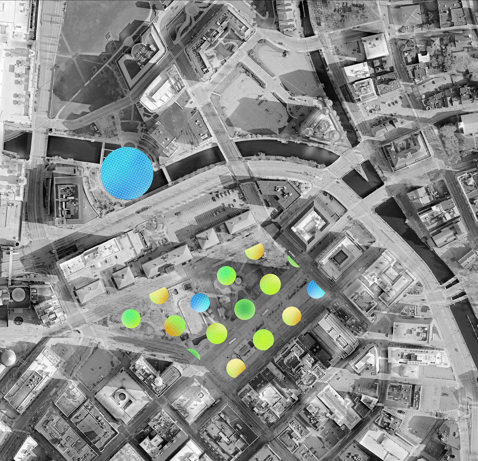
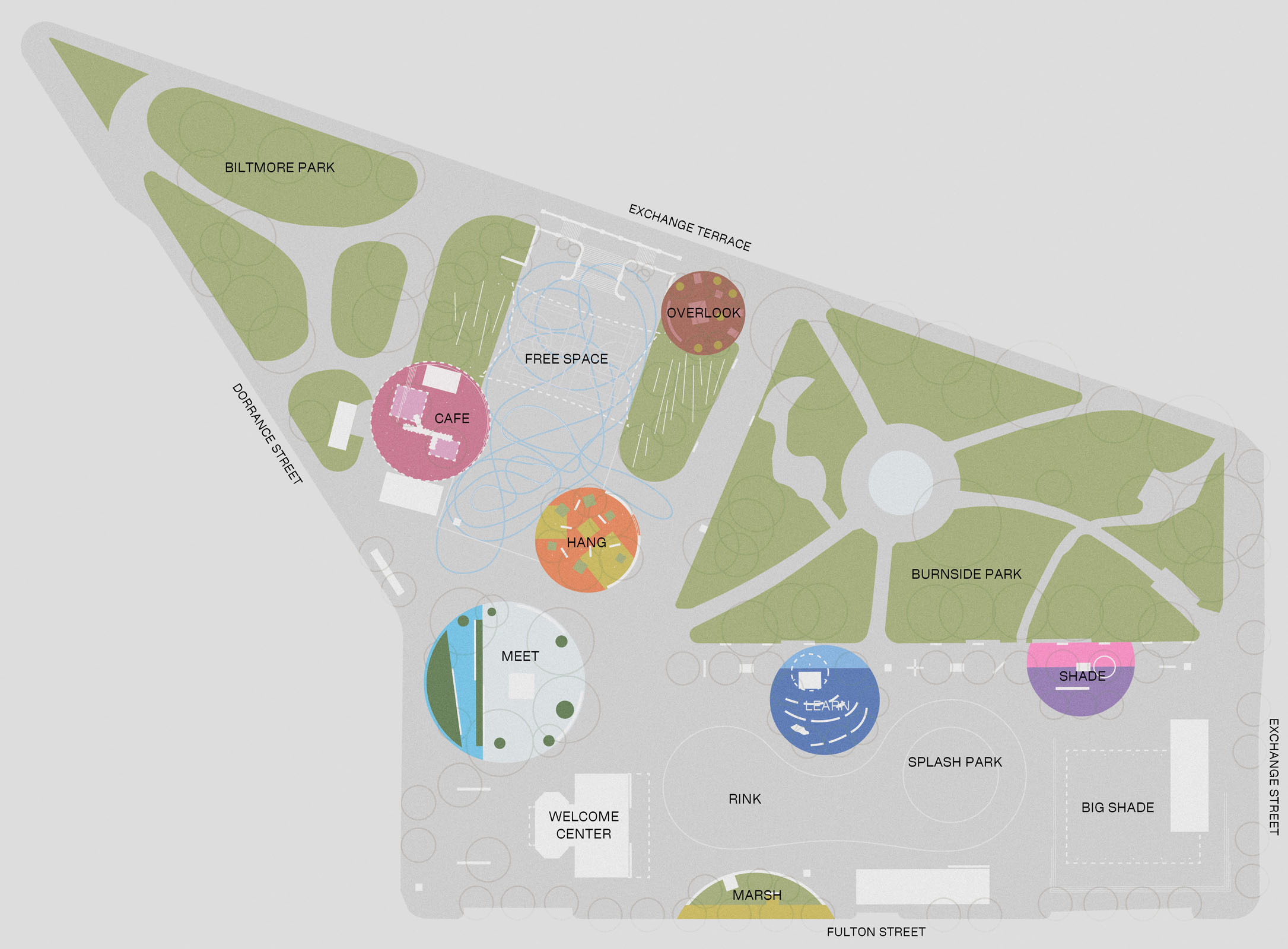
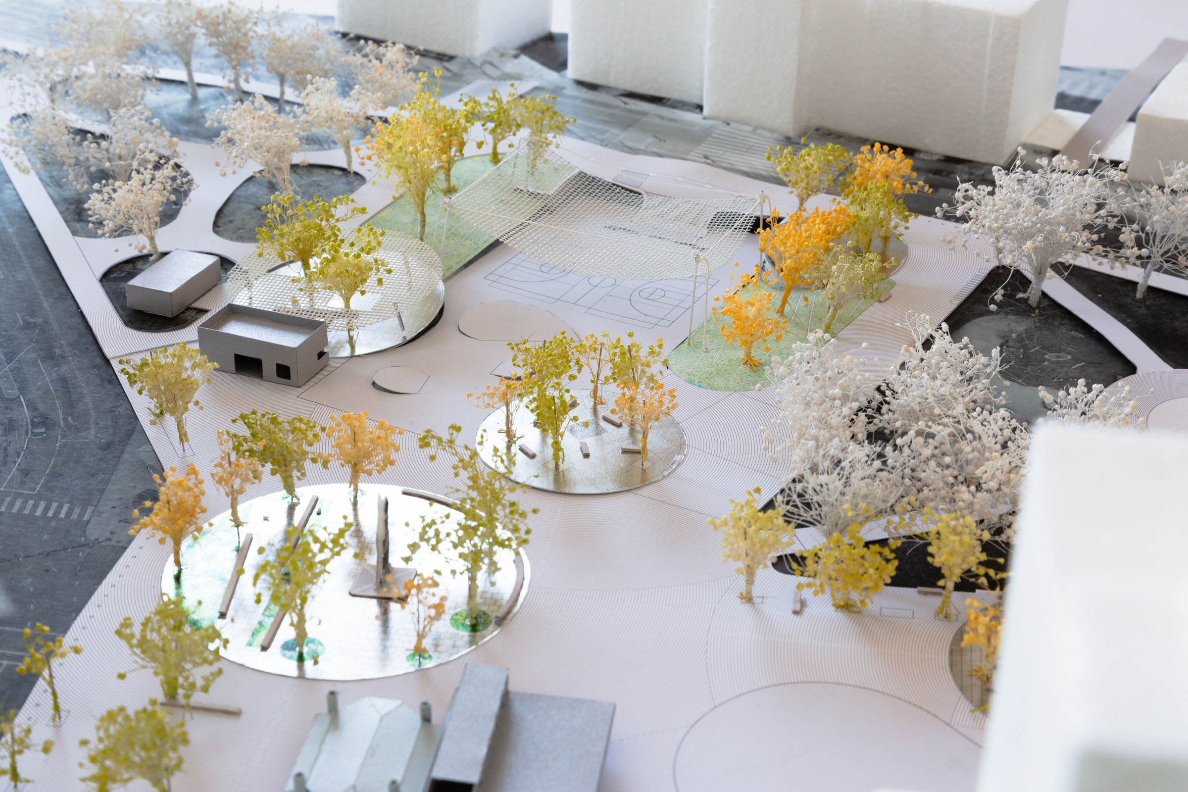
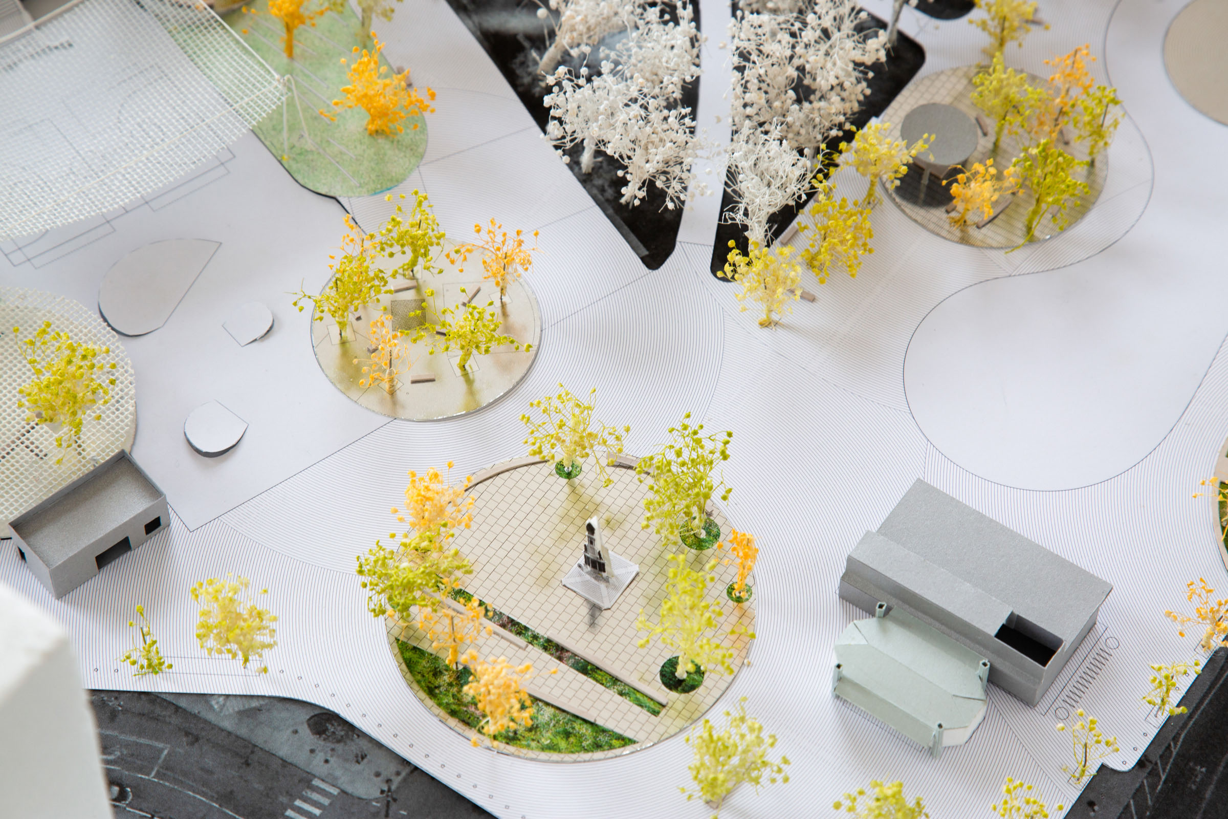
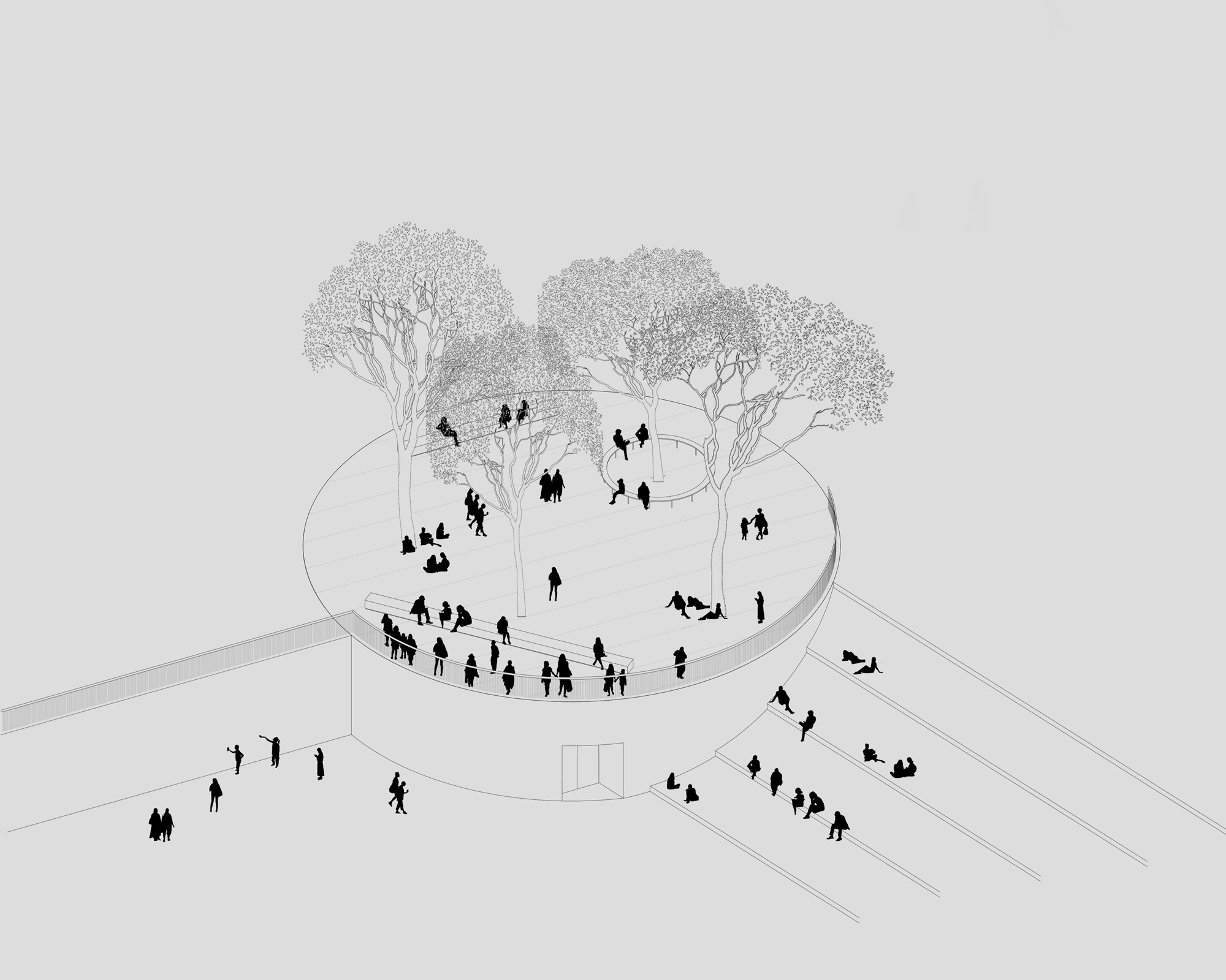
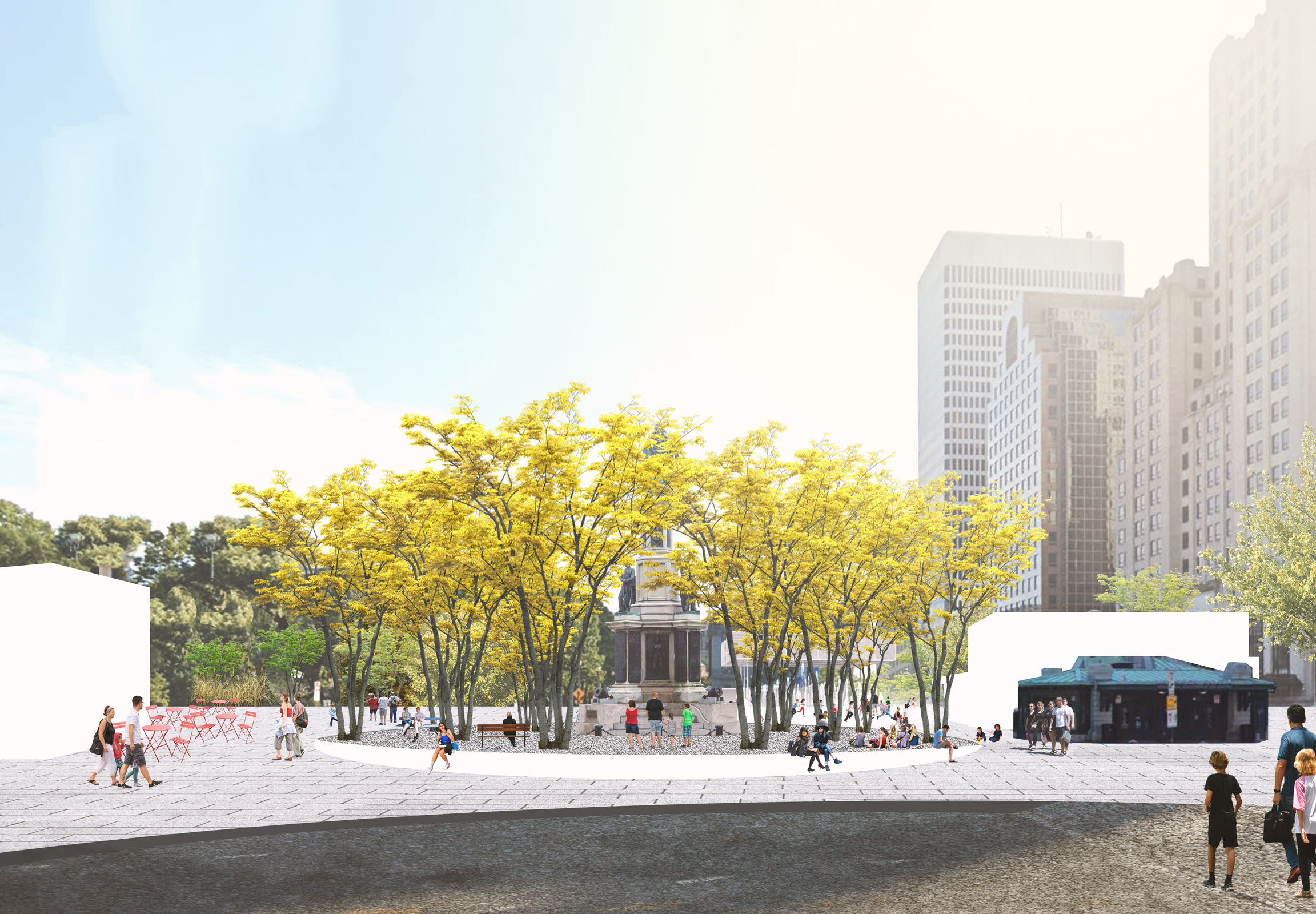
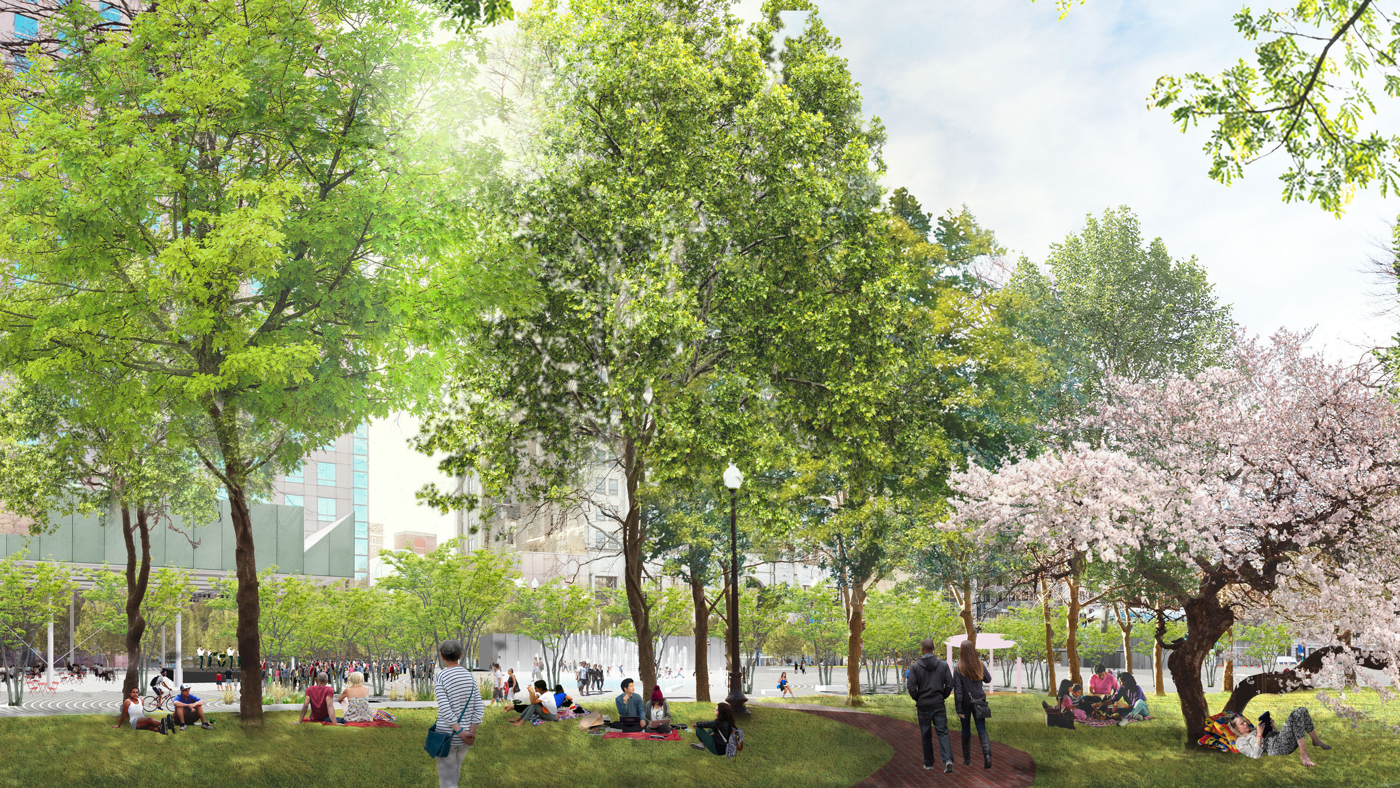
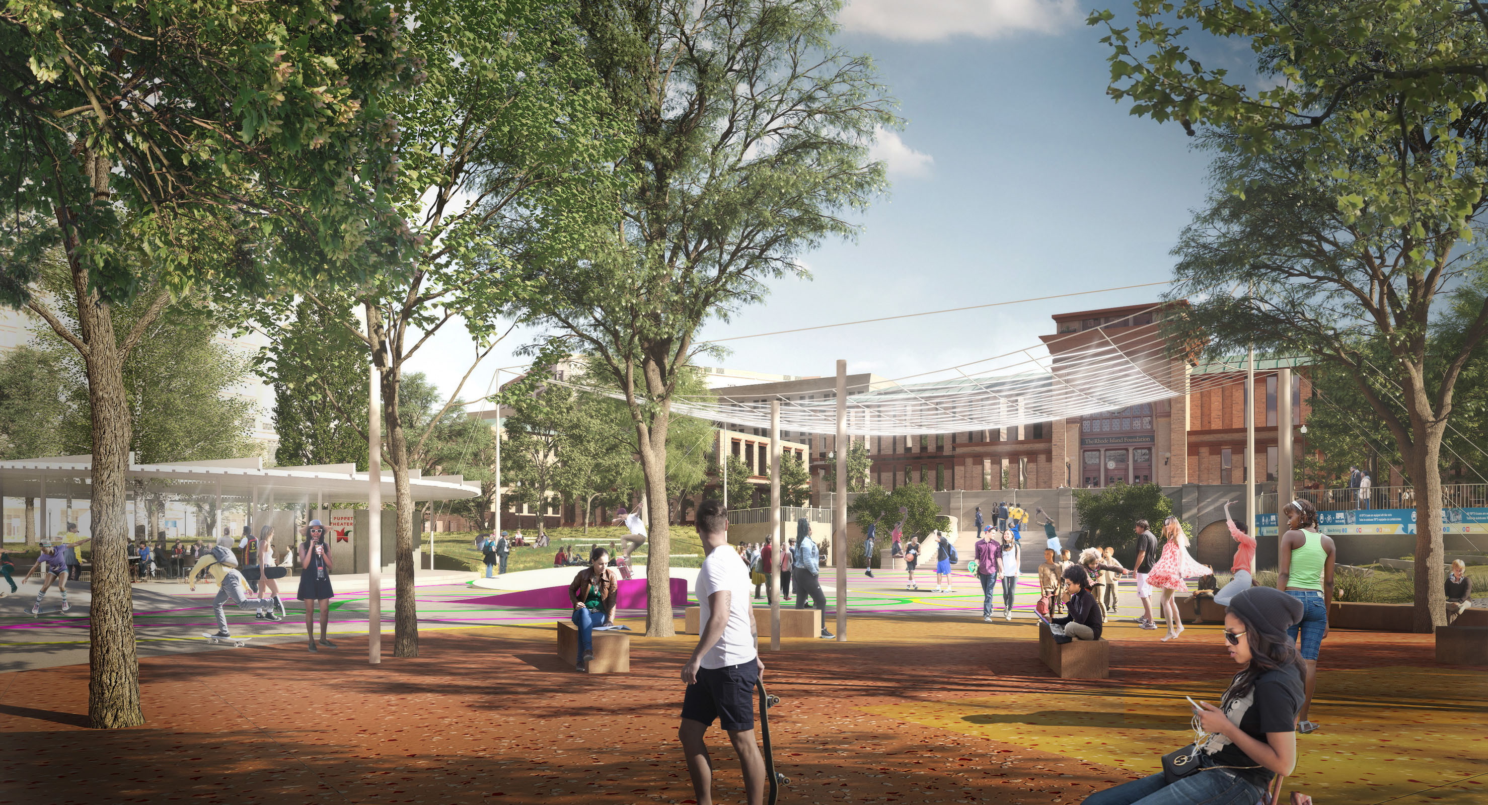
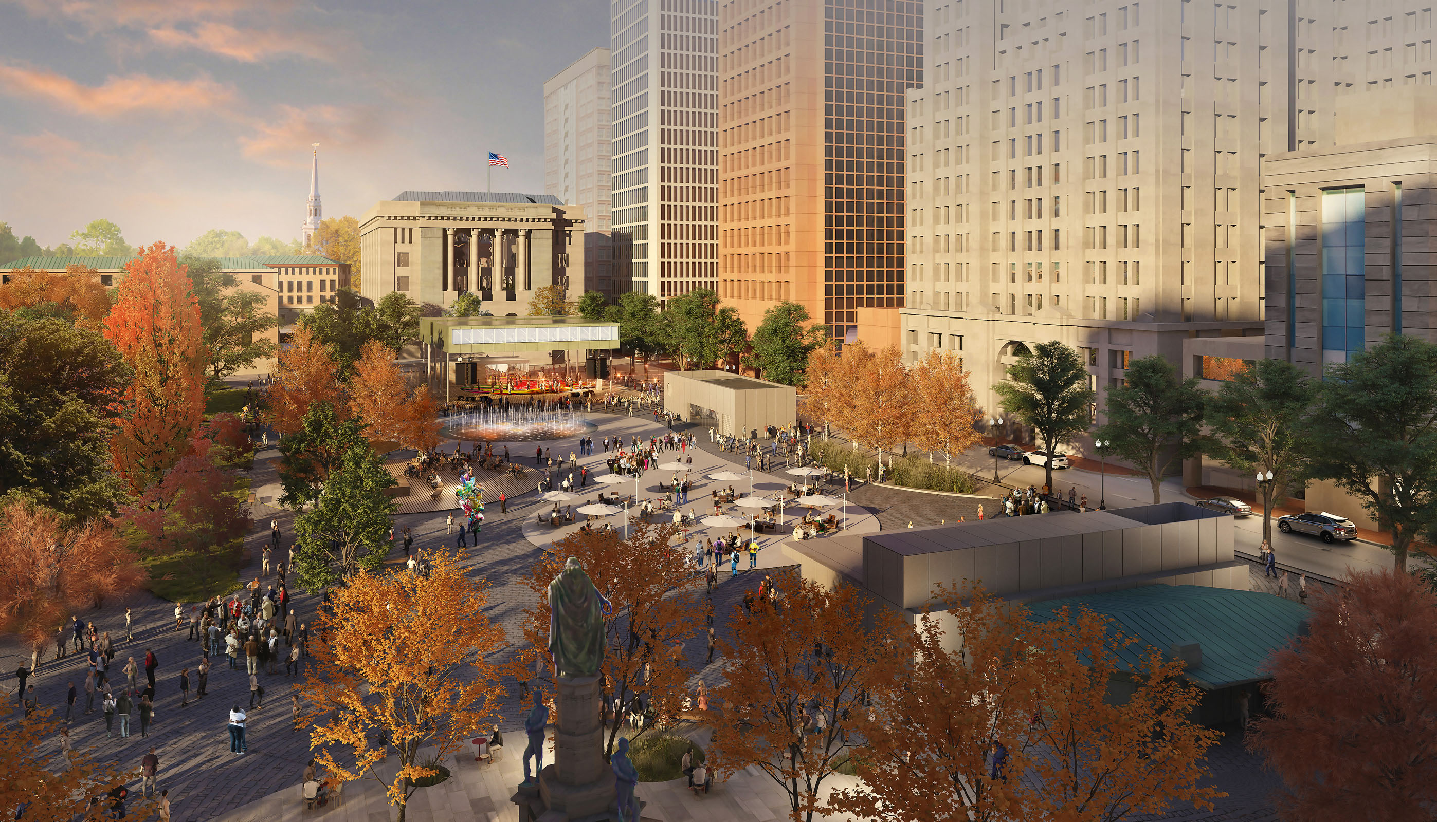
This masterplan, developed for the city in 2020—21, proposes a set of strategies to unify the downtown sites; to transform the civic center to welcome a populace that is more diverse, more cosmopolitan, more plugged—in, and more mobile; and to address looming environmental issues — particularly climate change — with a coherent, long—term vision. New amenities include more generous pedestrian access, a stronger connection to the Riverwalk, and a series of programmatic insertions throughout the site aimed at welcoming a broader public to downtown across a series of different spatial and temporal scales.
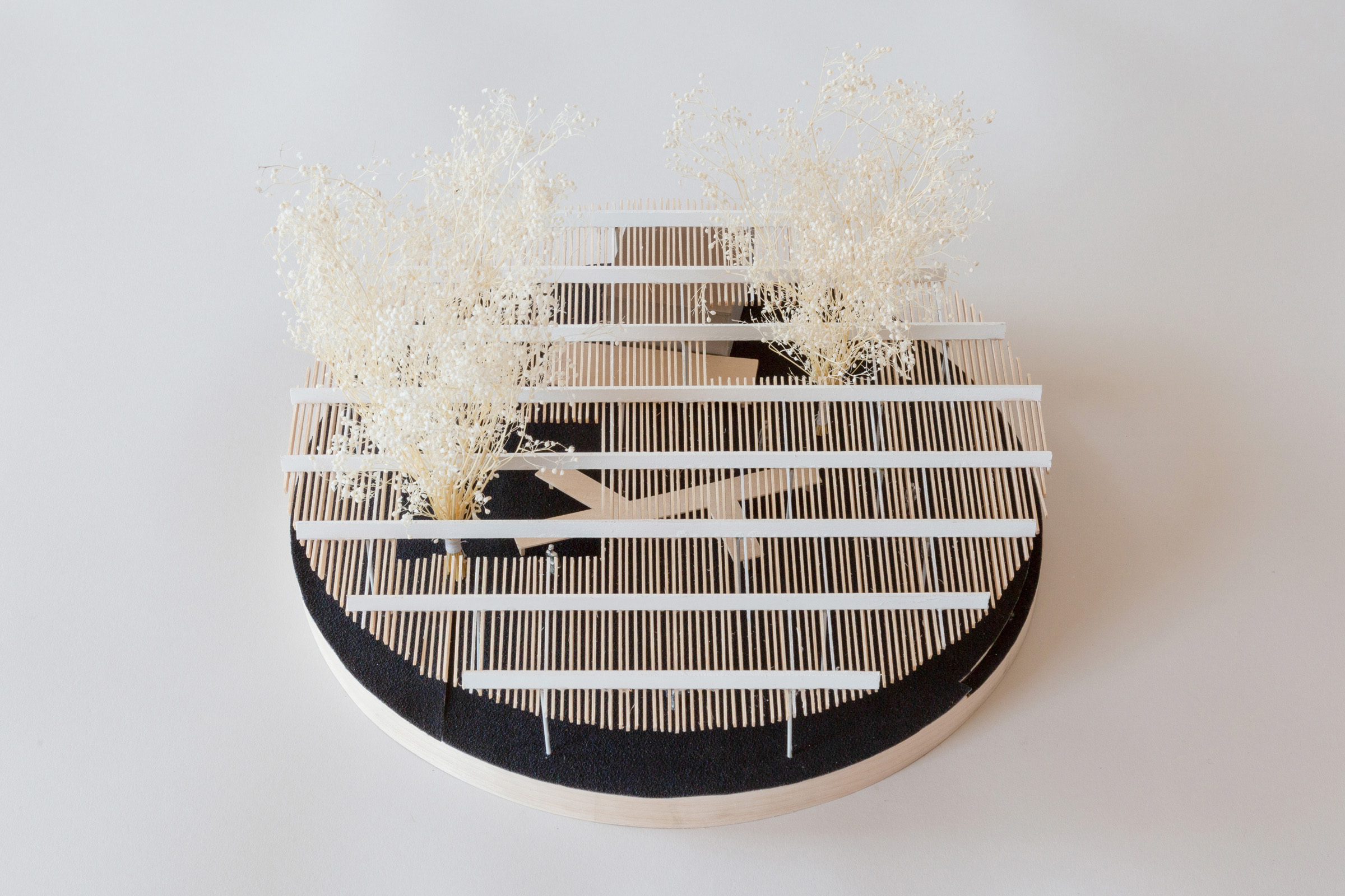
The site is unified by a series of shelter islands dotted across Greater Kennedy Plaza that simultaneously address issues of program, environmental resilience, and human comfort. Inspired by the original Great Salt Cove that underlies downtown, the islands together form an archipelago of relief, respite, and gathering. While Kennedy Plaza remains a civic—scale, open—ended space, the islands reintroduce moments of rest and intimacy.
The islands are overlaid across the Greater Kennedy Plaza area with a graphic playfulness that is fine tuned to the program at hand. Rather than sit neatly within one programmatic area, they span differing parts of the park and plaza, forming new connections between otherwise disparate environments.
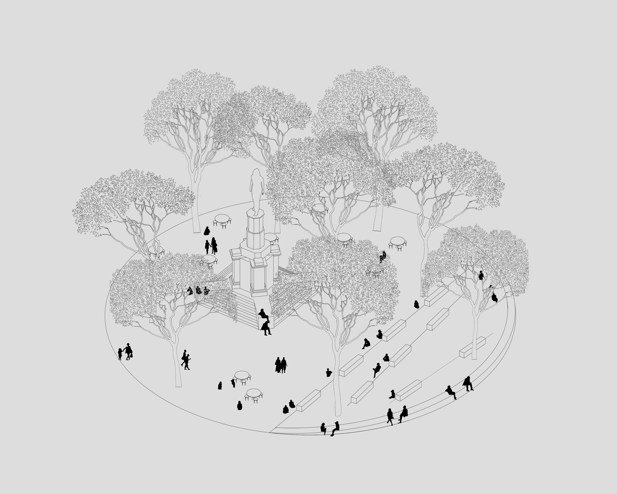
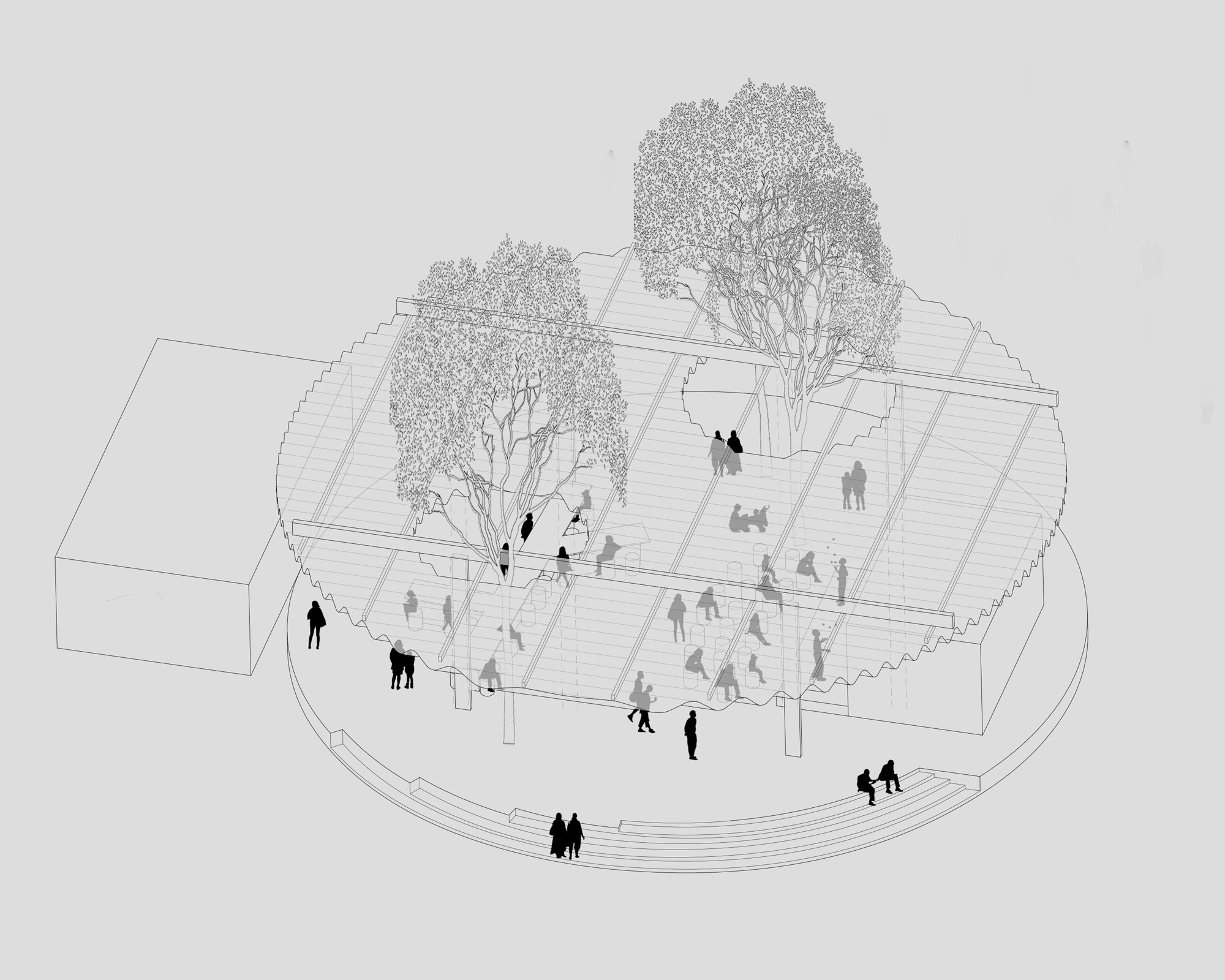
Each island has a different character, encouraging exploration and inviting play. Specific vegetation, materials, and seating define each island in a unique way. Their rich materiality creates moments of intensity and focus within the overall plaza. They create space for the small, simultaneous moments that make up the everyday: they are where an elderly person might sit with their dog, or where someone might play chess, or where you might practice skateboarding tricks with your friends, hold an outdoor class, or grab a bite to eat from a food truck while waiting for your bus.
The islands are lush landscape environments that make the plaza softer and more welcoming, but they also play a critical role in the sustainability of the project. The shade and vegetation introduced by the islands reduce the urban heat island effect in the summer while screening and slowing winter winds, improving thermal comfort year round. At the same time, the islands are strategically placed to absorb stormwater, slowing and filtering runoff before it is ultimately discharged back into Narragansett Bay.
The masterplan is now in the process of phased implementation, with pedestrian improvements, Riverwalk elevation, and the Big Shade, all in planning.
Project Team: Aaron Forrest, Yasmin Vobis, Kunyue Qi, Edgar Rodriguez, Katie Solien, Tammy Teng, Eamon Wagner
Professional renderings: Pax Brooklyn
Collaboration with Stimson Studio + Arup. Plaza design led by Ultramoderne.


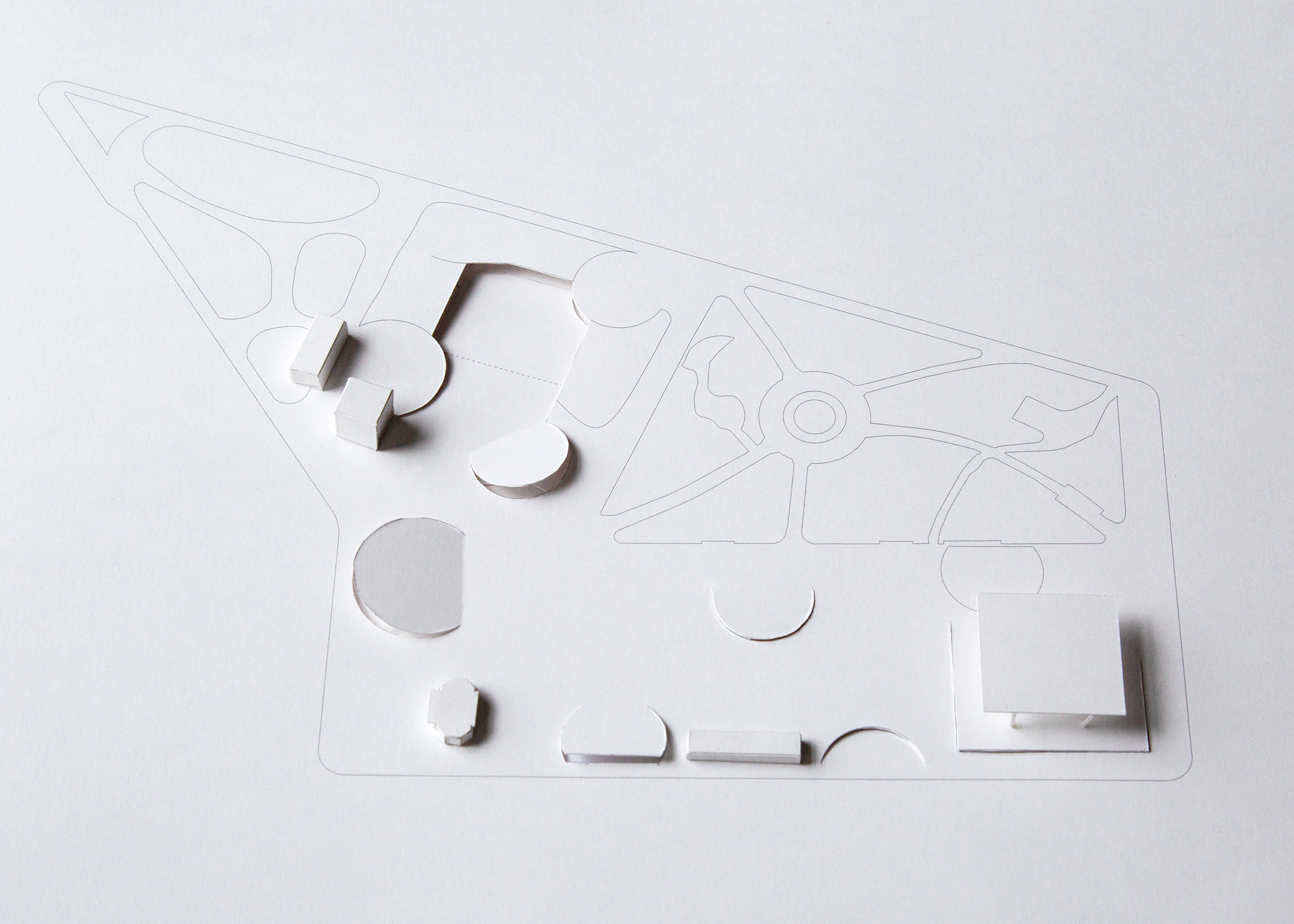


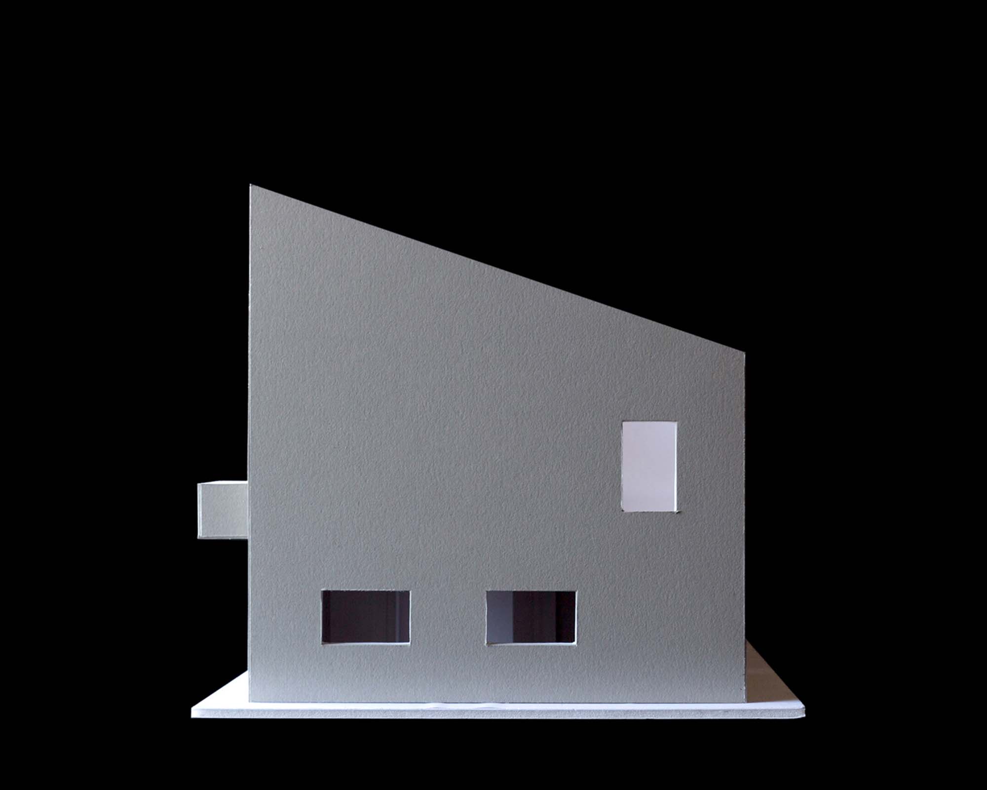
Our 2020 design for a house near the coast is comprised of a very large roof whose slope mimics the slope of the adjacent terrain, allowing it to blend in to its surroundings. A small patio on the roof allows the owners to maximize the views of the river and adjacent agricultural land.
The interior is organized around a compact core that contains all the building services and separates the communal space from the bedrooms. The interior circulation is pushed to the perimeter and is coupled with large windows that allow the inhabitants to walk around the entire perimeter with views out the the landscape in all directions.
Project Team: Kunyue Qi
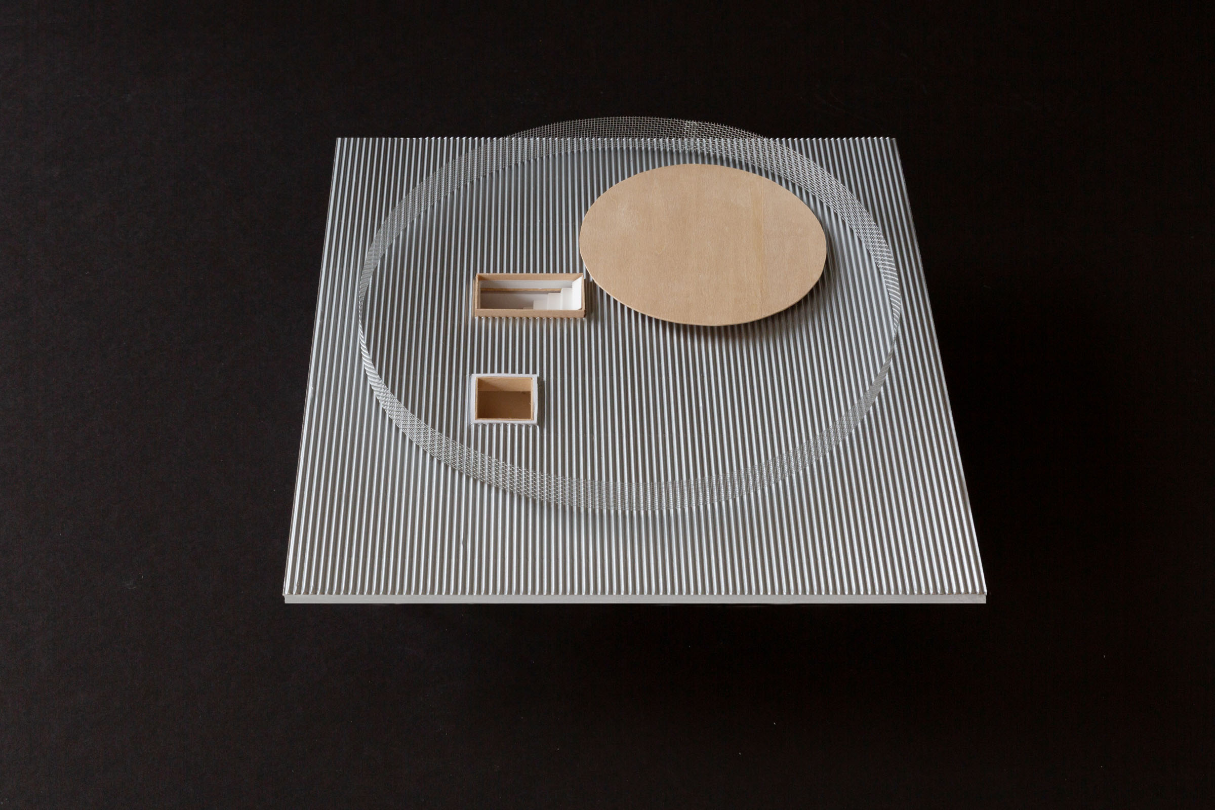
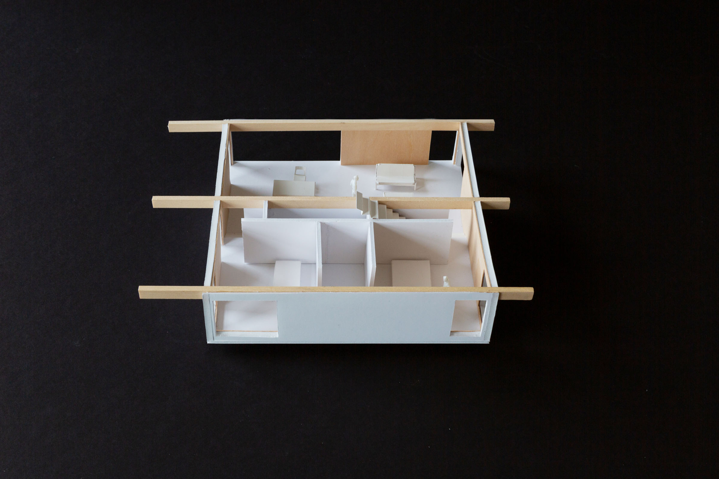



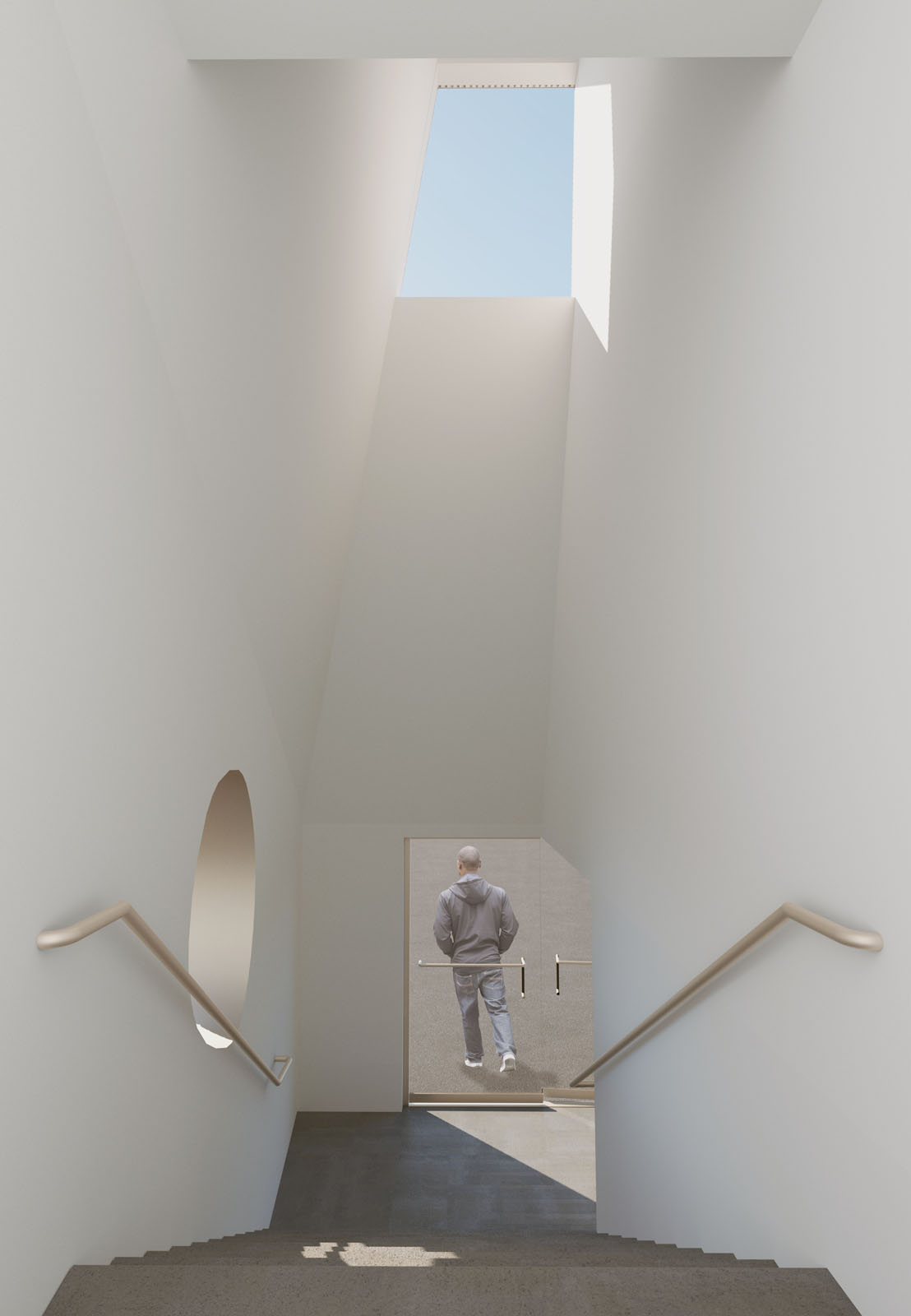
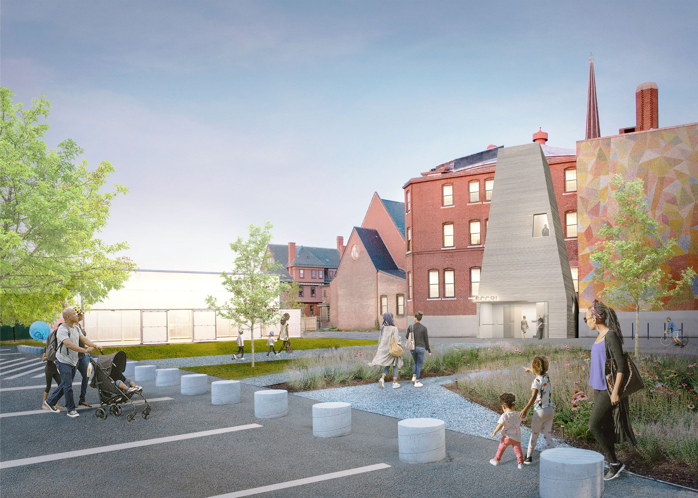
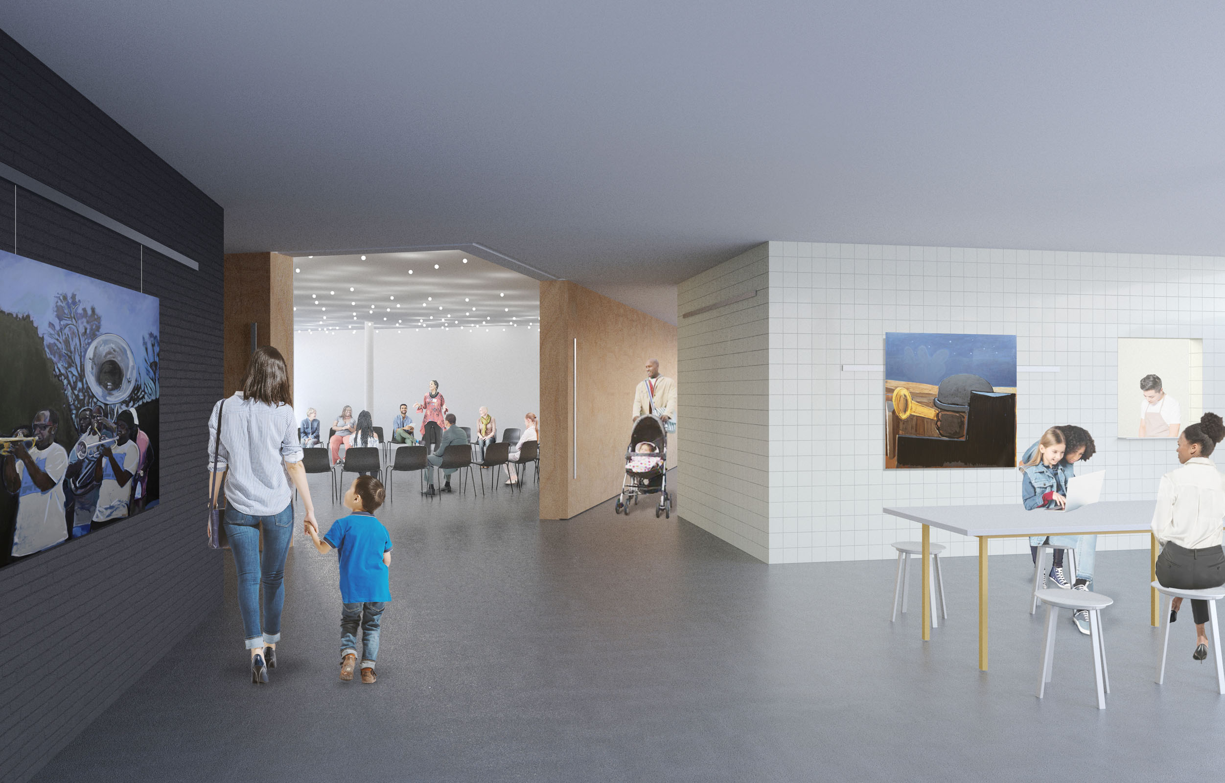
The Southside Cultural Center of Rhode Island is the cultural hub of the Southside neighborhood and is home to a number of partner groups whose activities range across many types of performance: including dance, theater, comedy and storytelling. Originally built as the sunday school for the adjacent church, this 24,400 square—foot building is in need of a renovation that can fully address its new use as a cultural center that fosters diverse voices.
Our proposed renovation aims to expand the cultural center’s capacity by making its four performance spaces more flexible and bringing them up to contemporary standards. The currently congested main floor will be reconfigured and opened up for better visitor flow, and will include a more generous entrance lobby and cafe that double function as a gallery and intimate performance space. A new accessible entrance facing the public garden and parking lot will welcome visitors and announce the activities housed within the building on an urban scale.
Project team: Charlie Cotton, Yunchao Le, Tiantian Lou, Katie Solien, Jeff Yinong Tao, Eamon Wagner





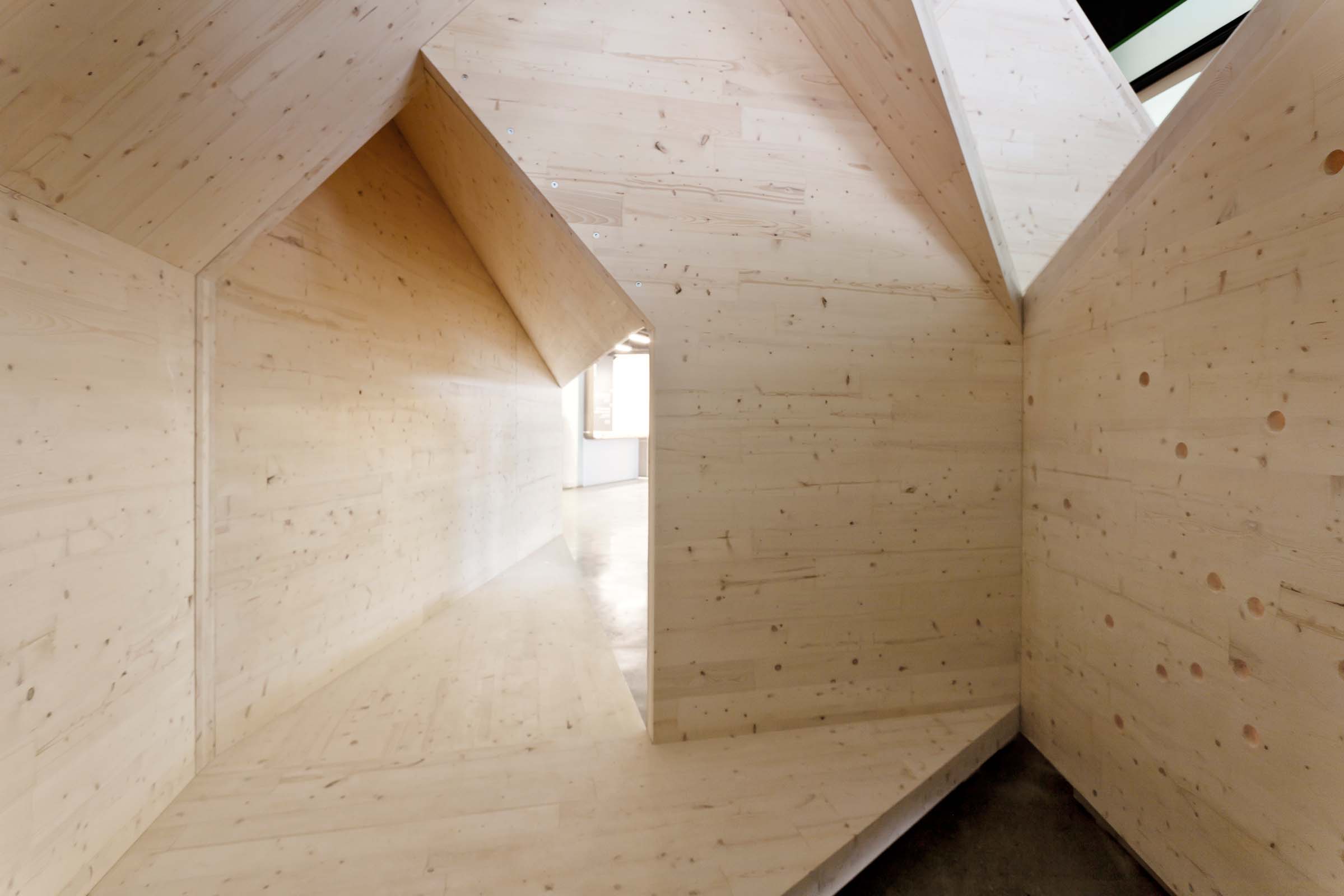
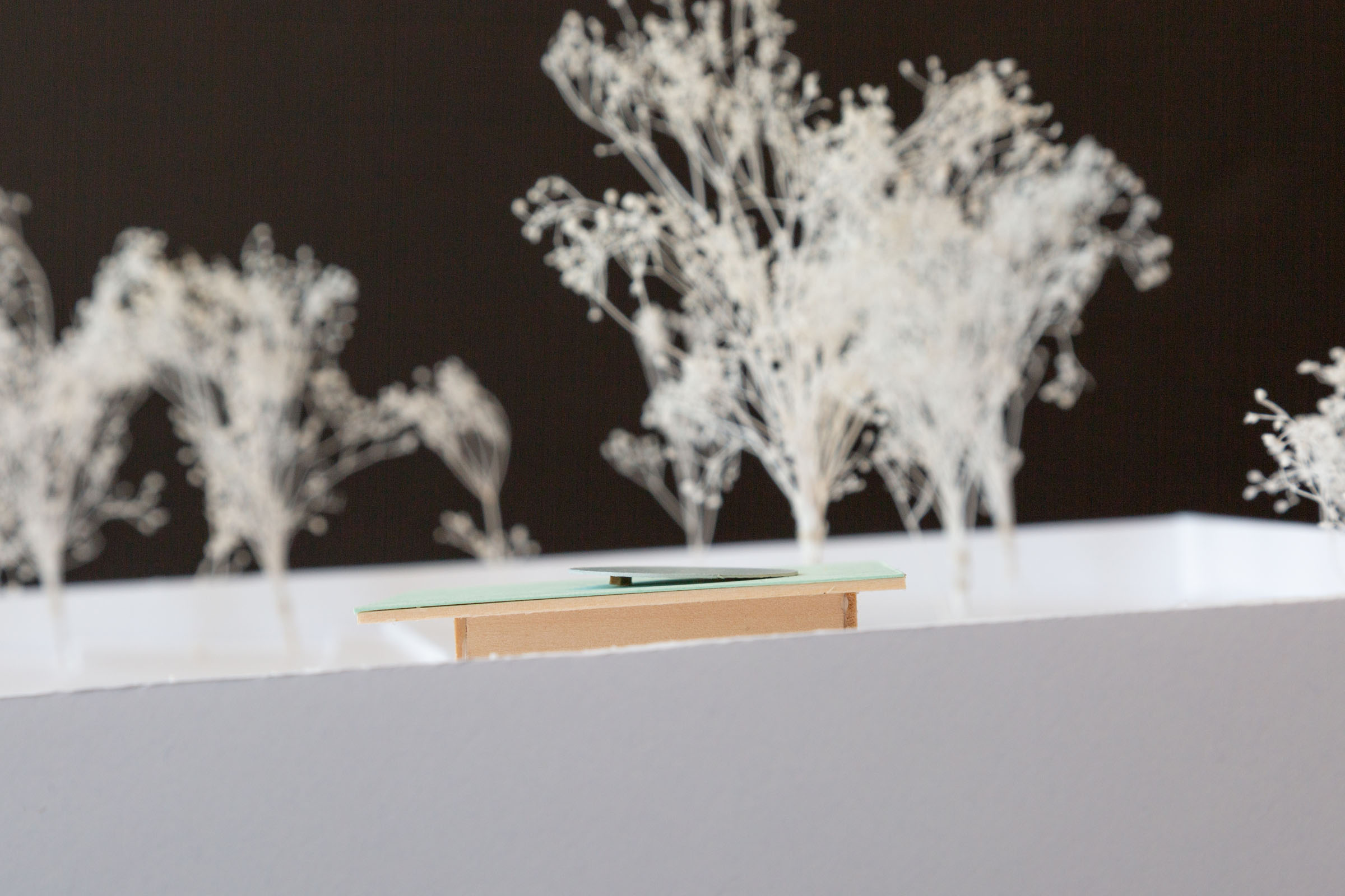
Four Corners reimagines the traditional timber bent as a three—dimensional construct, unfolding through space and developing unexpected forms and relationships. The design is composed of a series of Cross Laminated Timber "corners" of complementary proportion cut from a barn—shaped primitive and reassembled into a cantilevering column—assembly. Through recombination, arraying, and stacking, a varied and unexpected labyrinth arises.
Four Corners is composed of three interlocking column—assemblies forming a network of corridors, courtyards, and outward—facing apses. The central courtyard space serves as a micro—exhibition space featuring a rotating series of video works by artist Noah Klersfeld. The corridors and apses lead to the windows looking out to the city, creating a series of semi—private rooms in conjunction with the existing architecture.
Each column is assembled from four CLT bents cantilevering off of a central ‘column’, which is actually an extension of one of the bent walls down to the floor. Though each bent is structurally incomplete, when assembled into the four—corners column they become rigid. Likewise, once each column assembly is attached to its neighbors, they act together to become stable. CLT is used monolithically as both structure and skin, in keeping with the tradition of timber construction.
Structural Engineer: Chris Carbone, Bensonwood
Advisory Architect: Andrew Waugh, Waugh Thistleton Architects
Fabricator: Jean—Marc Dubois, Nordic Structures
Installation team: Jack Dinning, Jimmie Drummond, Pei—Ying Lin, Leo Henke, Neda Mostafavi, Matthew McMahon


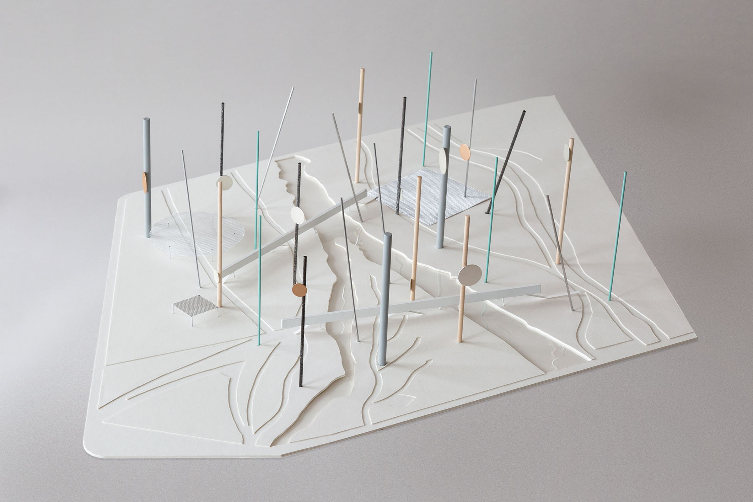
The Useless Machines are a collection of twenty—five dynamic towers distributed in a grid. The playful combination of vertical and canted stems maximizes lightness and visibility while dodging sensitive environmental conditions at the ground level. Together, the towers occupy a maximum area with a minimum footprint, using their collective volume, rather than height or mass to demarcate a new public ground.
The monument invites an exploration of materials old and new and their different structural, constructive, and aesthetic expressions. Each 200’ tower is made from a different structural material representing different eras of construction—wood, bronze, steel, concrete, carbon fiber—and expresses the strength and flexibility of each through near—impossible slenderness and a slow but steady breeze—induced sway. The towers are engineered to move, each independently, to produce a modern, subtle choreography in the sky. A series of photovoltaic ‘petals’ slowly orbit the stems, gathering sun during the day and emitting a soft glow at night.
The towers’ minimal footprint to the site allows the ground to remain open for activism, gatherings, and recreation, with minimal disturbance to existing flora and fauna. Select new public programs in the form of pavilions, bridges, and public spaces, are scattered across the site in a playful, informal manner. The programs activate and tie the site together and augment its role as a critical civic space within the city.
Project Team: Kunyue Qi
Animation Assistant: Jisu Yang
Design Engineer: Guy Nordenson and Associates

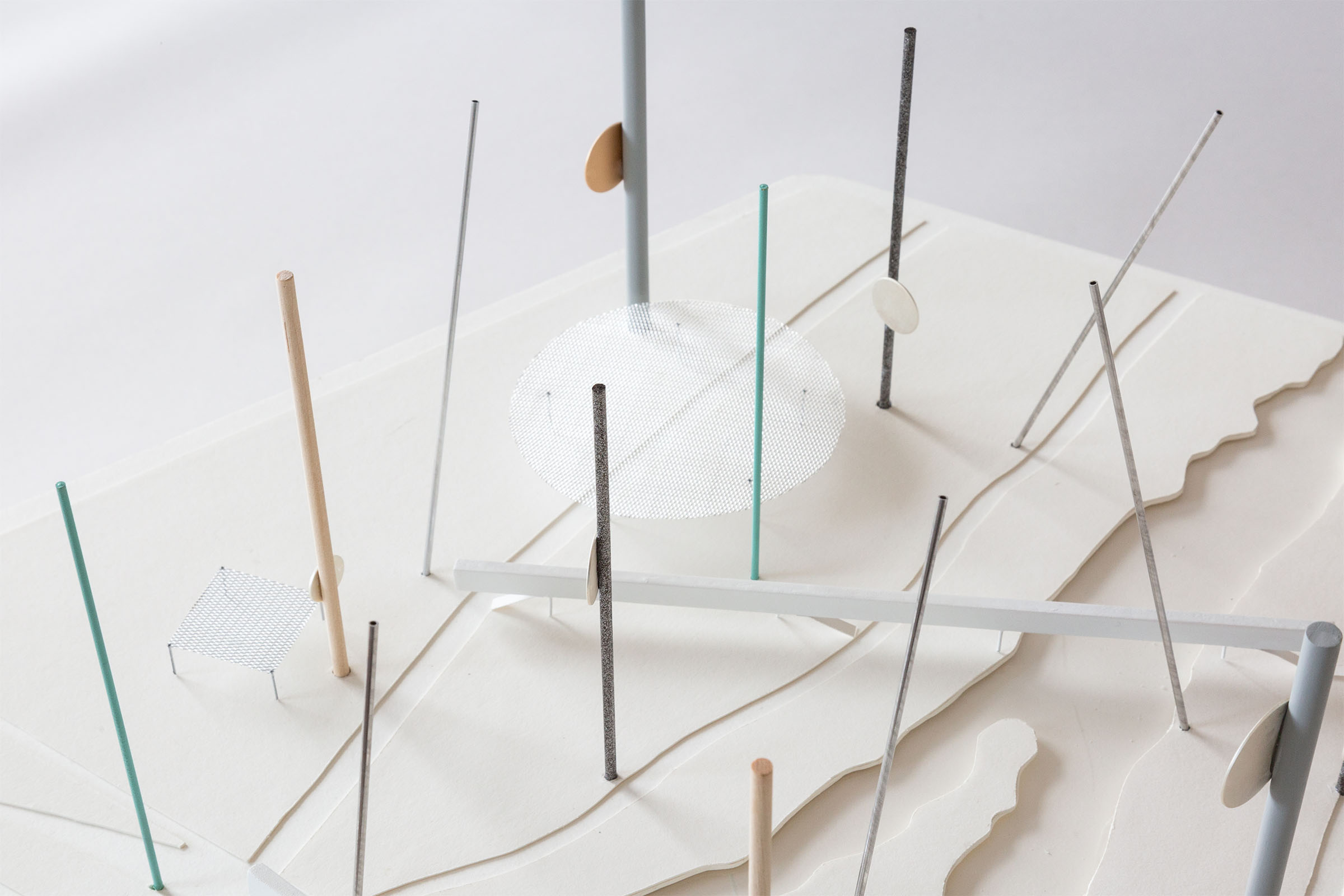
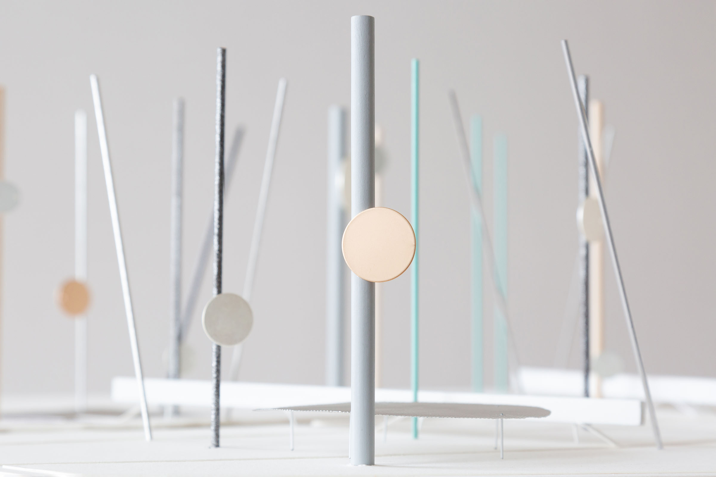
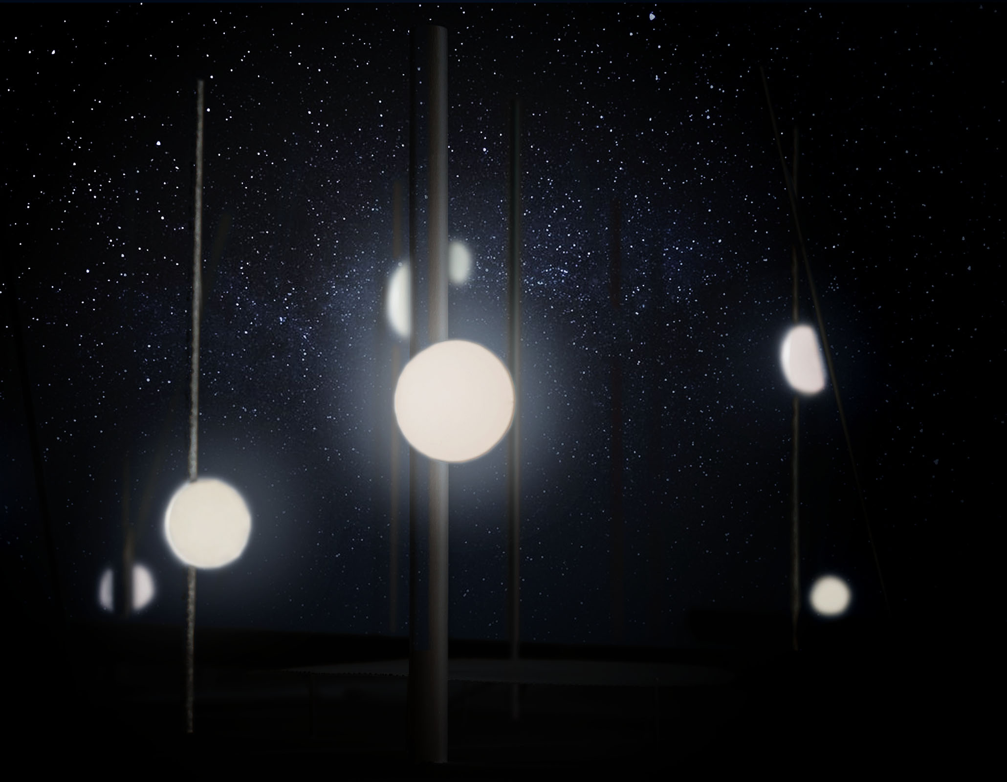

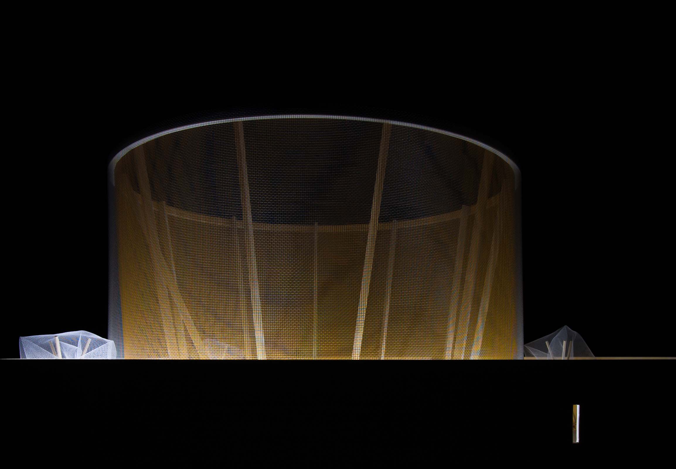
A simple boundary is formed through the collusion between centuries of layered real estate transactions with a pure Euclidean geometry: an inscribed circle. This simple demarcation has profound consequences: different rules apply inside the circle than outside. Combining a fascination with enormous lightweight structures with the use of cheap industrial materials, we can begin to consider how little it might take to delineate a maximum space—to create an immense volume without mass. A clearing in the city. A space for recess.
The interior is a flexible space that encourages play in its many guises. In addition to allowing for daytime recreation and massive crowds during music events, its subtle order creates opportunities for new forms of games and performance. The volume rises to a height of fifty feet, shading the courtyard on hot summer days and screening the immediate context with a soft but porous veil, creating the necessary preconditions for fantasy and play.
The boundary is made up of two chain link layers: one left raw, the other brightly colored; one vertical, the other inclined. Together the layers create a boundary with depth, ripe for exploration.
Rather than fussy details or precious materials, the emphasis is on maximizing space for play. Two simple materials—chain link and wood—used in structural counterpoint allow us to define this boundary with incredible economy. Chain link is used to stabilize the form while revealing itself to be beautiful and sensuous: a fabric with an origin in urban grit. The timber frame—eleven shifting columns at a scale rarely seen—negotiates between structural demands and spatial richness. It stands away from the boundary to create a subtle order of its own within the volume.
A number of movable elements instigate play. Hula—hoops, frisbees, and jump—ropes are the minimal tools for rule—based movements: they are essentially lines in space. When not in use, this equipment is hung between the layers of chain link, forming a transparent display of possibilities for action. In addition, oversize balls made of tightened chainlink and giant model trees made of lumber and construction netting confound the scale of the space and its players. Suddenly, we are all children again…
MoMA PS1 Competition Finalist.
Project Team: Will Gant, Hua Gao, Tida Osotsapa
Structural Engineer: Brett Schneider, Guy Nordenson & Associates. Chris Carbone, Bensonwood
Lighting Design: Elettra Bordonaro, Light Follows Behaviour


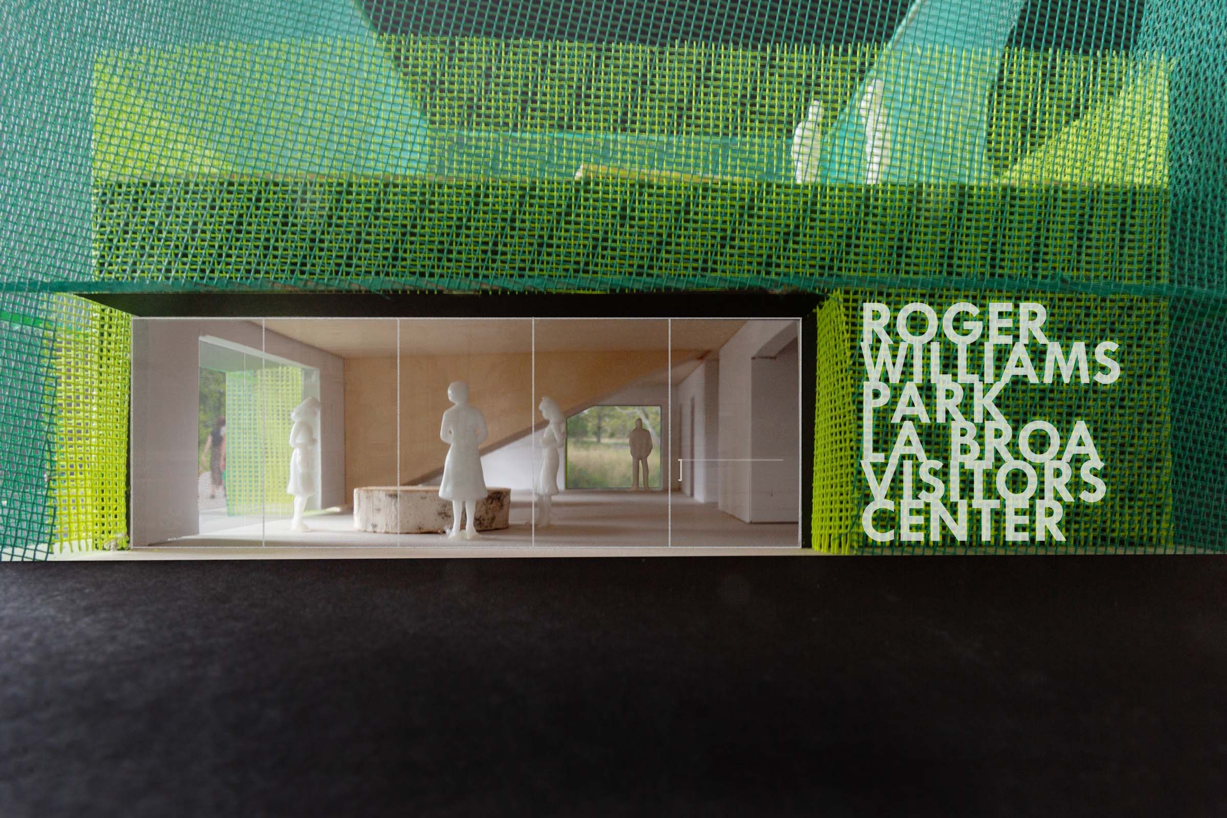
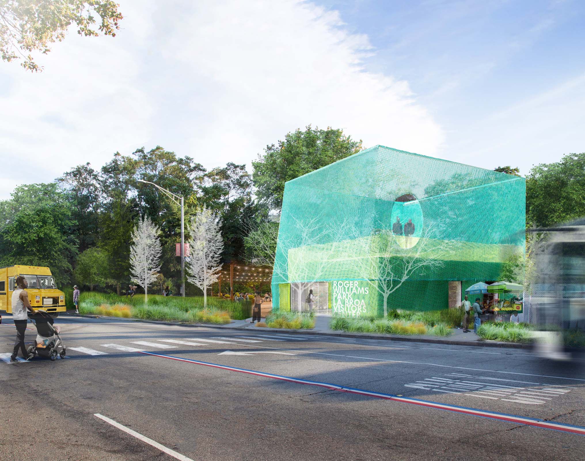
Our design for the Roger Williams Park Broad Street Visitor’s Center seeks to intensify the adjacent cultural and natural landscapes on site, creating physical and visual connections to both the city and the park. The building’s height and striking materiality create a visible, inhabitable landmark, and Broad Street’s bold colors are reinterpreted in a multilayered, diaphanous trellis, extending upwards and reflecting both the local architectural culture and the park’s greenery.
The trellis surrounds a public green roof terrace, planted with sedum and offering framed views towards the city and park. The terrace acts as a natural extension of the community plaza below, allowing additional space for programming, education, and fundraising.
The building’s design utilizes an innovative CLT structure which allows for long spans and large openings while folding down seamlessly to support the feature stair.
Competition Second Place
Project Team: Bob Mohr, Louna Bou Ghanem
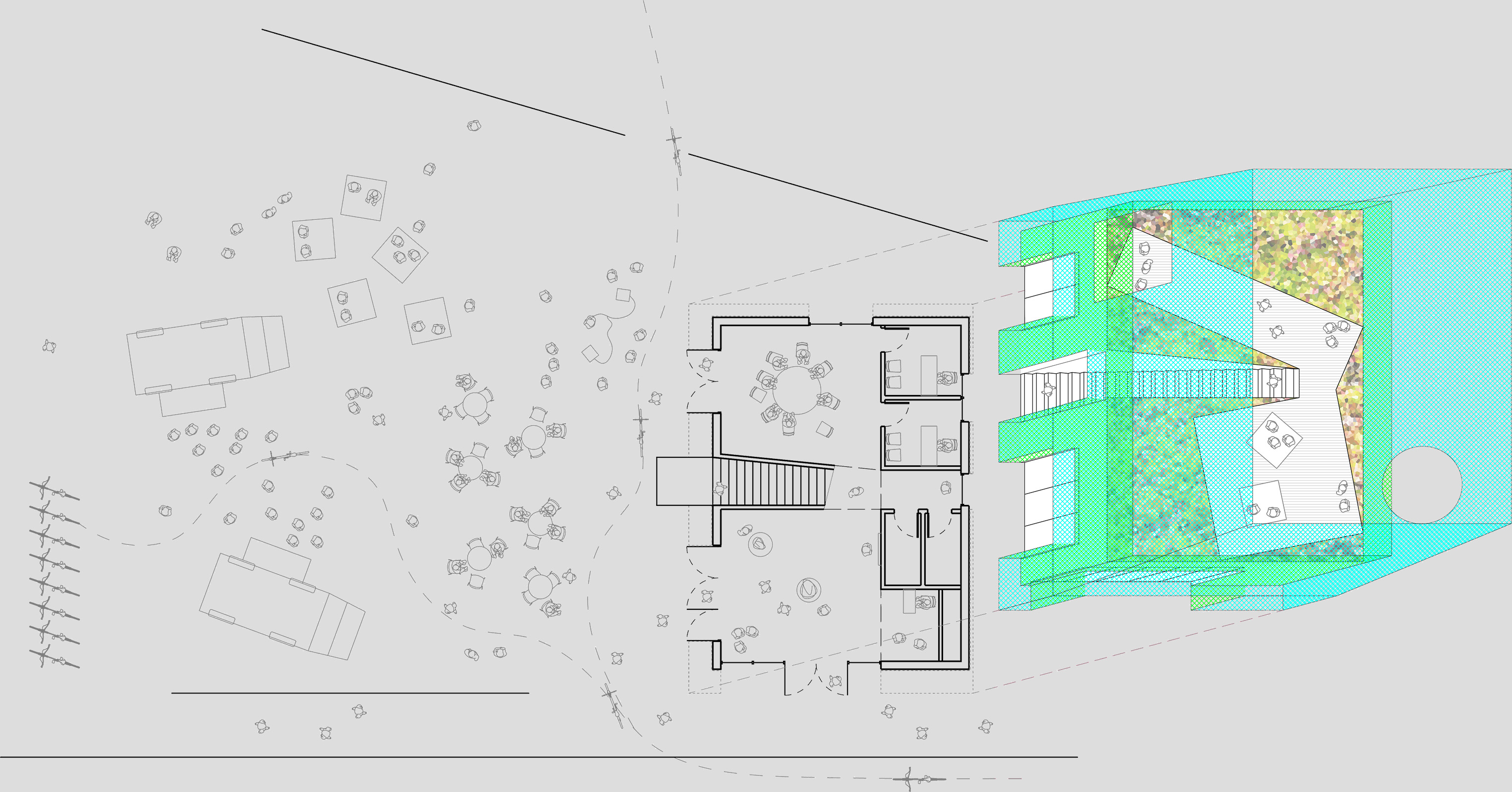
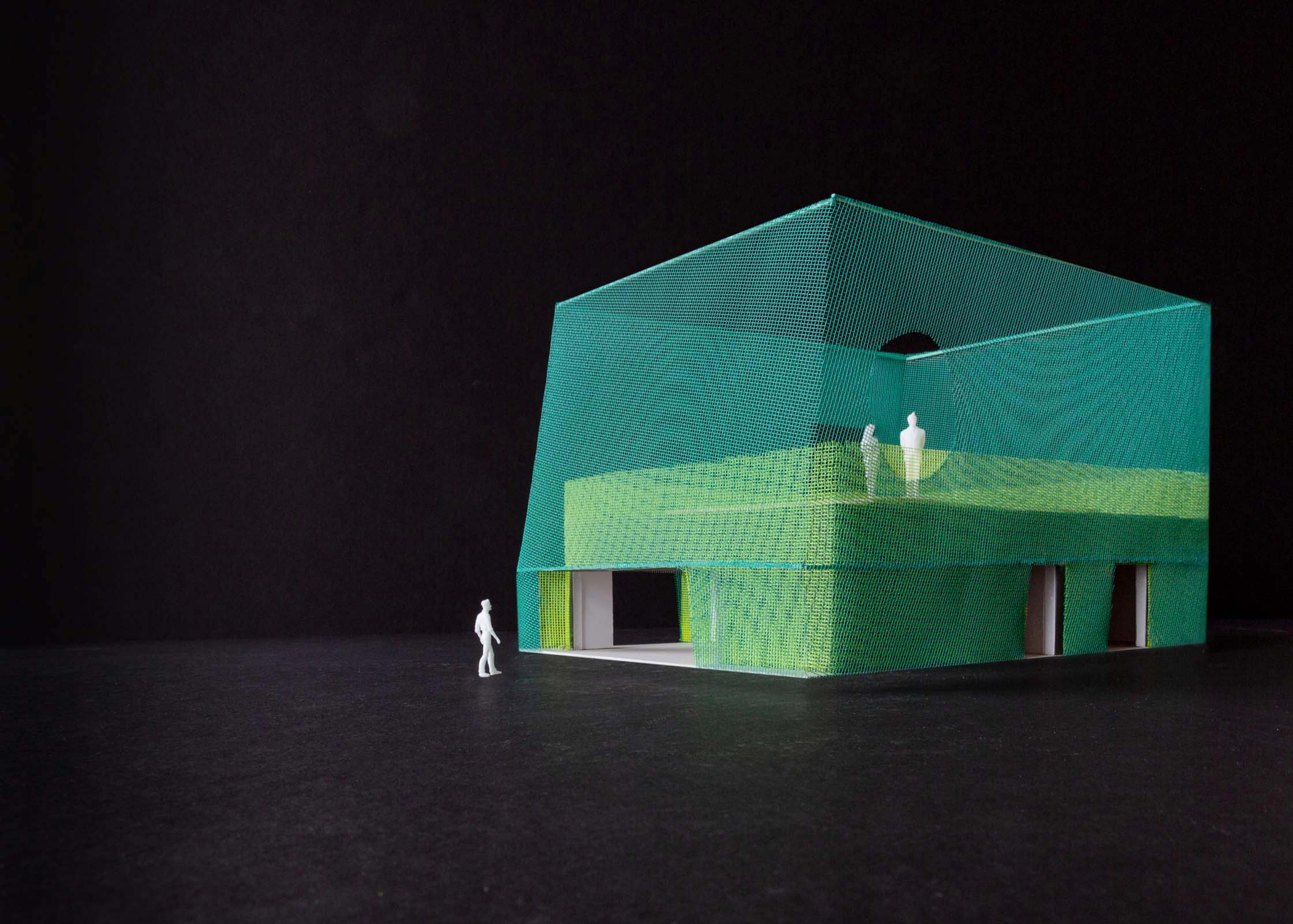



The renovation of a former industrial space into our own office is structured by two elements: oversized, abstracted furniture and a large—scale, veil—like curtain. The furniture, defined by a pair of very large tables and a stack of deep storage shelves, is built using standard construction products yet detailed to be purposely abstract. Its oversized scale allows flexibility of use and is shaped in part by the prominence of model—building in our design process. The custom furniture elements are complemented by abstract IKEA storage cabinets.
The curtain pairs two layers of scrim—one black, one white— that can regulate a variety of lighting conditions while serving as a veil over wall cabinets and other equipment for times when a cleaner appearance—or a bit of dramatic flair—is demanded. Hooks along the wall alow the curtain to be stowed for quick access to storage. The space is lit by a trio of standard fluorescent tube fixtures modified so that the bulbs are simply suspended from the ceiling above.
Project Team: Jeff Yinong Tao, Tiantian Lou, Charlie Cotton, Gabriel Schmid


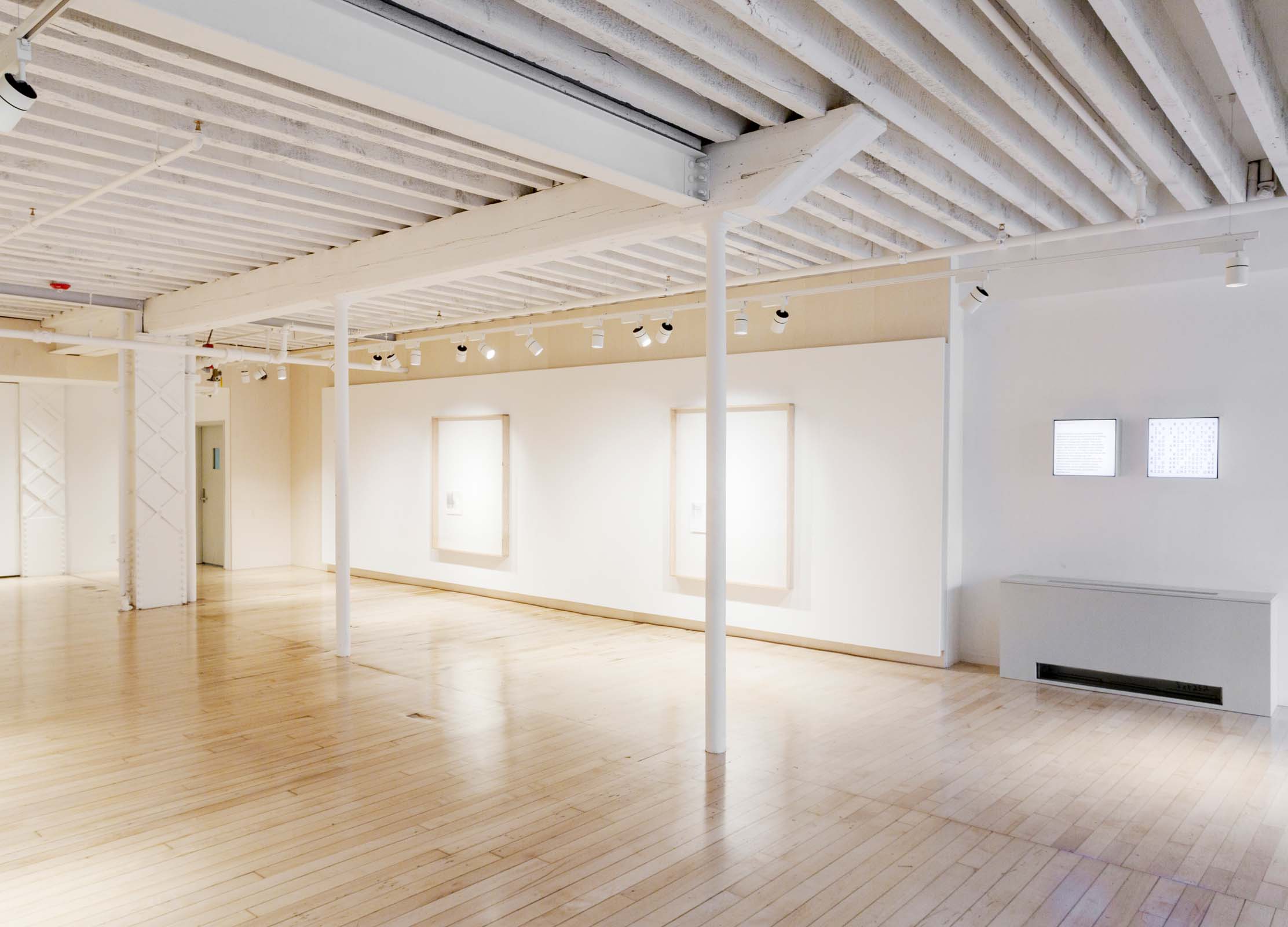
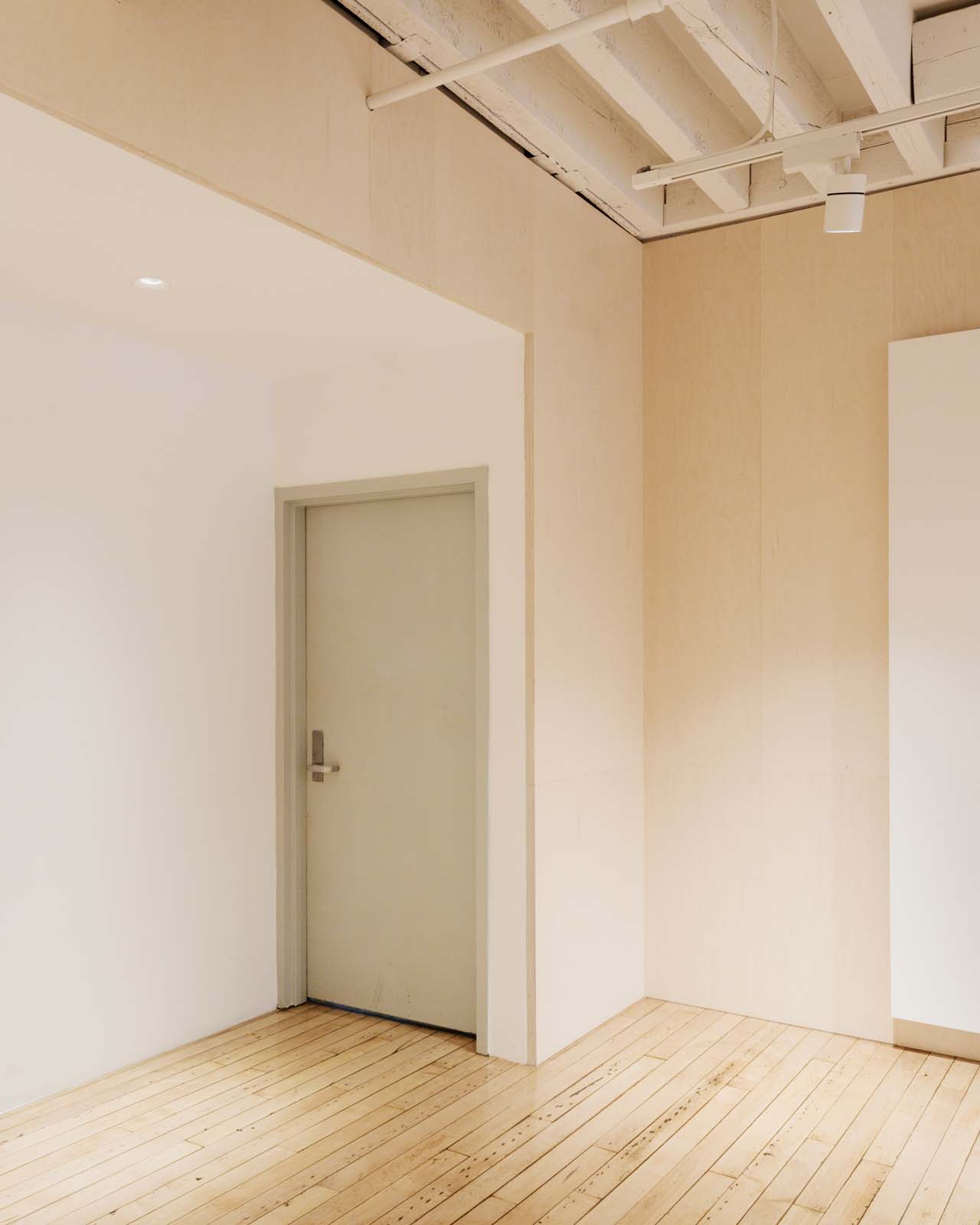
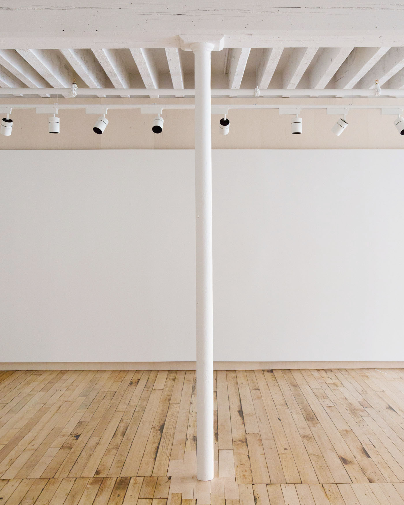
This project for the renovation of an exhibition gallery in an active art school required the resolution of competing demands: the need for a clean, neutral space for the display of professional artwork, and the demands of the students and faculty who regularly use the space for critique, debate, and large—scale fabrication. Our strategy for this renovation within a 19th—century factory building was to selectively reveal the working history evident in the building, and then to build up a new set of surfaces suitable for the exhibition of art. Working in concert, the historic and the new reinforce the concept of a gallery as a place for the creation and discursive exchange of artistic work in its many forms.
The first step included exposing original timber joists, heavy timber and steel framing, and cast iron columns. The second step manifested itself with the insertion of a plywood wrapper upon which two plaster display walls were hung, and which serve as the primary display surfaces. The plywood backing of the walls is expressed with an exaggerated thickness which contrasts with the lightness of the original cast iron columns while creating a cavity for the concealed routing of electrical cords required for exhibitions.
The project scope included the installation of a museum—quality LED lighting system, new built—in storage, and the creation of new building signage to announce the gallery’s presence to the street. Furniture pieces to complement the art display system were designed to allow visitors to rest in the storefront area.
Project Team: Po Ming Chou, Wilfred Rodriguez, Nil Shu Shang
Lighting Design: Elettra Bordonaro, Light Follows Behaviour
Graphic Design: Andrew LeClair
AIA Rhode Island Design Awards, Citation, 2017
Rhode Island Monthly Design Awards, Gold Medal for Commercial Interiors, 2018





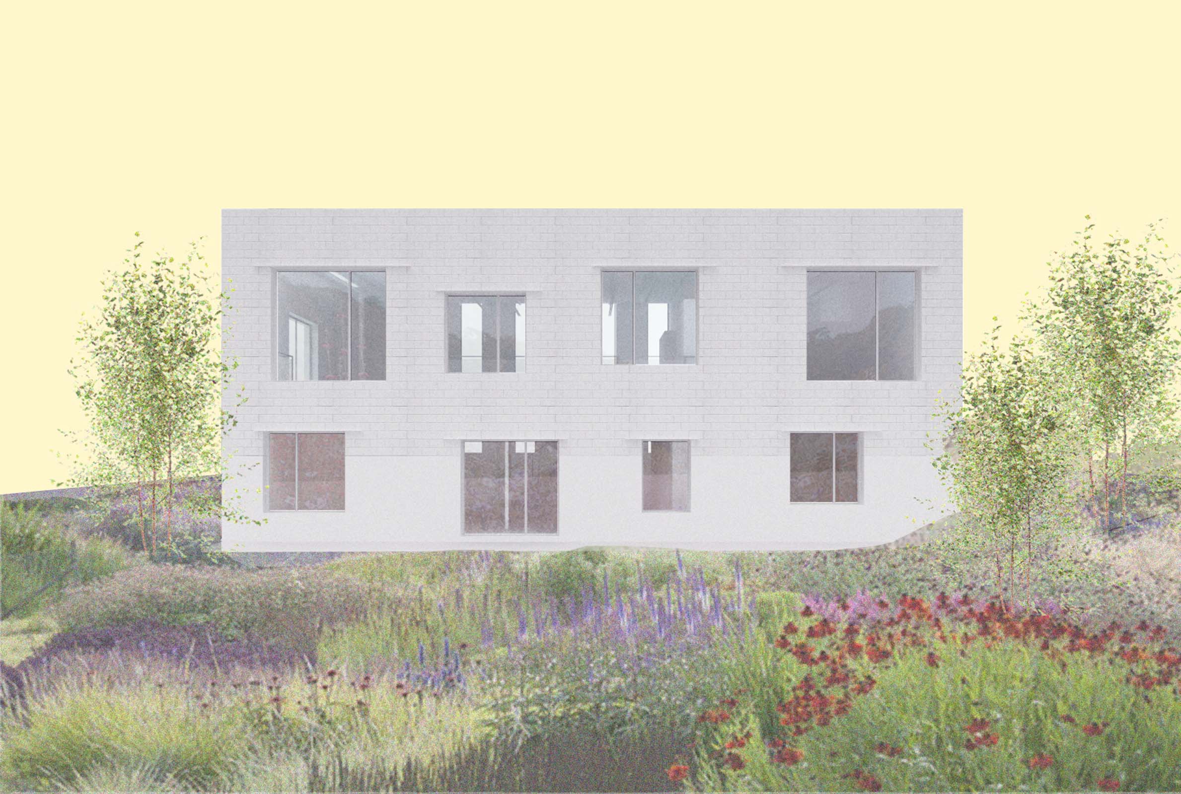
This conversion of a former VFW Hall into an artist’s house and studio is predicated on a dialogue between two vernacular forms: the brutalist concrete block and steel construction of the existing building and the residential neighborhood that surrounds it. The north façade retains the character of the original building, with vertical strip windows interspersed by split rib concrete masonry. The south façade, facing the garden, relaxes the window grid typical of masonry buildings to create a dialogue with nearby residential and industrial buildings with a set of large square openings. The steel lintels on the new window openings are exaggerated to add depth to the façade without unnecessary expression. The entire building is washed in a single color, evening out the tone while retaining the texture of past changes to the building.
The interior is split into two: a 3,200 SF loft—like space for the owner alongside a 1,600SF rental apartment. Editing the existing structure to a minimal state, the owner’s unit is characterized by a bridge—like living space floating between the two facades described above: one striated and vertical, the other a relaxed grid. The bridge creates double—height spaces along both principal facades, allowing substantial daylight into the below—grade bedroom and studio spaces and minimizing the need for artificial lighting.
Construction 2020.
Project Team: Aaron Forrest, Yasmin Vobis, Charlie Cotton, Yunchao Le
Structural Engineer: Structures Workshop


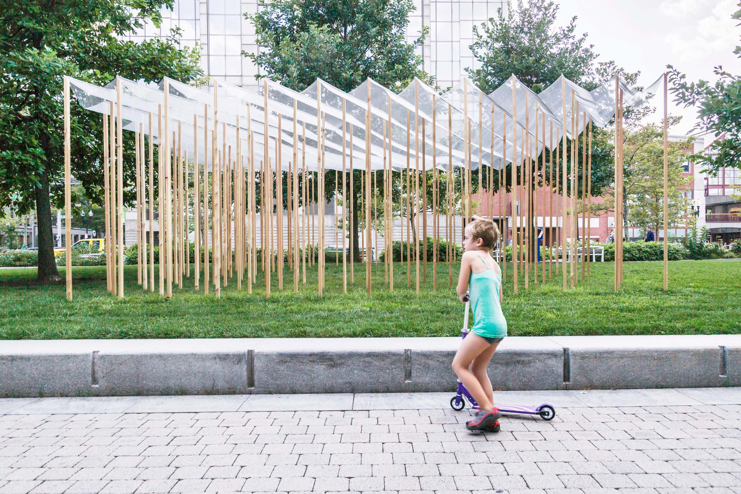
Most architecture is made out of planes. Plywood, sheetrock, glass. This one is different. It’s a solid made out of lines. It races from the first dimension to the third without stopping to catch its breath. An array of triangular columns form a square plan with a circular void cut out. An architectural primitive in every sense of the word.
The devil is in the details. The grid appears normal, but falls in a quincunx pattern, creating a dialogue between triangle and square. The circular void forces slight deviations in the pattern: the square talks to the circle. This geometric game of telephone is juxtaposed with a rough materiality: knotty cedar posts, an aluminum mesh veil over the top. The experience is that of an abstract, diaphanous orchard with a clearing in the center where people can gather.
Pavilion for Design Biennial Boston.
Engineering: Brett Schneider
Project Team: Aaron Forrest, Yasmin Vobis, David Amdie, Po Ming Chou, Karin Hostettler, Wilfred Rodriguez, Nil Shu Shang, Alice Zhen.


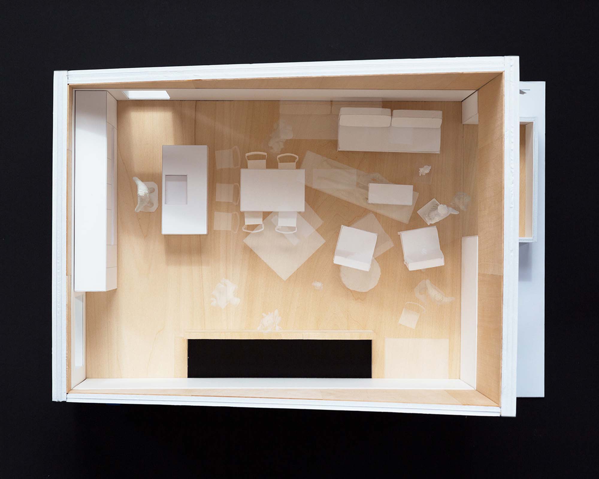
This prototype for a zero net energy affordable duplex proposes the combination of a unique organizational strategy with the use of cross—laminated timber to create a new model of affordable housing centered around ideas of ownership, generosity and sustainability. The layout places a highly flexible common living area above an efficiently planned first floor, allowing evolving family, living, and working arrangements to take advantage of the open layout as much as possible without sacrificing the privacy of individual inhabitants. The openness is made possible through the use of cross—laminated timber, which allows longer spans than traditional wood framing and creates a naturally efficient thermal enclosure.
The two units may be arranged in a variety of combinations depending on the available site. The arrangement shown here for a sloped site forms a shared courtyard between the two units that creates the opportunity for sociability between the two families and the neighborhood at large. An alternative configuration for a flat site places the two units side by side with a shared entry portal flanked by street—facing balconies on either side. Each configuration plays with subtly idiosyncratic symmetries that respond to the inherent constraints of the type.
Competition First Place
Project team: Po—Ming Chou
Structural Engineer: Brett Schneider, Guy Nordenson and Associates
Energy Consulting: Jeff Geisinger



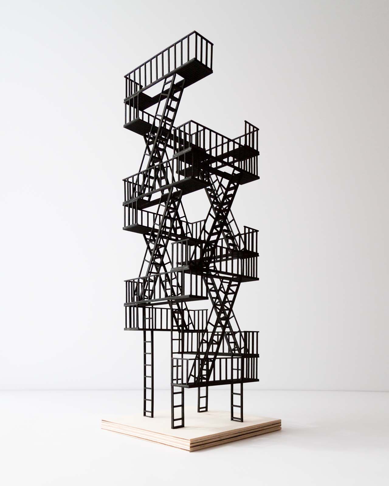
The brief for this project asked for a design of a souvenir that could represent present—day New York City. Born of a pragmatic compromise, fire escapes reconcile 19th century housing stock with 21st century safety standards. Every borough has them, and not one begrudges them. They’re even more universal than the Yankees.
When we lived in New York we had a fire escape. We never once needed to flee a fire, but we used it plenty, its prosaic architecture belying the experiences it made possible. We grew plants out there, ate dinner, and basked in the views and the late summer sun. It was an incredible escape from the confines of our apartment. In this regard, the humble fire escape seemed to open a world of possibilities when other aspects of city life appeared to close in on us. The fire escape became more than a code requirement: it was an aspiration.
Our proposal imagines a new life for the fire escape. No longer dependent on squat townhouses and tenements for support, it’s free to be itself. Its filigree architecture multiplies, it spirals upward, and it makes new friends. It even tries on a new look, the vertical form of a Manhattan skyscraper. Like most New Yorkers, it is happiest when trying to reinvent itself.
ESCAPE was commissioned by Storefront for Art and Architecture for the exhibition Souvenirs: New New York Icons.
Project Team: Po—Ming Chou


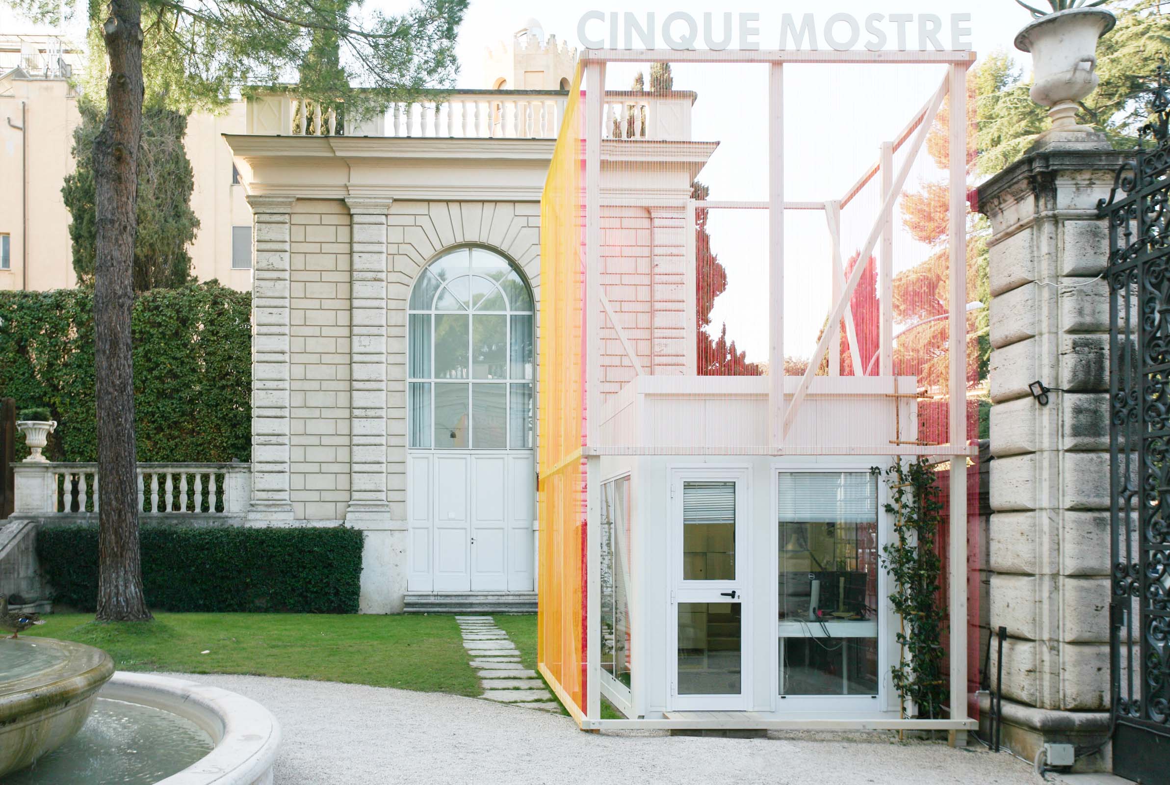
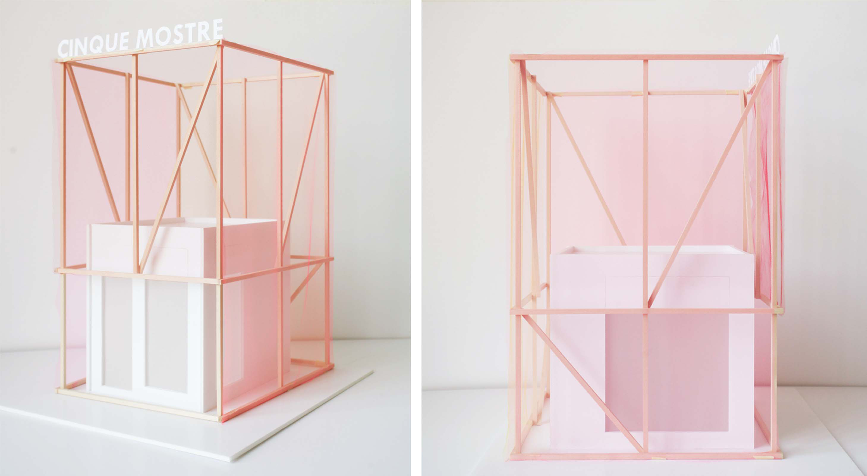
The work, inspired by Robert Venturi's "decorated shed" concept, surrounds the American Academy in Rome’s security shed in a pop textile. The new façade becomes a welcome beacon for the exhibition as well as an experiment in spatial color combination, conferring an alternative view of the pre—fabricated structure and of the Academy’s imposing street presence.
The design pairs a rotationally symmetrical structural frame with an ephemeral skin made of 11km of brightly colored acrylic cord. Taking apart the glowing orange tones of the surrounding buildings into six discrete hues, the colors are organized into two planes on each façade, to atomize and create depth in the recombined color.
Decorated Shed was a collaboration with Robert Hutchison Architecture for the 2017 Cinque Mostre exhibition at the American Academy in Rome.
Installation team: Hiba Karim, Alessio Alaimo


Note: the project text below was written in advance of the 2016 presidential primaries.
2024: Two terms of the Trump—Sanders administration have left global finance in disarray. Income inequality has skyrocketed, while ever more stringent emissions regulations have severely hamstrung the ultrarich in their unquenchable desire for the low—risk, high—return shares in uninhabited urban real estate. Simply put, emissions—adjusted construction costs now outpace investment returns in the most obscene high—rise developments. All the while, the pleasures of the city slip further from the grasp of its full—time residents.
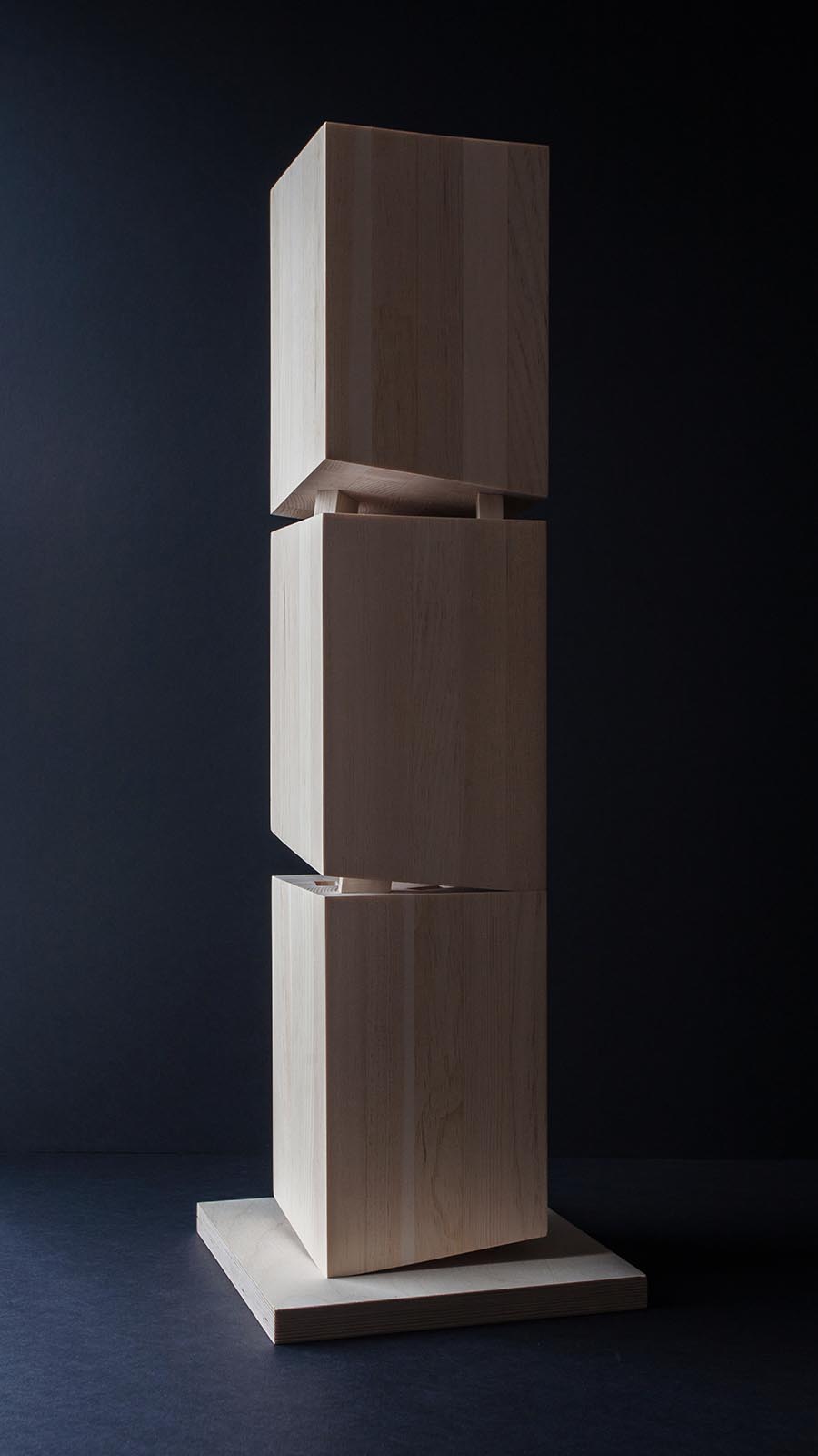
Spekulatius is a solid timber tower in which the volume is subdivided into condo shares that double as carbon offsets. In contrast to the gleaming steel and glass constructions that we are accustomed to seeing, this tower functions as a carbon sink by virtue of the carbon dioxide absorbed by the trees that supply its structure. As long as the condos remain uninhabited (that is to say, solid), their status as investment vehicle remains intact. Three observatory levels are cut through the tower and interconnected by a double promenade of circulation cores through the solid mass, creating new urban public spaces that operate as twenty—first century plazas: zones of relief from the economic determinism of the contemporary metropolis.
Spekulatius was commissioned for 5 x 5 : Participatory Provocations organized and curated by the editors of CLOG.
Project team: Tida Osotsapa
Structural Engineer: Brett Schneider


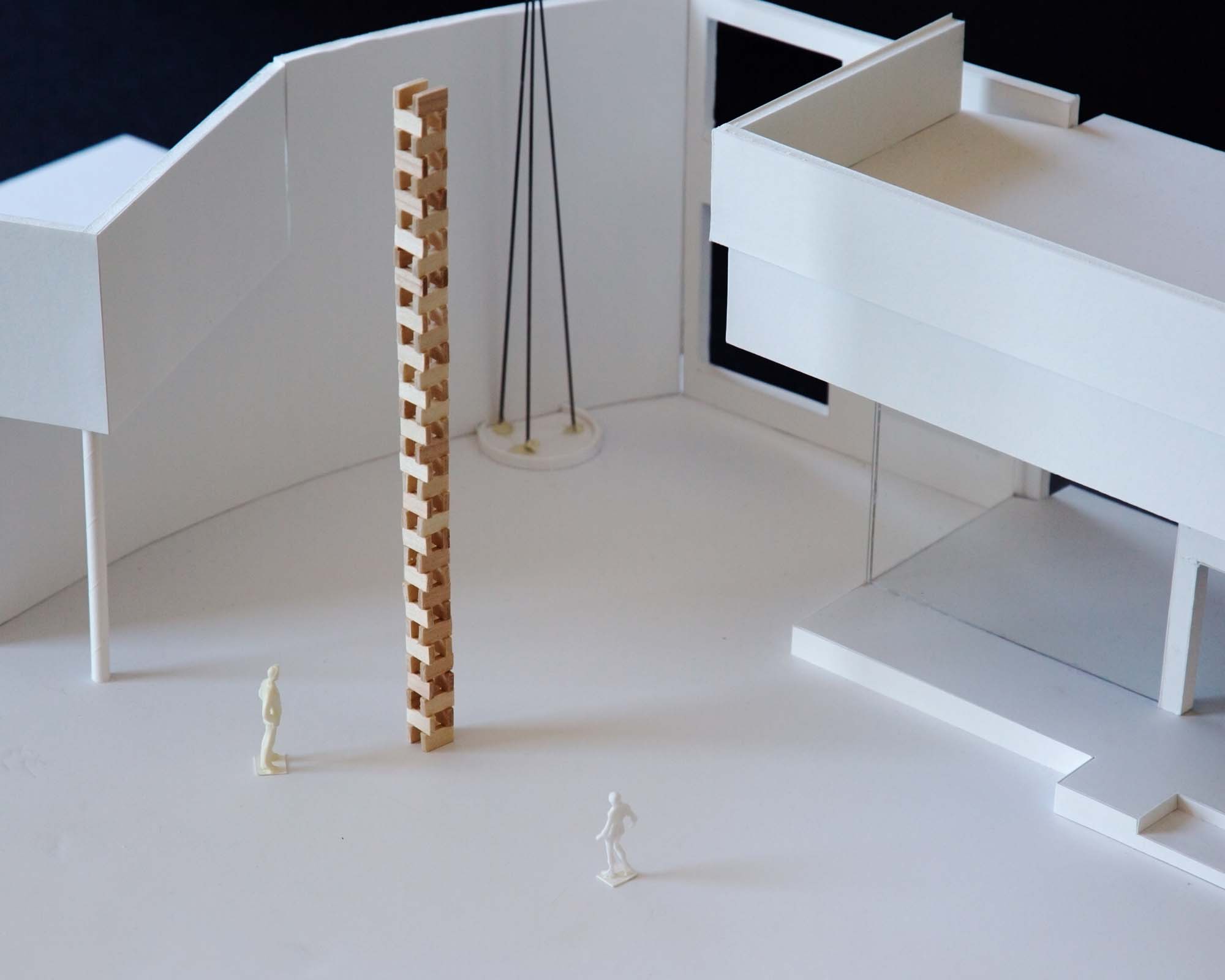
Atalaya is a collaboration with the artist Paula Gaetano—Adi for a 12—meter tall sculpture made up of stacked artisanal bricks that creates a simple alternating pattern of an apparent disturbing fragility.
Specifically conceived to be constructed in one of the most seismically active regions in South America, this narrow rectangular “tower” subtly mixes modernist systemized processes with the haptic and customized nature of artisanal making. The minimalist structure is to be constructed in collaboration with a team of local brick artisans from Alto de Sierra in Santa Lucia, and arranged in a crib—stack pattern reminiscent of the temporary drying walls of the artisan brick fields.
Placed at the heart of San Juan city, no one sits at the top of this watchtower. Nonetheless, the tower acts as San Juan’s sentinel, constantly proving its structural sturdiness during zonda winds and seismic movements. An anemometer or a seismograph of sorts, the tower’s apparent instability will be an active witness of the city's society and history, symbolizing the possibility of its perpetual re—constitution.
Structural Concept: Brett Schneider
Project Team: Kunyue Qi

