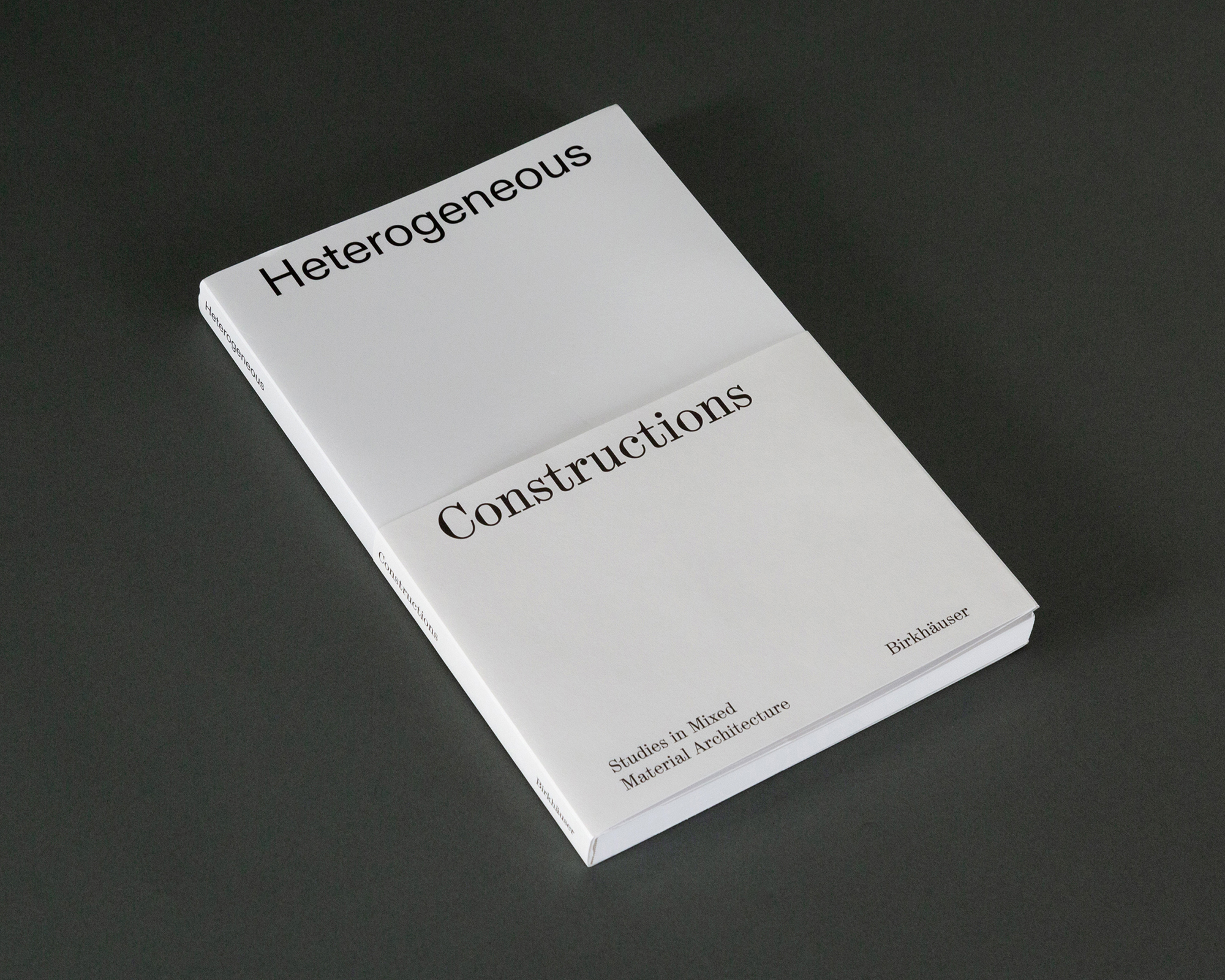
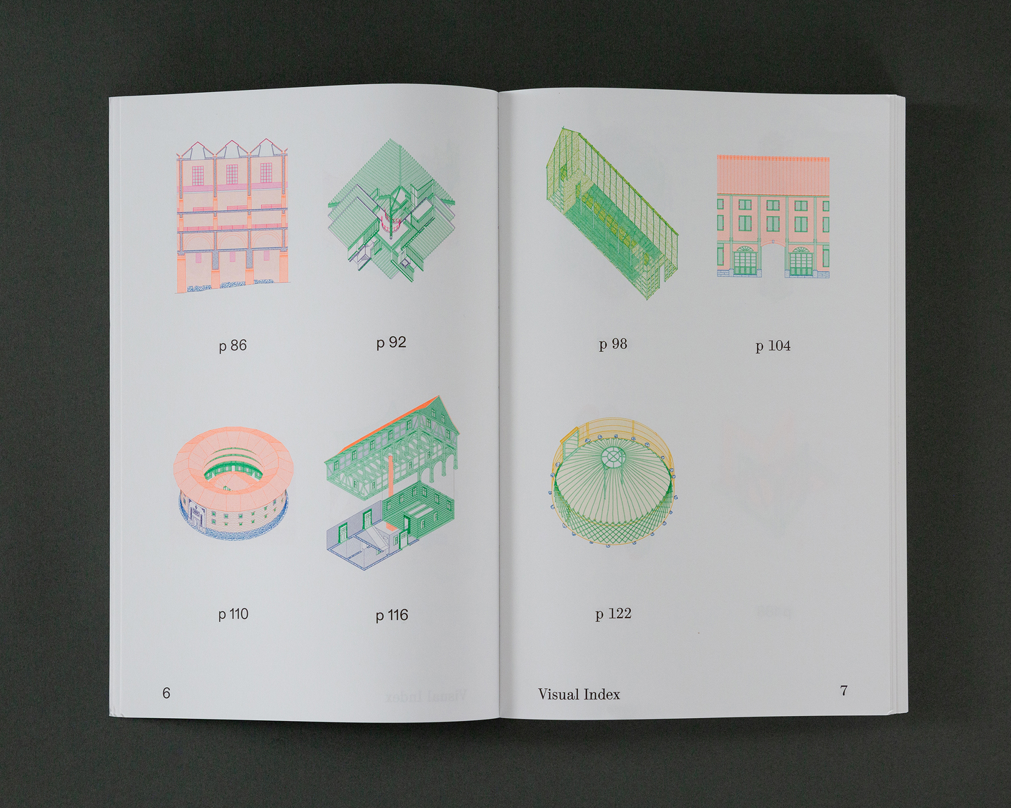
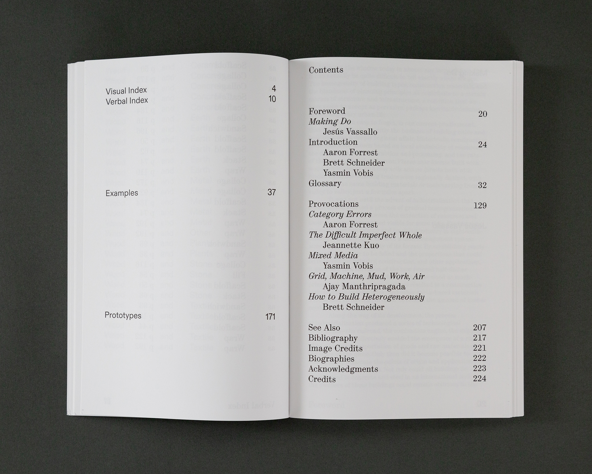
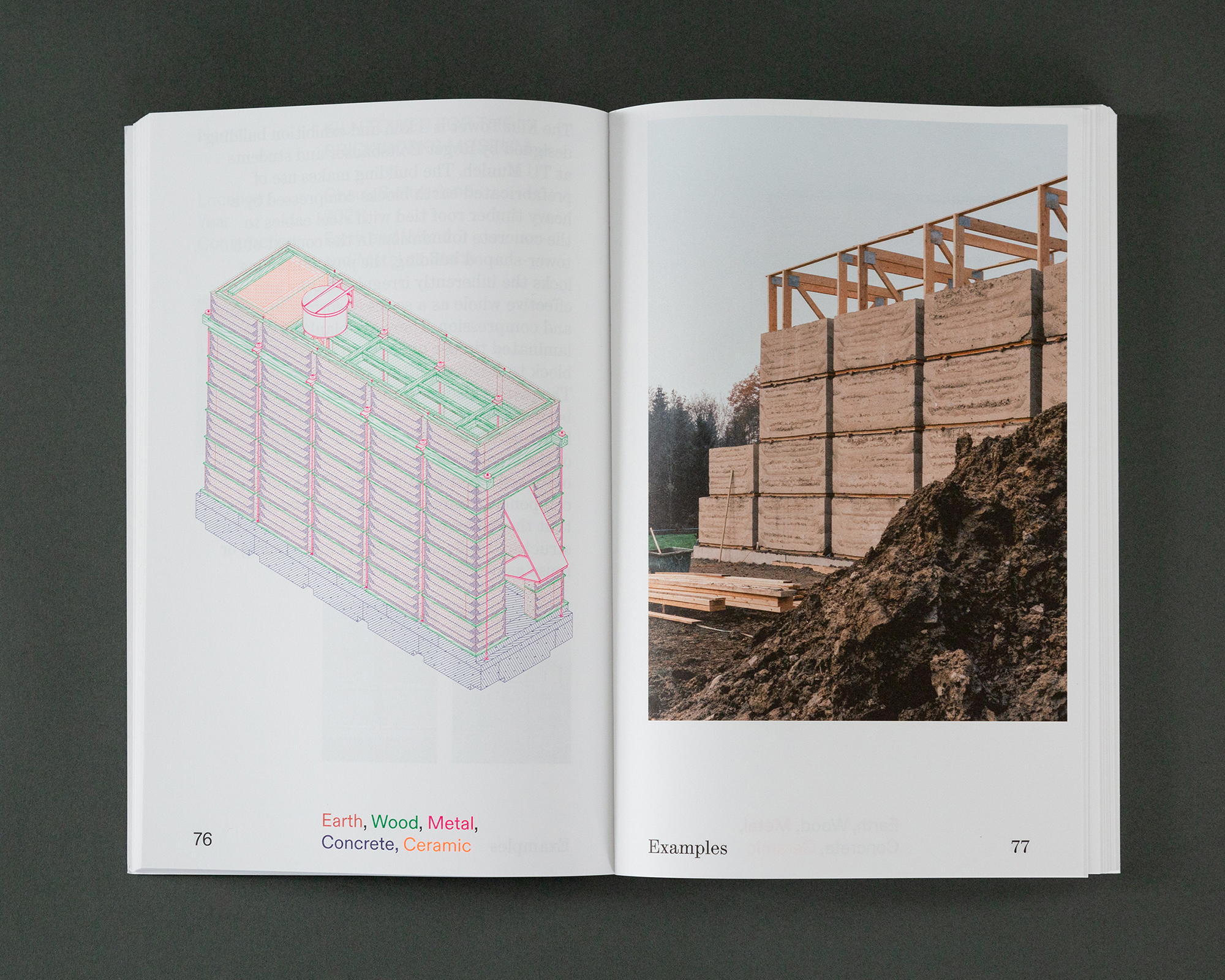
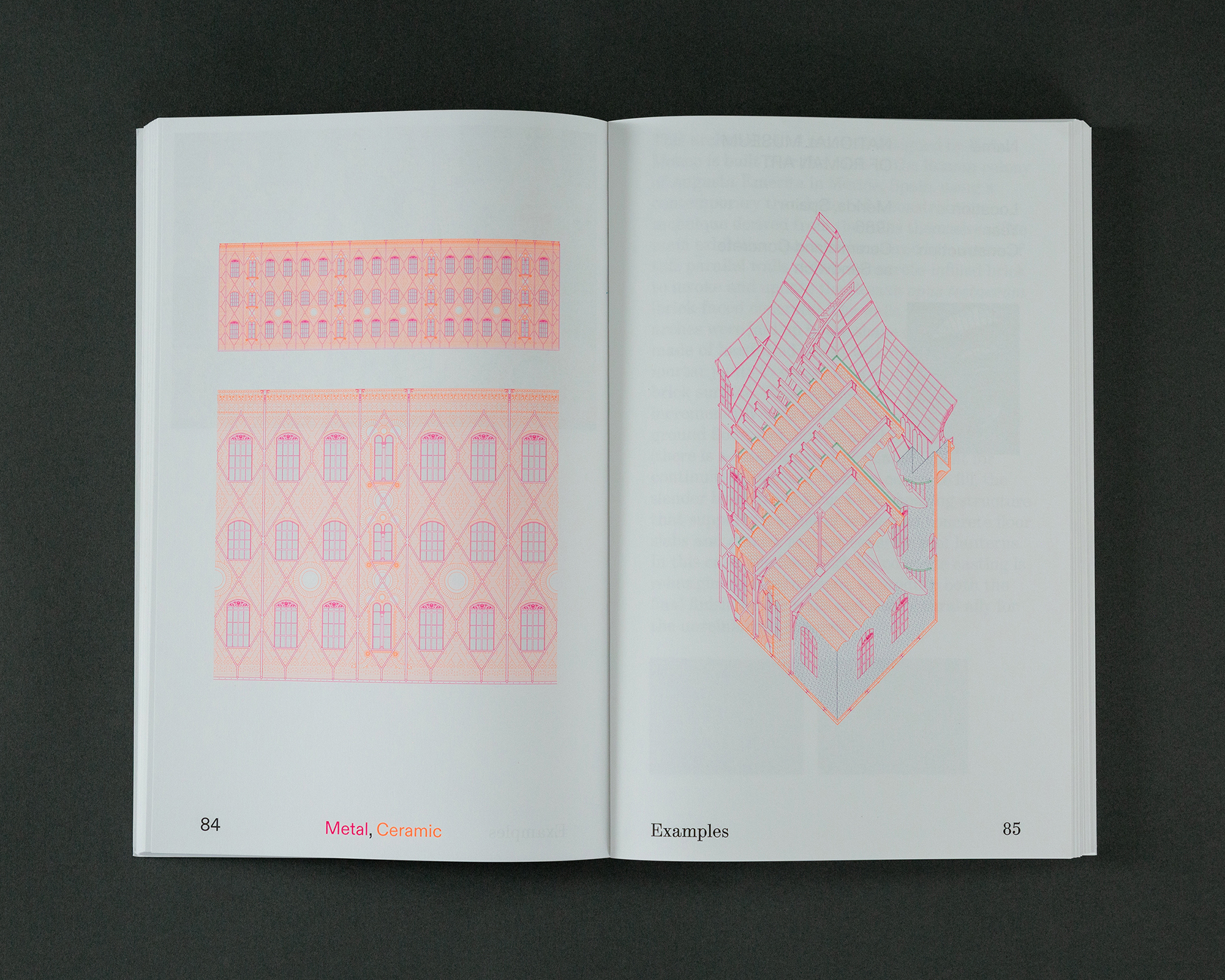
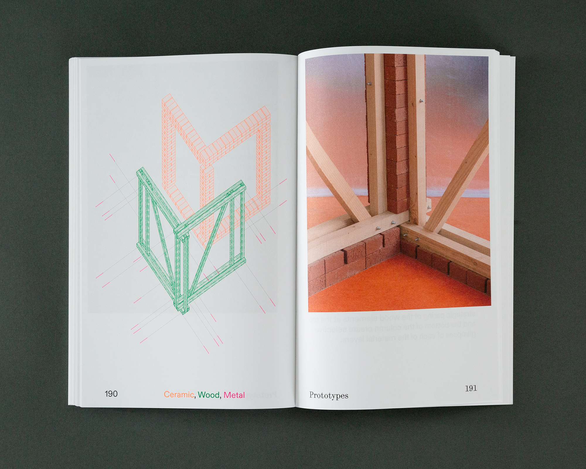
Heterogeneous Constructions is a book that examines material heterogeneity in construction as a cultural practice. Through the use of full—color technical drawings of global case studies, speculative construction projects, and critical essays, the book makes a case for the renewed relevance of heterogeneous construction as a driver of contemporary architectural thought. With contributions by Jeannette Kuo, Ajay Manthripragada, and Jesús Vassallo, photography by Naho Kubota, and graphic design by Andrew LeClair.
By Aaron Forrest, Brett Schneider, and Yasmin Vobis
Birkhäuser Verlag, 2024
Tokyo TDC Design Award Finalist, 2025
Research Team: Lara Avram, Pericles de la Torre Bien, Evelyn Ehgotz, Zoe Frothinger, Nicola Ho, Zak Leazer, Diandra Rendradjaja, Kei Takanami, Jordan Voogt, Ariana Wu, Wendy Zhuo
UC Berkeley Design Studio Fall 2023: Mishelle Abusada, Samara Bhatia, Grisel Chavez Diaz, Maria Escalera,Grant Fisher, Zoe Frothinger, Maria Hidalgo Rodas, Ethan Lamping, Amanda Liang, Oriana Lopez, Emily Tapia—Delgado, Jose Velasco Ochoa, Ariana Wu, Brant Zhao
CONSTRUCTIONS

Disegno, meaning drawing or design, has held a privileged role in art and architecture since the Italian Renaissance, when art historian Giorgio Vasari defined drawing as “the animating principle of all creative processes” in his Lives of the Artists. Vasari characterized a fundamental split between drawing and color in artistic production, linking disegno to Apollonian rationalism and colore to Dionysian intuition and lack of control. Disegno has been taken up as the primary mode of architectural design ever since; the role of the drawing cannot be overstated. Countless modern treatises on formal analysis stress form and the object as the primary locus of architecture. Architects today are expert manipulators of complex geometries, but when it comes to color there is little to say. Color, when used, is typically understood as a surface treatment, subservient to the basic structure of forms.
Yet each half of Vasari’s dichotomy promises a different spatial conception: disegno that of the hard—lined, geometrically defined space based on geometric projection; colore on the other hand, promises a coloristic approach based on aerial perspective which deals directly with regions and gradients, fields and potential environments. By reconsidering colore in conjunction with disegno, fresh possibilities for architecture arise.
The Rome Prize—and the Prix de Rome before it—has historically been a time for architects to draw the buildings of Italy as a means for reframing the discipline as a whole. In addition to what architects drew, how they drew often became frameworks for future work. Color Space has been focused on working with new digital scanning techniques to draw space through the lens of color. Relying on the camera as a simple perspective—machine, spatial coordinates and RGB values are combined to produce digital environments that connect color and space in a form of architectural pointillism. Colore (color and tone) is the main protagonist of these environments, while disegno (linework and geometry) is inferred from the color clouds — a neat inversion from the typical draftsman’s approach to delineating architecture. Such models produce information about color, light and surfaces in three dimensions, rendering precise atmospheres.
Color Space has been exhibited at the American Academy of Rome, the Rhode Island School of Design, the Cooper Union, and the Washington University in St. Louis, and published in Perspecta 52.


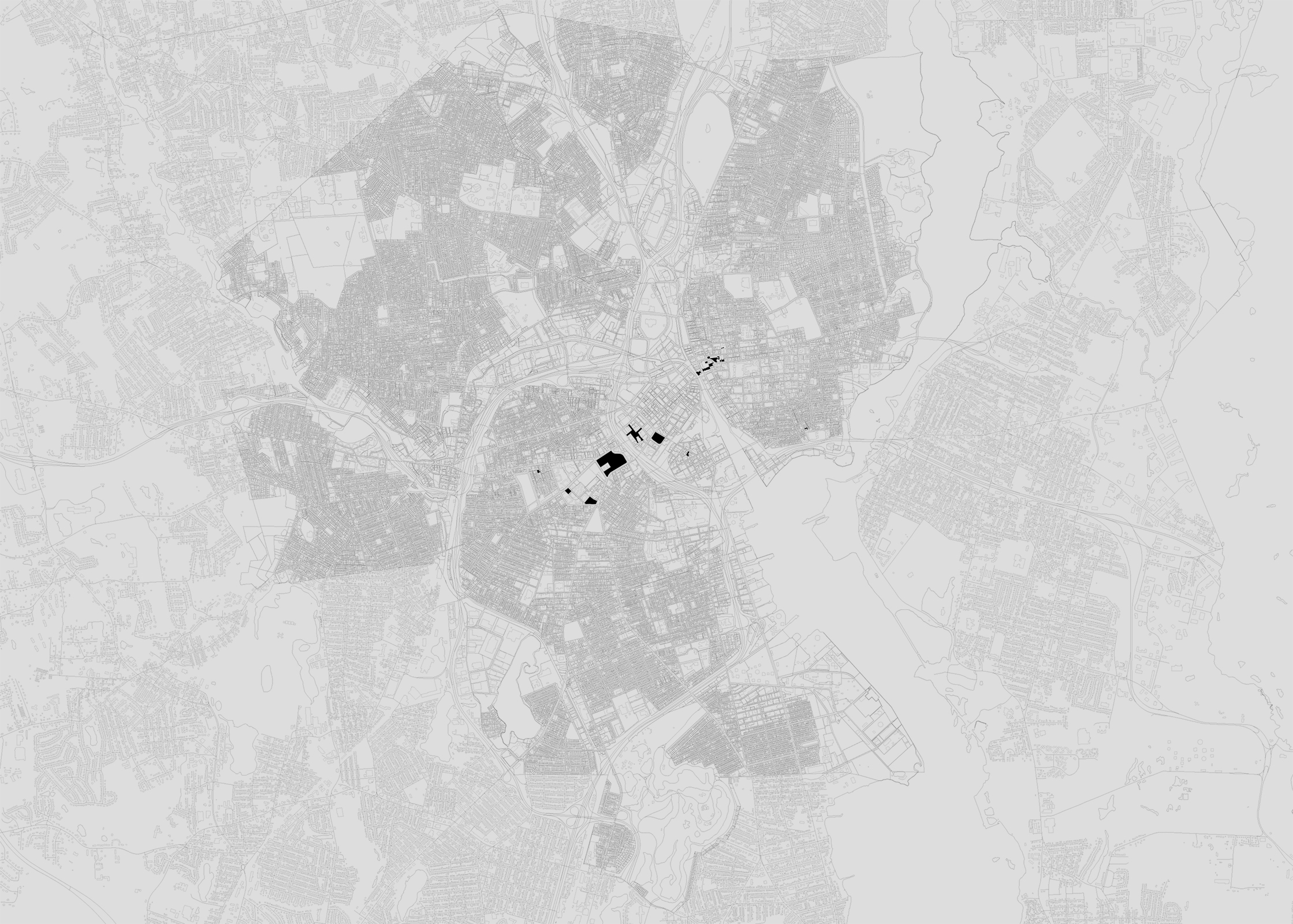
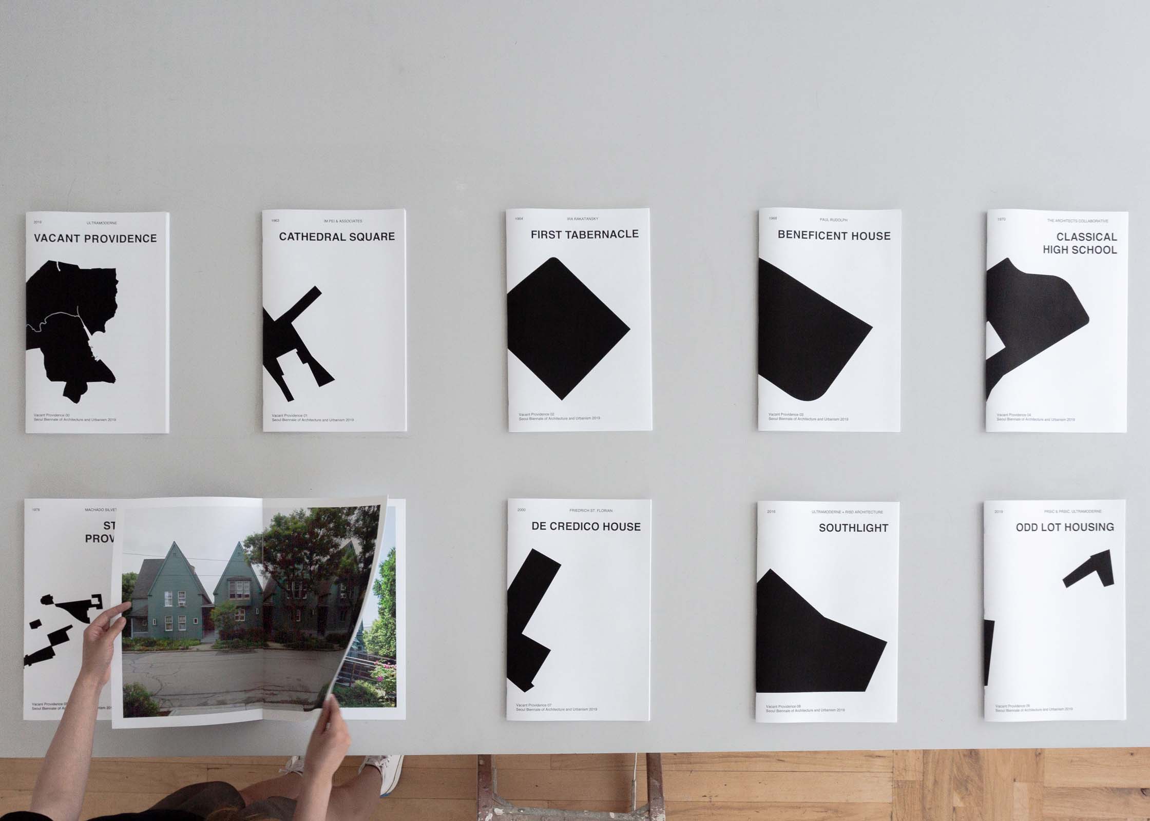
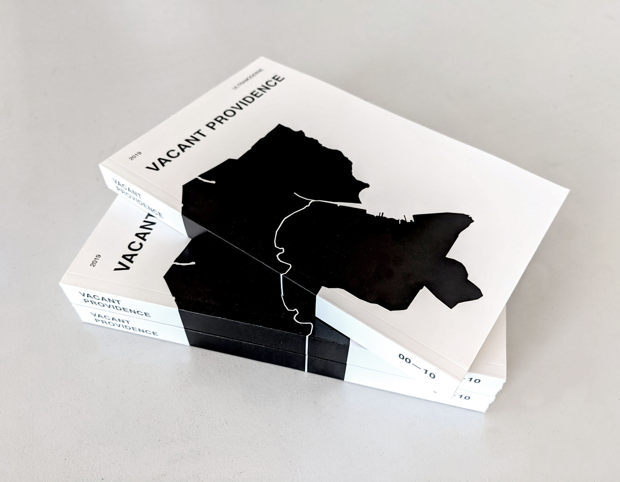
This publication and exhibition, originally commissioned for the 2019 Seoul Biennale of Architecture and Urbanism, proposes a rereading of the American post—industrial city as a space of latent potential for radical experimentation in both architecture and urbanism.
Vacancy is a condition common to all cities. In the post—industrial cities of the American northeast it is often seen as a crisis. Empty and underdeveloped lands bring the cities below a critical density at which point the cost of delivery and maintenance of infrastructural services no longer matches the population’s ability to pay.
The economic challenges of vacancy are thus well established, and much current thought in city planning is indeed focused on the efficient economic management of urban real estate as a means of minimizing vacancy. In this context, vacancy is understood as a purely negative condition. It denotes a site (land or building) that is not living up to its economic potential. Economists and planners alike see vacancy as a pejorative condition: a problem to be eradicated through pricing, taxation, incentives, and other market props.
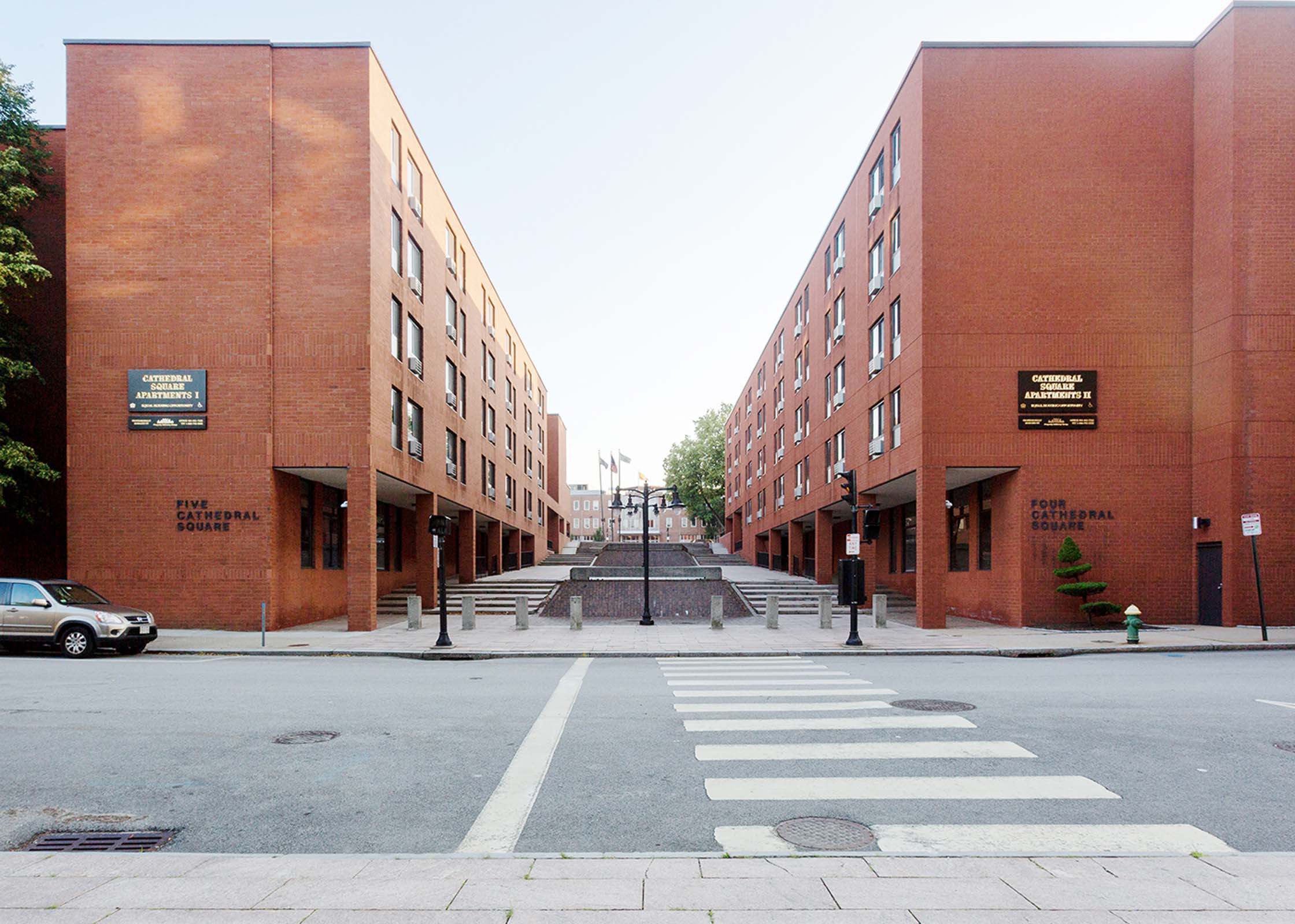
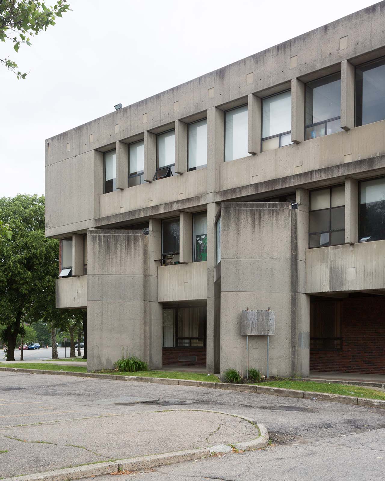
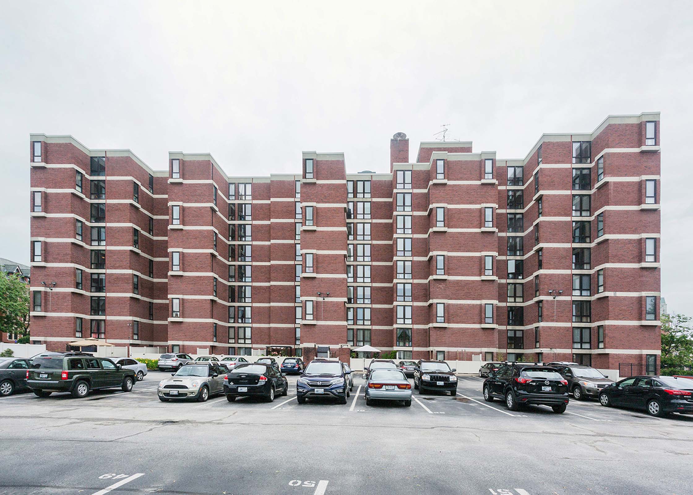
What this approach neglects is the enormous civic potential left behind when all the empty space is efficiently filled by revenue—generating uses. The city of Providence, Rhode Island, proposes an alternative model where vacancy is seen as a generator of new forms of collectivity. While the city by no means discourages real estate speculation, architects, planners, and cultural groups have used the economic fallows of the last several decades as an opportunity to experiment with new housing types and cultural development in these vacant spaces. Simultaneously scrappy and potent, these experiments in the margins of the city—margins that at times have appeared to be the dominant feature of the urban landscape—have leveraged a condition of temporary inefficiency to reflect on alternative futures for urban life.
The exhibition has been published as a single—volume book with new original drawings and photography of the ten featured projects. For a copy please contact info@ultramoderne.net.
Featured architects: IM Pei & Associates, Ira Rakatansky, Paul Rudolph, The Architects Collaborative, Machado Silvetti, Durkee Gordon Viveiros, Friedrich St. Florian, Pršić & Pršić, Ultramoderne, BriggsKnowles A+D
Project team: Liz Parker, Kunyue Qi, Dave Waite.
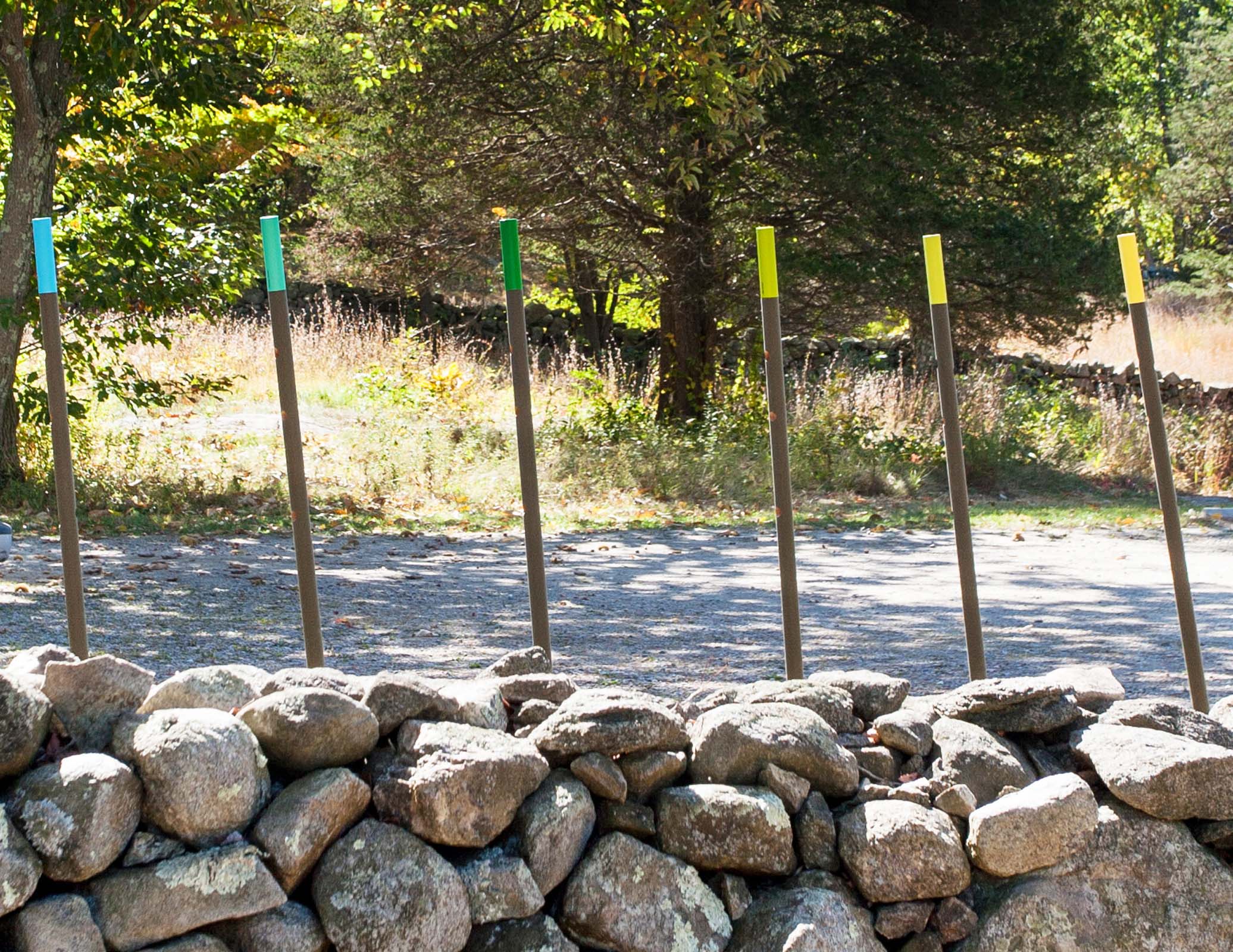
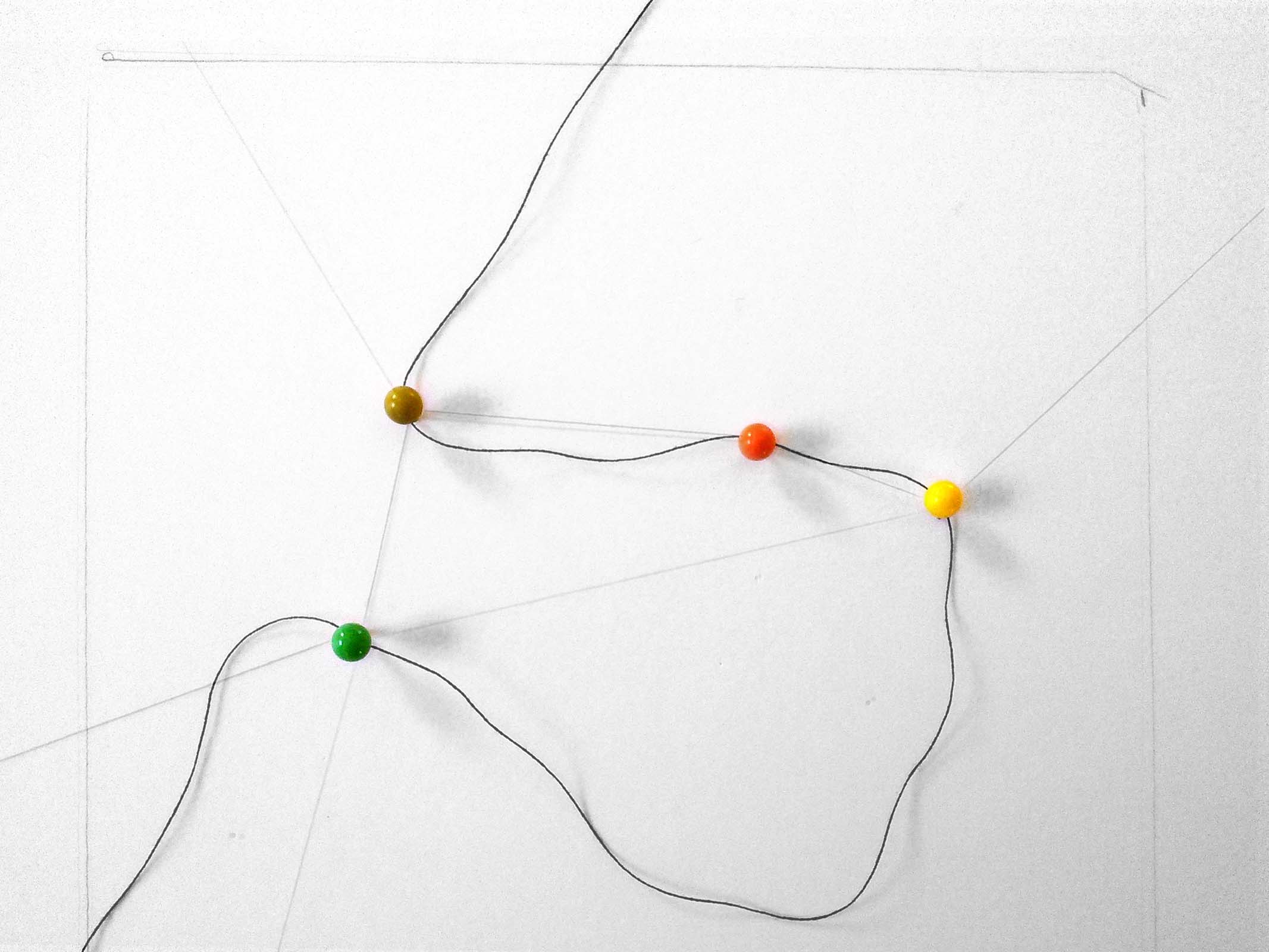
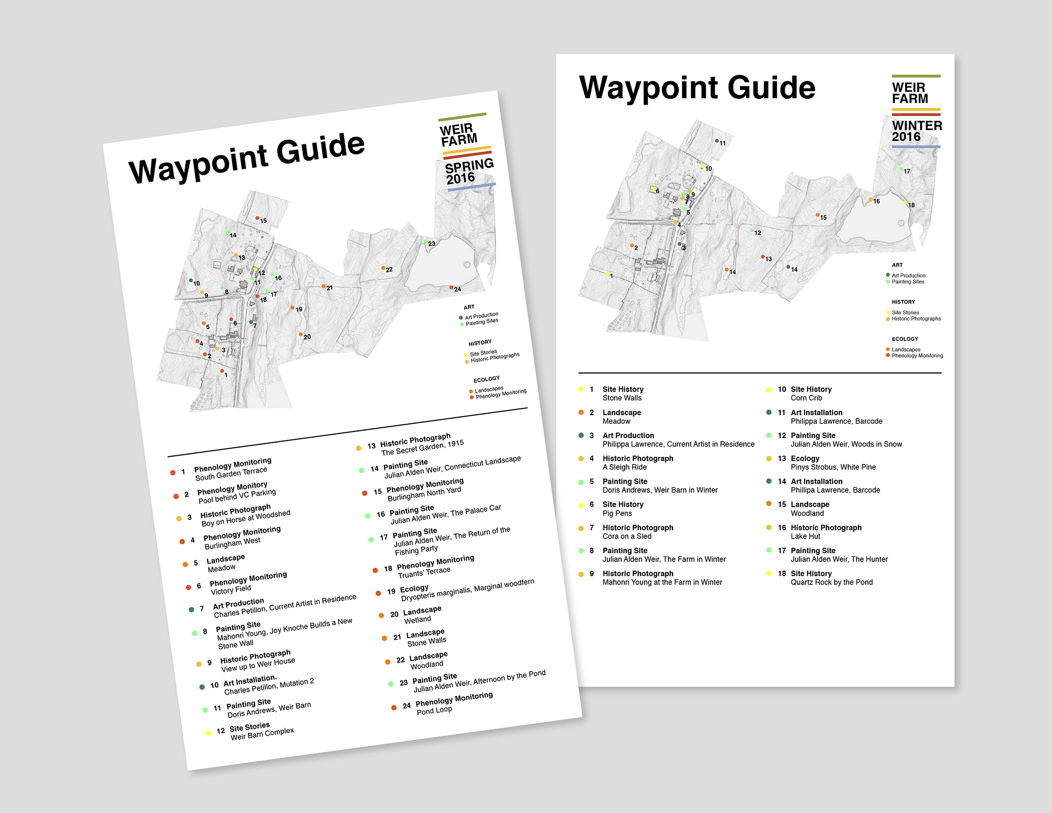
Working with the Van Alen Institute and National Park Service, we proposed a series of interconnected design concepts tying together disparate elements of the visitor experience at Weir Farm National Historic Site, former home of landscape painter Julian Alden Weir and later sculptor Mahonri Young and painter Sperry Andrews. The design encourages self—guided exploration via experimental wayfinding tools, landscape maintenance regimes, and their careful integration with social media, asking visitors to find their own paths through the site and to see it in light of the legacy of experimentation and exploration key to its historical significance.
The wayfinding system is a lightweight, portable series of viewfinders that suggest particular views and paths through the site while avoiding prescribed routes. The waypoints introduce visitors to the environmental conditions that were central to the work of the artists that worked here, and allow visitors to capture these phenomena for themselves. A minimal identifier on each of the waypoint prototypes allows for the collection of images from visitors online so that the collected experiences begin to create altogether new representations of the site. Coupled with the wayfinding system, a zero—budget landscape strategy redeploys existing maintenance regimes to create a rotating series of constantly updating meadow paths, carve new social spaces into the landscape, and create new opportunities to extend dwindling open—space habitats. Both strategies work to create an ever—evolving visitor experience that responds to changes in site ecology, new interpretation strategies, and asks visitors to see the site through a different lens each time they return.
Collaboration with Jessica Forrest, Noah Klersfeld, Suzanne Mathew, and Dungjai Pungauthaikan
Project Team: Will Gant, Hua Gao, Ronak Hingarh, Daejeong Kim, Yin Lu, Tida Osotsapa, Mengcen Shen, Emily Yen


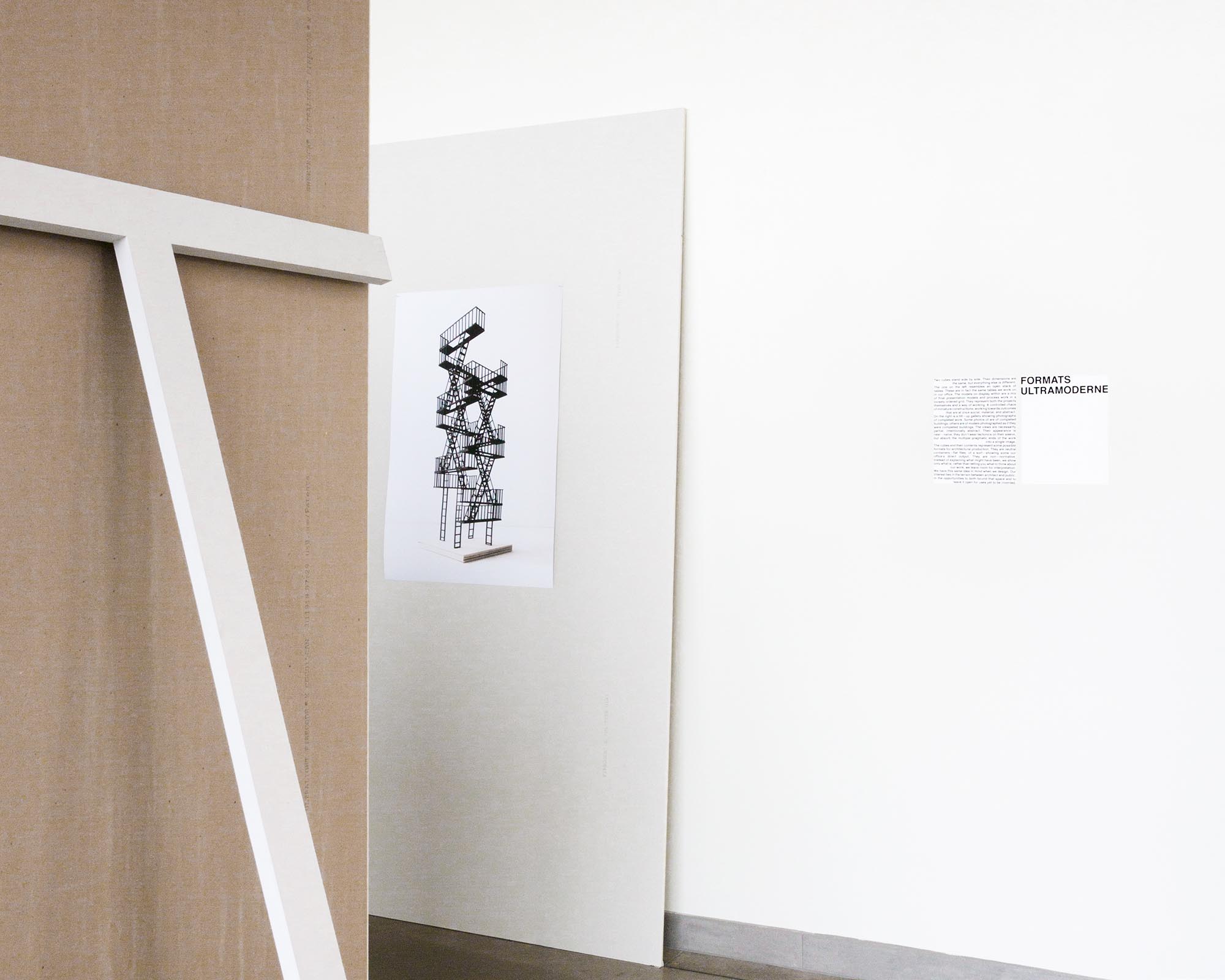
Two cubes stand side by side. Their dimensions are the same, but everything else is different. The one on the left resembles an open stack of tables. These are in fact the same tables we work on in our office. The models on display within are a mix of final presentation models and process work in a loosely ordered grid. They represent both the projects themselves and a way of working. A controlled chaos of miniature constructions, working towards outcomes that are at once social, material, and abstract.
On the right is a tilt—up gallery showing photographs of completed work. Some photos of are of completed buildings, others are of models photographed as if they were completed buildings. The views are necessarily partial; intentionally abstract. Their appearance is near—naïve; they don’t wear tectonics on their sleeve, but absorb the multiple pragmatic ends of the work into a single image.
The cubes and their contents represent some possible formats for architectural production. They are neutral containers—flat files, of a sort—showing some our office’s direct output. They are non—normative. Instead of explaining what might have been, we show only what is; rather than telling you what to think about our work, we leave room for interpretation. We have this same idea in mind when we design. Our interest lies in the terrain between architect and public; in the opportunities to both bound that space and to leave it open for uses yet to be invented.
Formats was a solo exhibition of our work at UMass Amherst in Spring 2019. Exhibition design, curation, and content by Ultramoderne.
Project Team: Charlie Cotton, Derek Yunchao Le, Giacomo Sartorelli


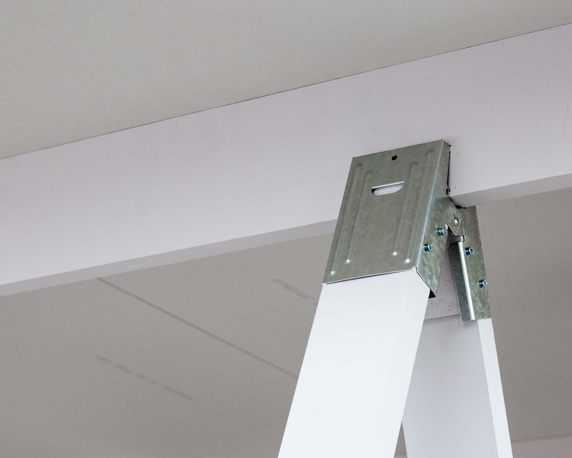
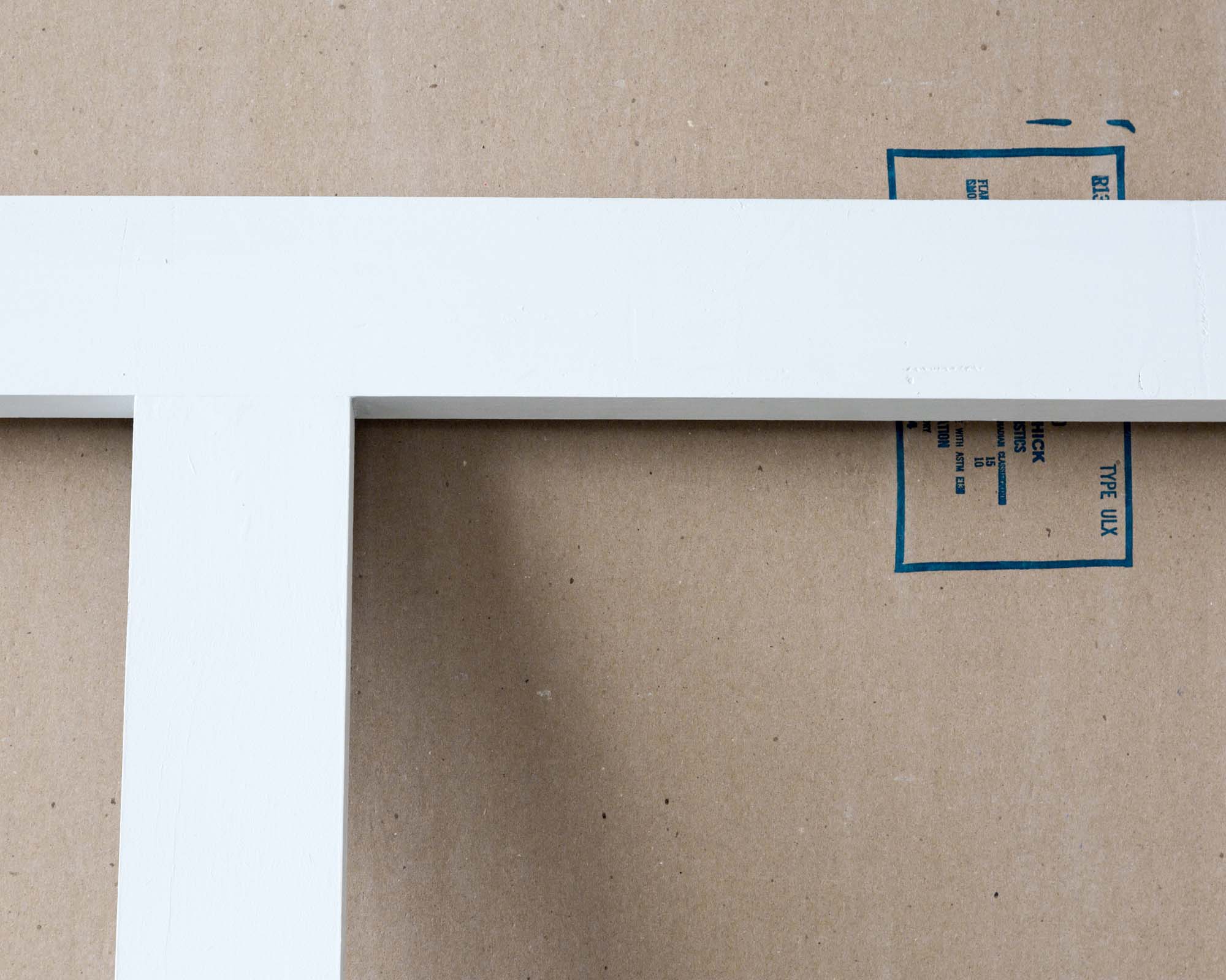
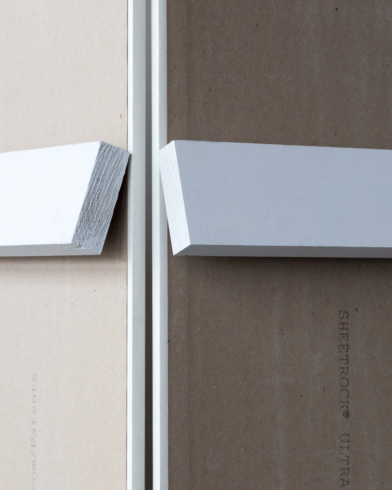
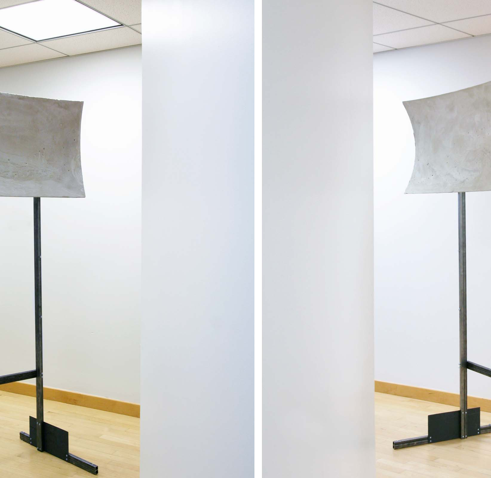
Periphon is a pair of concrete sound reflectors similar to sound collection devices built along the British coast during World War II as an early form of radar. The installation reconnects two areas of the library that were isolated acoustically—but not optically—by a glass partition. The result is the aural equivalent of a periscope, allowing conversation across the partition to take place through the act of voice—throwing, producing an uncanny orthogonality between sound production and sound reception.
The installation is made up of two concrete shells. Each shell is a fragment of a different paraboloid, sharing a common focus and axis but differing in focal length in order to account for the skewed geometry of the library's floor plan. Despite their very different lengths and curvatures, the shells are acoustically symmetrical: an incoming sound wave that hits the outermost point on the long shell is reflected through the focus to the innermost point of the short shell, at which point it is reflected out parallel to the axis once again.
Periphon was part of the exhibition sounded() at the Princeton University Mendel Music Library. It was published in Pidgin 6.
Collaboration with Howard Huang and Ajay Manthripragada.


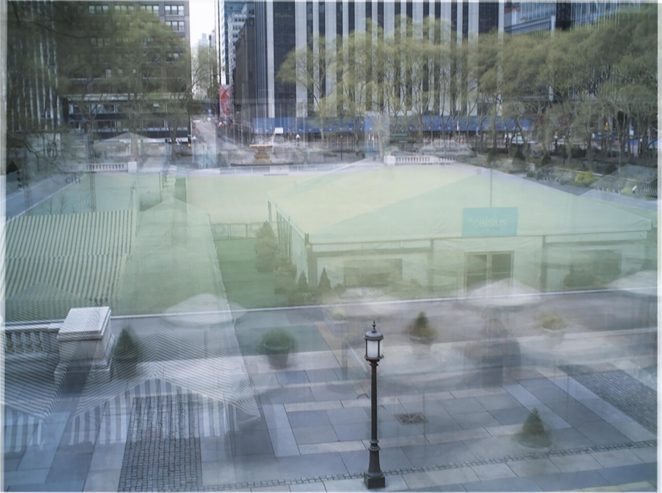
Bryant Park is a public space controlled by a private corporation. Owned by the city, everything that happens in the park happens at the behest of the Bryant Park Corporation. The main lawn only functions as truly open and public for a small percentage of the year. At other times it is used for Fashion Week, corporate events, private galas, etc. During the Christmas season the lawn is turned into a tent—enclosed shopping mall centered around an ice rink. Probably the number one occupation of the park is by construction crews. The space is converted so often, from lawn to catwalk to mall to stage to theater and back again, that it is constantly under construction. On the main lawn of Bryant Park, the only park in midtown Manhattan, scheduling is tight; indeed, time is at a premium. Events [and their preparations] take up so much of the year that less and less time is available for the public.
But while time in the case of the Bryant Park calendar is a tool of exclusion, it is also an equalizer. In the following photographs, average views of the park over various time scales, specific events disappear into the muddle of time. Tents, ice rink, and lawn fade into one, the parks occupants settle into a grey haze enveloping every available open ground. Even the trees lose their specificity. Strangely enough, public space reemerges: the architectural boundaries of this most artificial of sites are the only markers of stability, indicating that perhaps the time for action, for reclaiming of space in the name of the public, is not ‘now,’ but ‘next year.’
The images compiled here are averages of photographs culled every ten minutes from the Bryant Park webcam from 29 September 2006 to 1 October 2007. The ‘day’ and ‘week’ images are simple arithmetic means, in which each pixel in the final image is an average of the RGB values of the matching pixels [ie the pixels with the same coordinates] across the set of images. The year image is also the result of an arithmetic mean, but due to small movements of the webcam over the course of the year, each of the individual images was first realigned to increase clarity.
Average Bryant Park was published in Pidgin 4.


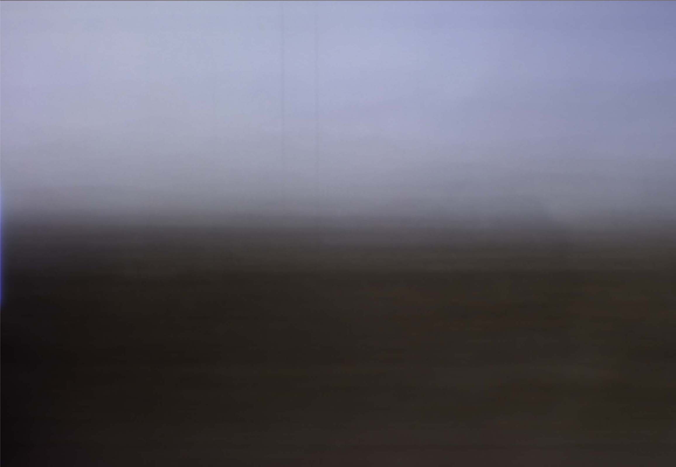
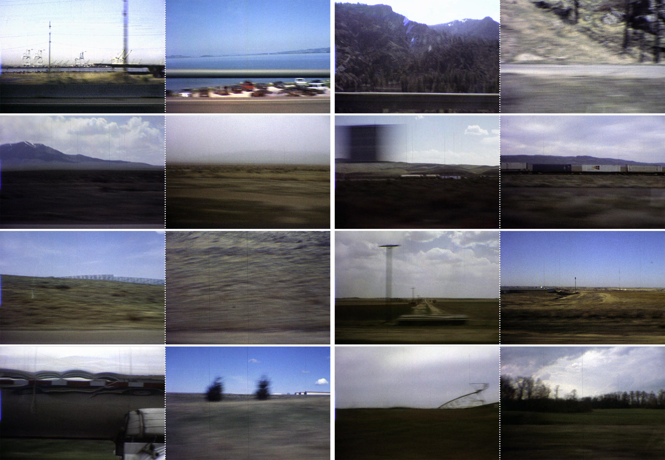
autotimelapse is a series of short films inspired by the John McPhee series Annals of the Former World, which he envisioned as "a geological cross—section of North America along Interstate 80." Preparing for a cross—country car ride we asked a similar question: what would a photographic cross—section of North America look like? The videos presented here are intended as a first take.
The first film documents a trip along the entire length of I—80 traveling west from New Jersey to San Francisco. The left pane looks south and the right pane looks north, each view capturing one frame per minute [or approximately one frame per mile]. In this instance the film is played back at a standard speed of 18fps. The result is a wall—eyed experience of the journey compressed into one minute forty—one seconds. The primary object of this experience is not any single grand view but a stereoscopic horizon line shifting subtly up and down, in and out of view. The only recognizable objects are the icons of the American landscape: snow—capped peaks, the Bonneville salt flats, and cars in the next lane flickering by.
The second film documents a similar journey down the Pacific Coast Highway from San Francisco to Los Angeles, capturing four frames per minute. Only the view west is presented, showing the ocean and the intervening landscape as it passes by. The film slows as it approaches Los Angeles, as heavier traffic causes the repetition of certain views for many frames in succession.


Inspired by the flattened historical perspective of ostalgie, this project looks back to forms of spatiality developed under the Eastern Bloc which have since been abandoned as useful design paradigms. Specifically, it revives an excess of unaccounted space—typified by communist parade grounds, monuments and palaces, where space was scaled to the mass rather than the individual—to propose that this form of spatiality could have new relevance for democratic capitalist programs today.
The design relocates the Neubabelsberg Film Studios to the center of Berlin to bring production back to a site suffering from cultural over—exposure. By integrating the studios with a vast public plaza, new possibilities for experimental media and public participation emerge. Public plaza and back lot become one and the same. The location provides film makers with a readily available supply of backdrops (cropped views to different parts of the city) and unpredictable extras, while the expansive blank field of the plaza encourages a new subject: a spectator—producer, someone who produces and consumes content in a continuous feedback loop.
Unlike Schinkel’s Altes Museum next door, the plaza’s bowl shape forms a non—panorama: it elevates the horizon, blocking out the immediate context and scale while producing a spatially expansive field of vision by juxtaposing much larger elements: the vast concrete basin below and the open sky above. The city is shut out acoustically, visually and historically, leaving an intense focus on movements and actions of people on the surface. The multiple valleys within the plaza create the possibility for disparate simultaneous attractions. These centers are eroded from below and connected to the exterior by cavernous vomitoria, which immediately immerse the new visitor in an expansive field of activity. The elements of distraction that form the plaza require a more extreme peripheral emphasis—a constant awareness and reading of other possible locations for action.
Spherical projections are an experimental technique for this new mode of peripheral viewing. They are synchronic views that are inherently a collection of multiple perspectives over time. They collapse plan, elevation and perspective into a single drawing by looking everywhere at once. Likewise the project, in its manifold mechanisms of representation, becomes a screen for a continual projection of public desires through an excessive multiplication of reality.


